Type Trends: 2023 Q2 Summer Type Trends
Predicting trends of, pretty much, anything is very difficult – and fraught with issues. Spotting tends, however, is much easier. Especially if you have a database to work from. And, boy, do we have a database.
The MyFonts web site has over 230,000 fonts that you can purchase and download – and we regularly look at what new fonts are selling best. Check out Hot New Fonts, and see for yourself.
Which is exactly what we did for this Type Trends update. But we didn’t just look at the individual fonts. We used Hot New Fonts as a database to do some trend spotting.
Along with a bunch of great new fonts, we found four definite trends in typeface design. We’re calling them:
- Weight Shifters
- Not Your Average Sans
- Approachable Whimsy
- Fun & Games
Weight Shifters
Weight Shifters turn the traditional norms for typeface weight stress on their ear. In traditional letter forms, stress is derived from a related aspect in writing or lettering created with a broad-edged writing instrument. (Think: broad brush or flat pen.) It’s subtle, but you can even see it in some sans serif typefaces.
Traditional stroke stress was born of an analog world. But we’ve been living in a digital world for a long time – and typeface designers are embracing this reality. Weight shifting fonts clearly call attention to themselves, making them excellent display designs. They can also create a modern and, sometimes elegant, ambiance.
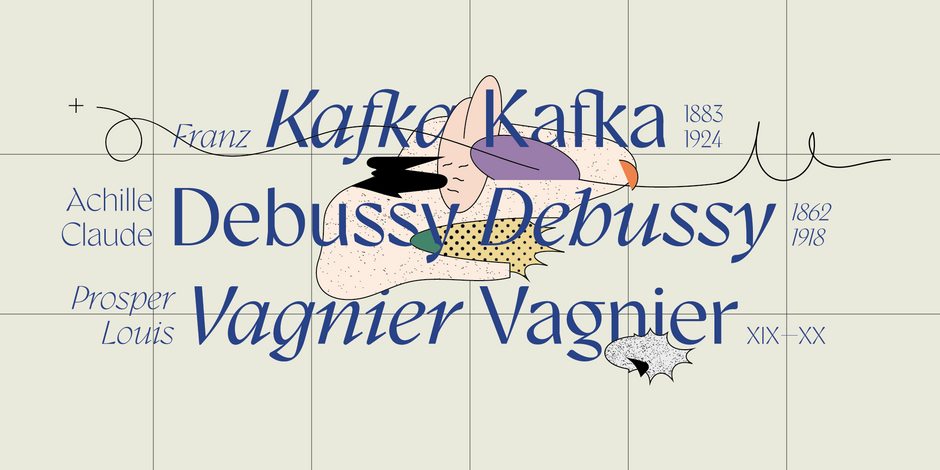
Gyst
Traditional old style typeface designs carry the heaviest stroke weight at about 2:00 and 8:00. Gyst rotates this stress to 1:00 and 7:00, making round characters almost a reverse italic. The result is a design that artfully melds the principles of sans serif and old style typefaces. Gyst is both elegant and cutting edge.
Remixa
Remixa’s hairline strokes limit its use to large sizes but it clearly bring the essence of modernity and timeless elegance to just about any project. Even the boldest weights are light on their feet.

ZT Vollun
It’s safe to say Vollun is unlike any other sans serif typeface. Its hairline strokes appear in the most unlikely of places. And yet, it works. This is a typeface with spirit and the bravery to say, “I may not be like the other sans, but I can get the job done with confidence – and a dash of cool.”
Not Your Average Sans
Be it geometric, grotesque or humanistic, we’ve come to expect certain things from sans serif typefaces. Delicately curved terminals, sensuous curves, interlocking ligatures and enhanced digital overtones, however, are not normally part of the mix. But then, this trend is called “Not Your Average Sans.”
Morality
Morality’s a natural for branding and logo design. It both fits-in and stands out. At first glance, it’s a well-crafted geometric sans. A closer look, however, reveals softly curved baseline terminals and several left-of-center lowercase characters.

Twogether Sans
A slightly squared sans (an aid to letter spacing), Twogether Sans combines opulent strokes with diminutive baseline curves, to create a design that won’t be confused with your average sans – and yet, does not flaunt its diversity.

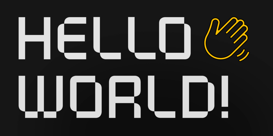
Glitch
Glitch has an obvious digital heritage, but is not hard-edged or demanding. It clearly makes a statement, but doesn’t shout. While best in display headlines, posters and other large-size environments, Glitch is also surprisingly easy on the eyes, in short blocks of copy.
Approachable Whimsy
These are fonts that are friendly, welcoming – and tend to be bit on the plump side. They also set a mood, encourage reading, and create an affable vibe. This trend isn’t exactly new. The lineage of these designs can be traced back to the early 20th century. The following, however, are a fresh take on typefaces that are affable and more than a little endearing.
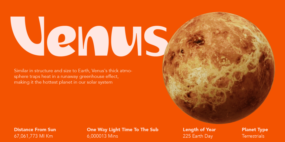
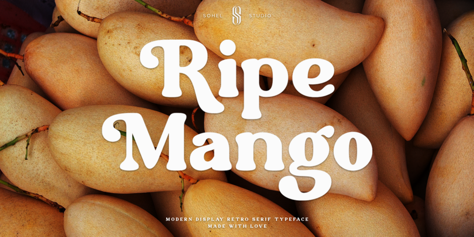
Ripe Mango
A little bit of ITC Souvenir and Cooper Black and a lot of its own personality, Ripe Mango has more attitude and whimsy than its predecessors. Characters like the a, e, g, y, G, Q and T give the design a more extravagant and carefree quality. Ripe Mango is both happy and relaxed.
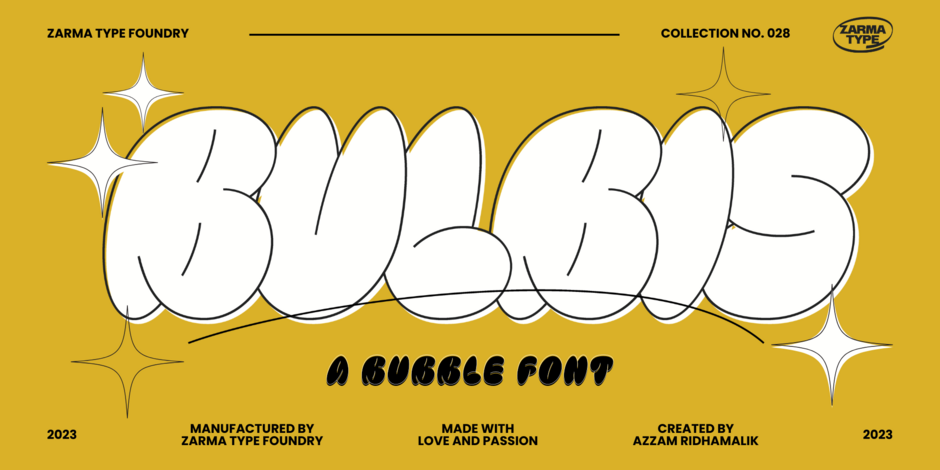
Bulbis
Inspired by graffiti and street art, Bulbis, takes whimsy to new heights. Pair it with stalwart sans serif typeface and you’ve created a typographic counterpoint that’s hard to be missed, and sure to be memorable. Bulbis is infectious fun, on its own, but needs to be set big for full effect.
Funky Choky
Yup, “Funky” clearly describes this design. It’s modern, stylish and unconventional. It’s also playful and approachable. Funky Choky’s rounded letterforms and soft contours, give it a friendly mien. The font also comes equipped with swash, alternate and ligatured characters that create a spontaneous, hand lettered quality.

Fun & Games
OK, “fun and games” is a bit of a catch-all. But there is definitely a new crop of handwriting and comic book fonts that add a new twist to the genera. Some have a 70s psychedelic demeanor, while others push the limits of brush lettering. All will add a light-hearted energy to your designs.
Cheer Forever
Cheer Forever melds the straight forward simplicity of a sans serif with playful brush-like intonations. The result is a contrast that is both cheerful and commanding. Best used with color and set large, to accentuate the brush highlights, Cheer Forever is contemporary and playful.

The Bolder Shadow
The Bolder Shadows is a delightful mash-up of urban graffiti and comic book lettering. It’s bold weight commands attention, while the charismatic letter shapes charm the reader. The Bolder Shadows three-font suite allows for setting solid bold, outline, bold outline and interior highlights. While the other typefaces in this category are friendly and charming, this is a design with an attitude.
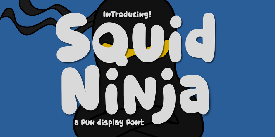
Squid Ninja
Squid Ninja is fearlessly irreverent, with lots of movement – but no rhythm. It’s bold. It’s fun and playful. Squid Ninja’s marshmallow soft shapes and quirky weight shifts are disarming, though not for the typographically timid, Squid Ninja has its own idea of what “fun & games” means.
Like every other creative endeavor, trends in typeface design come and go – and chasing them is rarely advisable. But, while popularity is fickle, the above trends offer insight into the ever-shifting nature of typographic creativity and, perhaps, a platform for building something new and fresh in your next project.