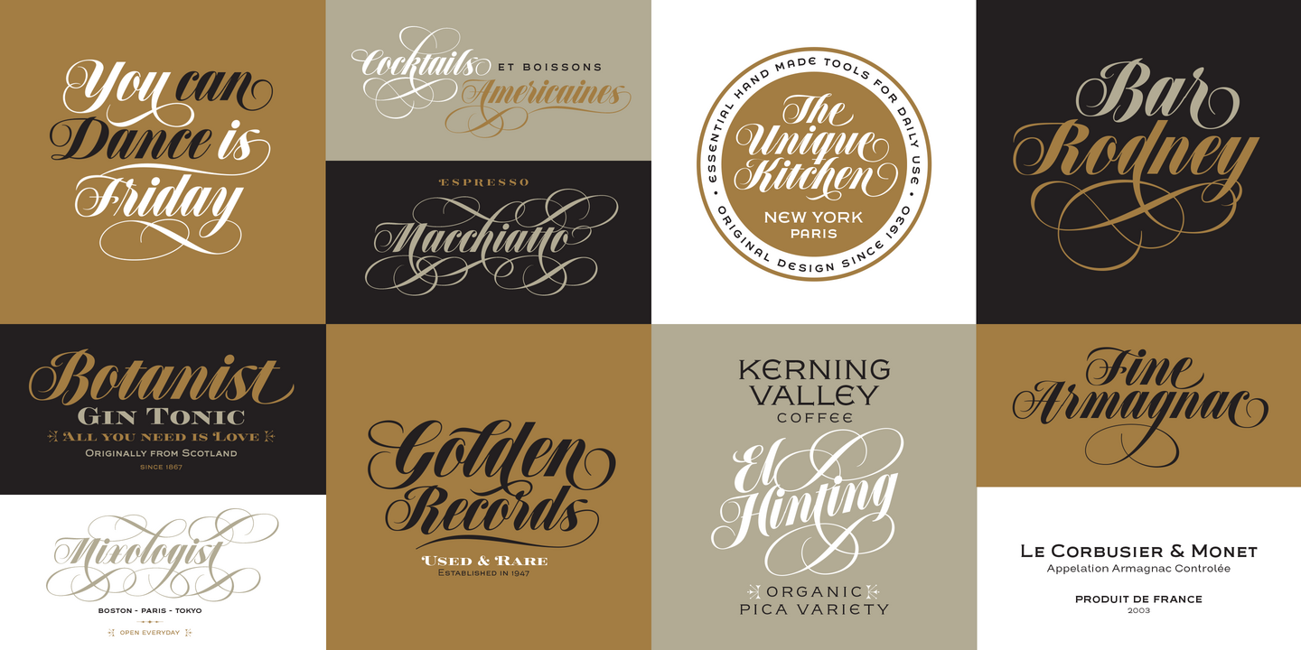
Popular Sudtipos fonts.
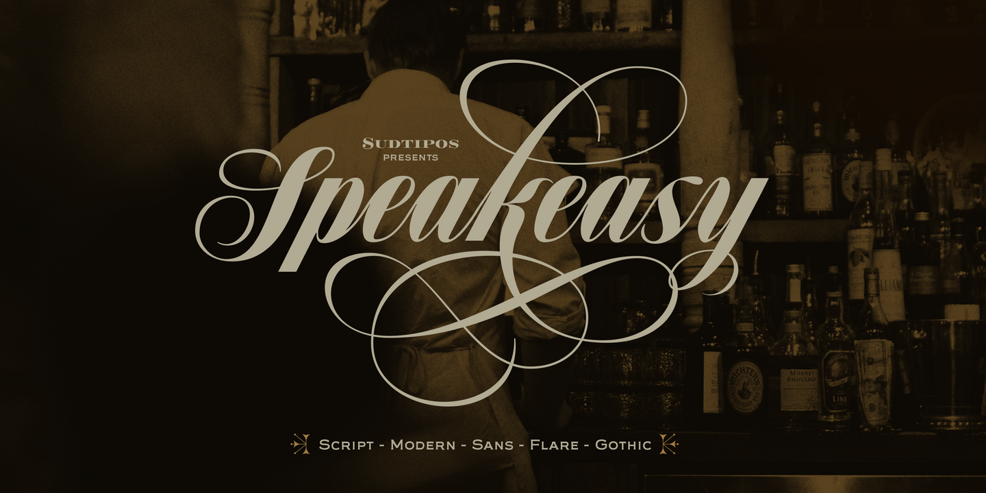
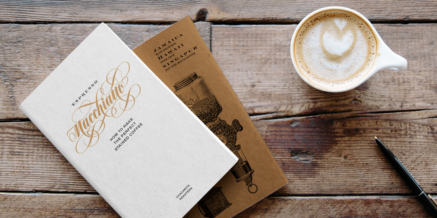
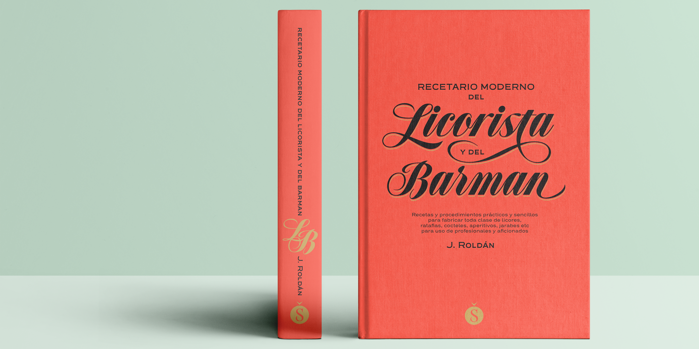
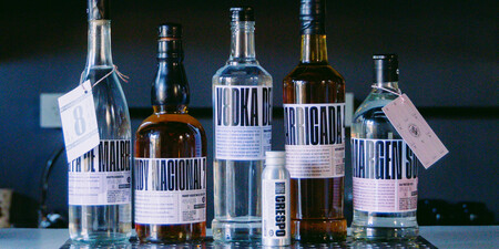
Speakeasy is a 5-font combo thematically built as a toolset for designing menus and liquor labels as well as coffees, restaurants and signs when the desire is to communicate with style. Originally put together to be used by the most famous speakeasy in Buenos Aires, this set contains a script, a minor (almost flat) wedge serif, a flare serif, a sans serif, and a bold Didone. The seed for the script was found in a German lettering book, and the other fonts reflect the familiar advertising and announcement styles of the early 20th century.
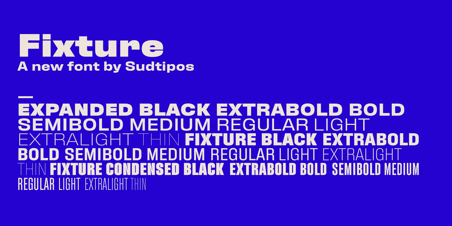
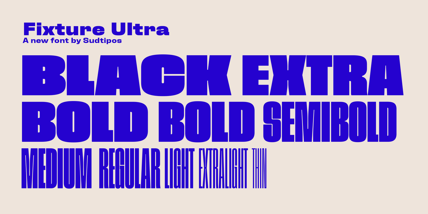
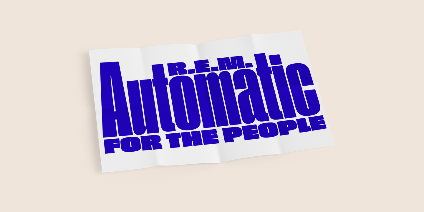
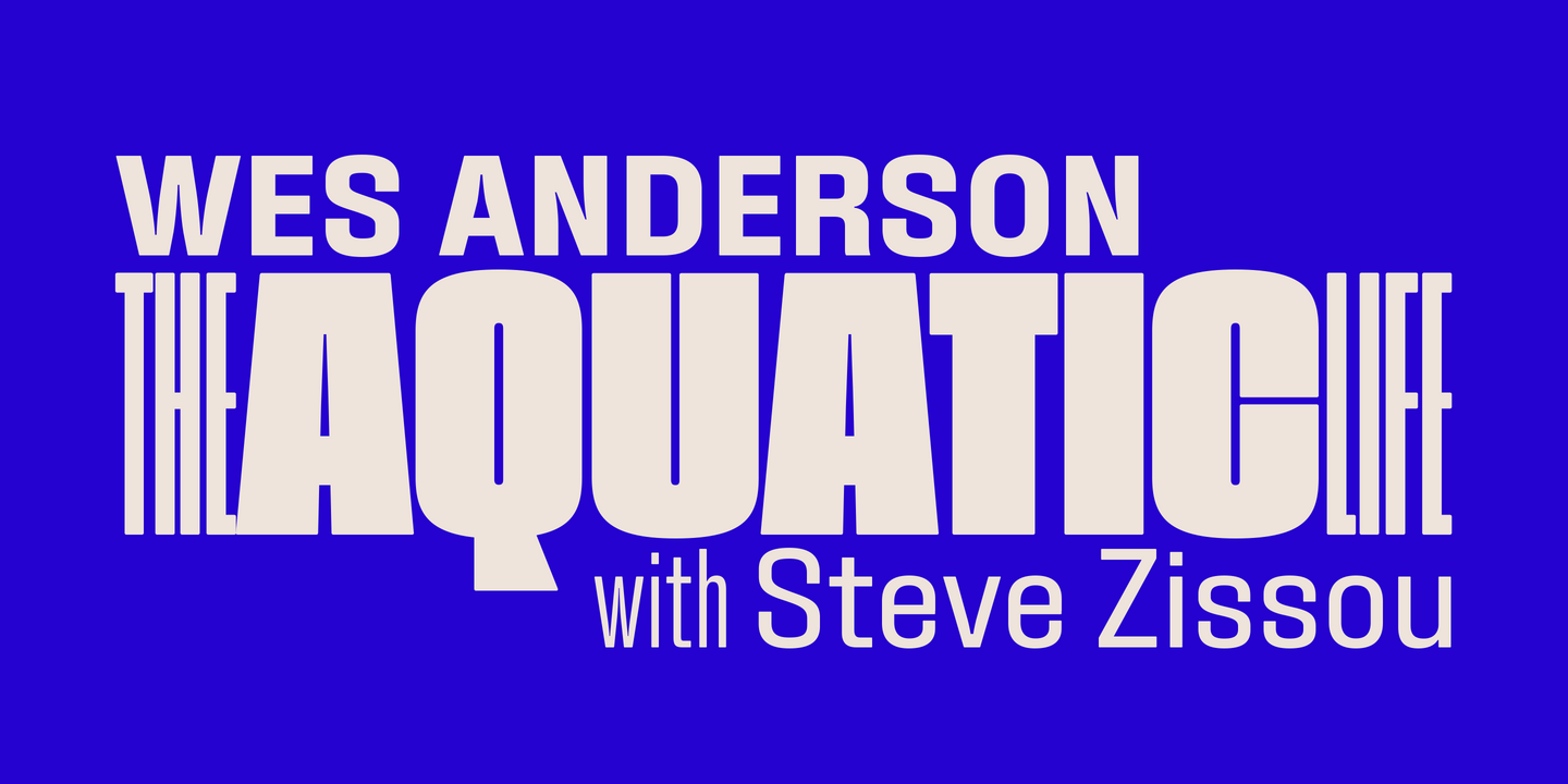
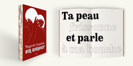
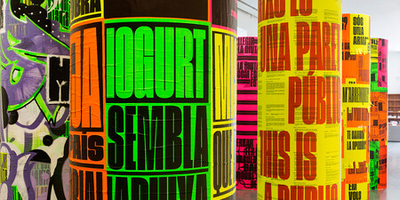
Fixture is our massive 72-font take on plentiful offerings of the late 19th century’s typefaces, posters and wood letterpress sundry done in the Grotesk genre. Four widths ranging from Ultra Compressed to Expanded each come in nine weights and accompanying italics. Some common sans-serif alternates, such as the a and g, are included in all the fonts. The idea with this design was to put together a workhorse font family with enough functional flexibility to work in multiple environments, from the subtlety of magazine layout or film credits to the visual drama of billboards or packaging.
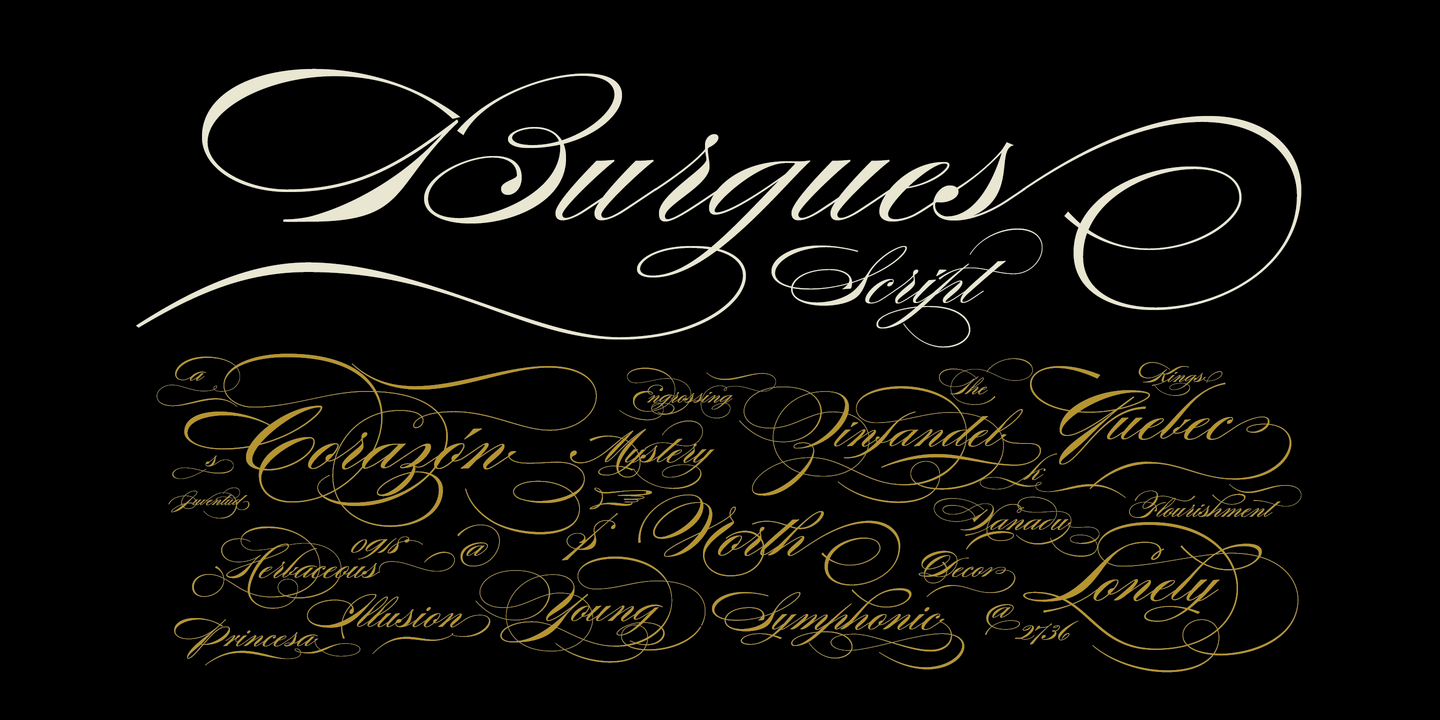
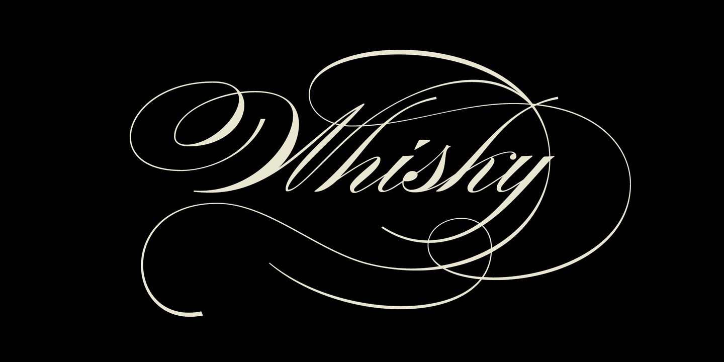
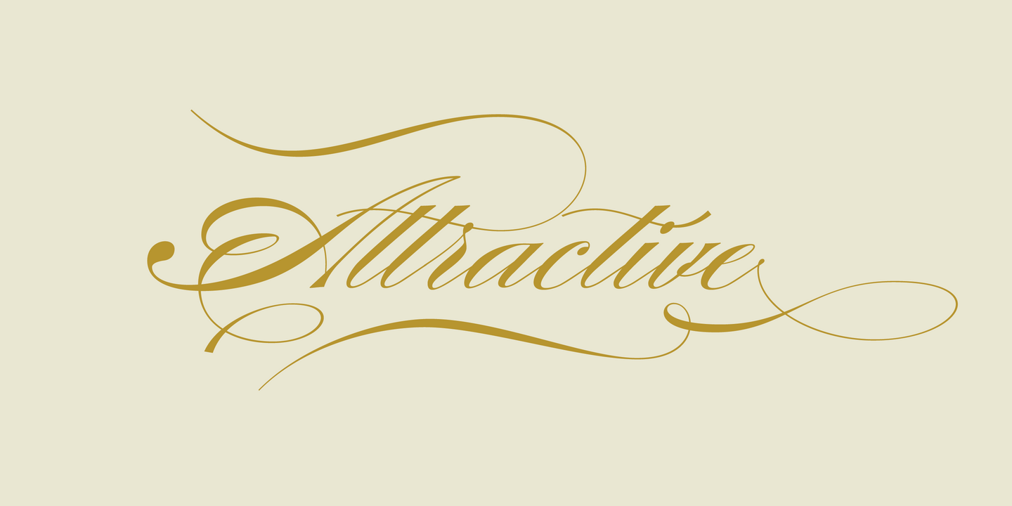
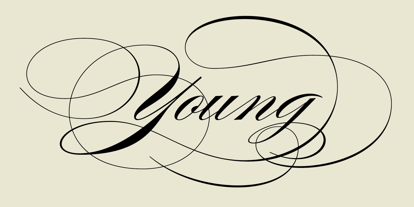
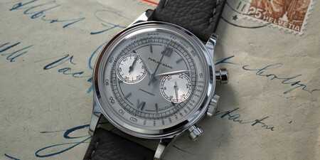
Burgues Script is an ode to the late 19th century American calligrapher Louis Madarasz, whose legendary pen has inspired schools of penmanship for over 100 years. His talent has caused some people to call him “the most skillful penman the world has ever known.” I use the word ‘ode’ in a colloquially ambitious manner. If I was an actual poet, my words would be about things I desire but cannot attain, objects of utter beauty that make me wallow in humility, or people of enormous talent who look down at me from the clouds of genius. But I don’t write poems. My work consists of letters drawn to fit together, that become an element of someone’s visual poetry.
Fonts in use.
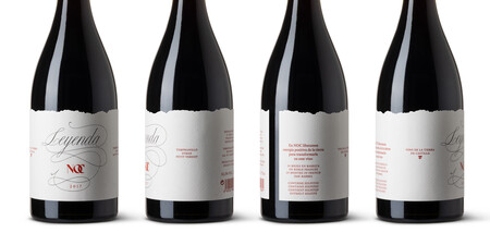
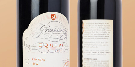
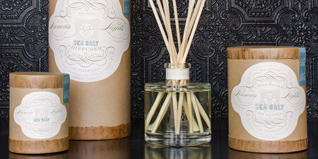
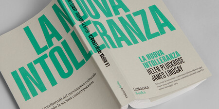
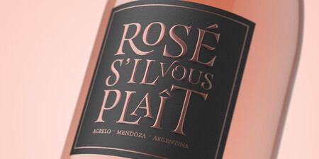
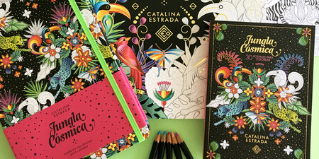
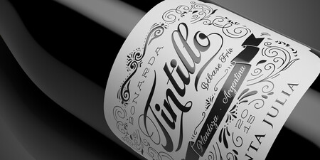
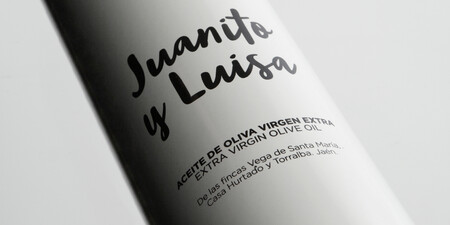
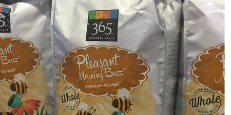
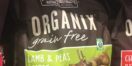
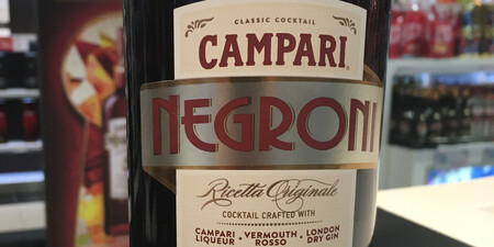
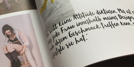
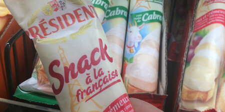
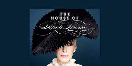
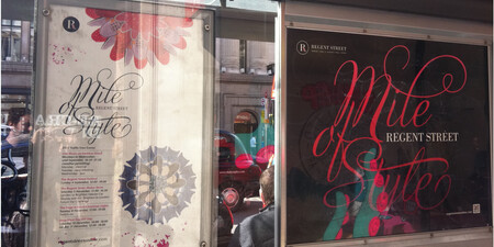
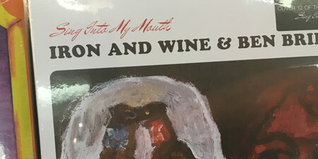
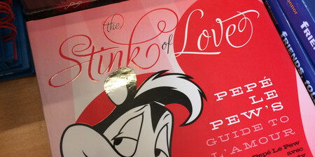
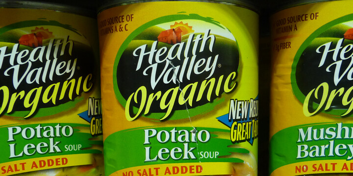

Fonts from Sudtipos

In the constant search for new typographic niches to explore and always trying to keep up with technological advances, Sudtipos has been in the market for 20 years, establishing itself as one of the most awarded and used type foundries in the design world. Their projects range from exquisite typography for packaging to complex typographic systems for text. Sudtipos typefaces have no borders as its designers are spread all over the world.

Type Designer
Alejandro Paul
Ale Paul is one of the founders of the Sudtipos project, and a key reference for the quality of its work. His work has contributed enormously to placing Argentina firmly on the map of Graphic Design. Ale's career as an art director landed him in some of Argentina's most prestigious studios, and handling such high-profile corporate brands as Procter & Gamble, SC Johnson, Danone, and others. With the founding of Sudtipos, Ale shifted his efforts to typeface design, creating fonts, lettering, and commercial faces for several top packaging agencies. In 2012, his font was selected for Letter2. He has received four certificates of excellence from the Type Directors Club NY and several awards at the Tipos Latinos biennial of typography.
He teaches a postgraduate typography program at the University of Buenos Aires, where he previously taught graphic design. He has also taught seminars and spoken at the Type Master Weeks NY, TypoBerlin, TypeCon, Pecha Kucha, and Atypi conferences, at the Type Directors Club in New York City, and at events in Hong Kong, France, Czech Rep., Austria, Spain, Portugal, Chile, Brazil, Colombia, Ecuador, Venezuela, Bolivia, Uruguay, Mexico and Canada. His work has been featured in publications around the globe, including Eye, Communication Arts Print, Creative Review, Visual, Creative Arts, Novum, and many others. He has been designated ATypi's country delegate and is a member of the Alliance Graphique Internationale -- the first one for Argentina.

Sudtipos
Sudtipos Fonts are included with Monotype Fonts.


