Alphabet Tree - The Letter O

Some believe that our present O evolved from a Phoenician symbol; others consider an even more ancient Egyptian hieroglyph of a knotted cord as the source.

The most fanciful explanation, though, is offered by Rudyard Kipling in his Just So Stories. “How the Alphabet was Made” recounts how a Neolithic tribesman and his precocious daughter, Taffy, invent the alphabet by drawing pictures, or finding objects, to represent sounds.
“Now make another noise, daddy.”
“Oh!” said her father, very loud.
“That’s quite easy,” said Taffy. “You make your mouth all around like an egg or a stone. So an egg or a stone will do for that.”
“You can’t always find eggs or stones. We’ll have to scratch a round something, like one.” And he drew a round circle.
The father’s sketch of the first O would serve perfectly well today, since “round” remains the defining property of the letter.

Actually, the O did start out as a drawing of something, but not an egg or a stone, or even a mouth. The true ancestor of our O was probably the symbol for an eye, complete with a center dot, for the pupil. This was from the Proto-Sinaitic alphabet. The ancestor of our letter represented a realistic eye, an image that was later simplified, but retained the pupil. This symbol “ayin” (pronounced “eye-in”) appears among the Phoenician and other Semitic languages around 1000 B.C.

The symbol was further simplified to be just a circle with a center dot.

The Greeks adapted the ayin to their communication system and used it to represent the short vowel sound of ‘o.’ By this time, the dot was gone.
The Greeks also changed the name of the letter to Omicron. (The Omega is another Greek O, which they invented to represent the long ‘o’ sound.)

While the Phoenicians and the Greeks drew the letter as a true, nearly perfect circle, the Romans condensed the shape slightly to be more in keeping with their other monumental capitals. Also note that the weight stress is such that the heaviest parts are, roughly, at 2:00 and 7:00. This is a reflection of the stone cutter drawing the letter with a flat brush, prior to incising it.


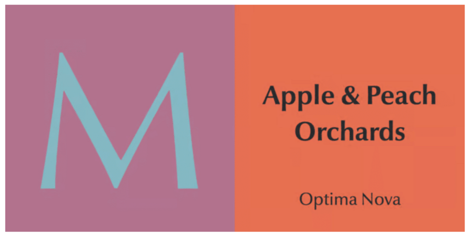
Hermann Zapf was hesitant to share the preliminary designs for his Optima® typeface. “I did not show anything to the type foundry until the design was finished,” he recalls in his book Alphabet Stories. “I wanted to avoid pressure by salespeople until I found the best solution myself. Unfortunately, the sales manager of D. Stempel AG did decide on the name of the typeface. My preference was ‘Neu Antiqua,’ but this was rejected in favor of ‘Optima’.” Optima was first released in 1958 (early in Zapf’s career) when he had the recognition as a gifted young designer – but not the eminence that precludes questioning.

Over 50 years after the first release of Optima, Zapf was provided the opportunity to redraw the design for digital typesetting. In this project, he was also able to collaborate with another designer: Akira Kobayashi, type director for the Linotype Library. The design team seized the opportunity to undo the technical concessions made in earlier versions of the typeface. The result was released as Optima Nova, in 2003.
In the design of Optima Nova, Zapf and Kobayashi corrected all the inherent spacing and proportional problems that were the result of metal typesetting technology.
They also drew a cursive italic and variety of new designs to round-out the Optima family: a full range of weights from very light to very bold, in roman, condensed, and italic, as well as the addition of small caps and old style numerals.


