Alphabet Tree - The Letter S

Any way you look at it, the S is a complicated letter. Not only is it one of the more challenging characters to draw, but the story of its evolution has more twists and turns than its shape.
The serpentine saga of our 19th letter gets its start with the early Egyptians and their hieroglyph for the ‘s’ sound, which was a drawing of a sword. Later, in the Egyptians’ hieratic writing, the sword was simplified until it looked more like a short piece of barbed wire than a weapon of war.

When the Phoenicians built their alphabet on the Egyptian model, they rotated the piece of barbed wire 90 degrees and called it “sameth,” which meant a post. The Greeks adopted this letter but not as a true ‘s’ sound. (A major reversal in the evolutionary road.)

At the same time that the Egyptians were using the symbol of a sword to represent the ‘s’ sound, they also used a drawing that represented a field of land to represent the ‘sh’ sound. Like other hieroglyphs, the field symbol was simplified during the transition to hieratic writing. Unfortunately for the Egyptian scribes, the symbol’s usage became more complex. The reason? The Egyptians allowed as many as nine different versions of the symbol to exist at the same time.

The Phoenicians dropped most of these Egyptian ‘sh’ characters and settled on something that looked like our W to represent the ‘sh’ sound in their language (The symbol represented teeth). The Phoenicians called their version of the letter “shin” or “sin.”

The Greeks borrowed the shin from the Phoenicians but drew it with three, four, and sometimes even five strokes. In some cases it hardly resembled the original Phoenician symbol, but in each the basic zigzag shape of the letter was maintained.

In its final Greek form the character became the sigma, which resembles our present capital M lying on its side.

The Romans used a form of the sigma, which omitted the lower horizontal stroke of the character and made it look a little like a backward Z.

Over time, the Romans changed the sharp angles of the sigma into softer, rounded forms and finalized the letter into its current graceful shape.

Does the story of the S end here? Not quite; there are still a few twists and turns left. In English manuscripts of the 17th century, a lowercase version of the letter was modified to look remarkably like our lowercase f and stood for the long ‘s’ sound. Even today, the German language uses a letter which resembles a capital B (probably made up of a long and a short s), to represent the double lowercase s in words like “Strasse” and “weiss.”

Not only is the S a complicated letter, it is the first letter of a very short word that is the most complex in the English language. The word “set” has over 430 definitions and requires 60,000 words, covering 24 pages in the Oxford English Dictionary

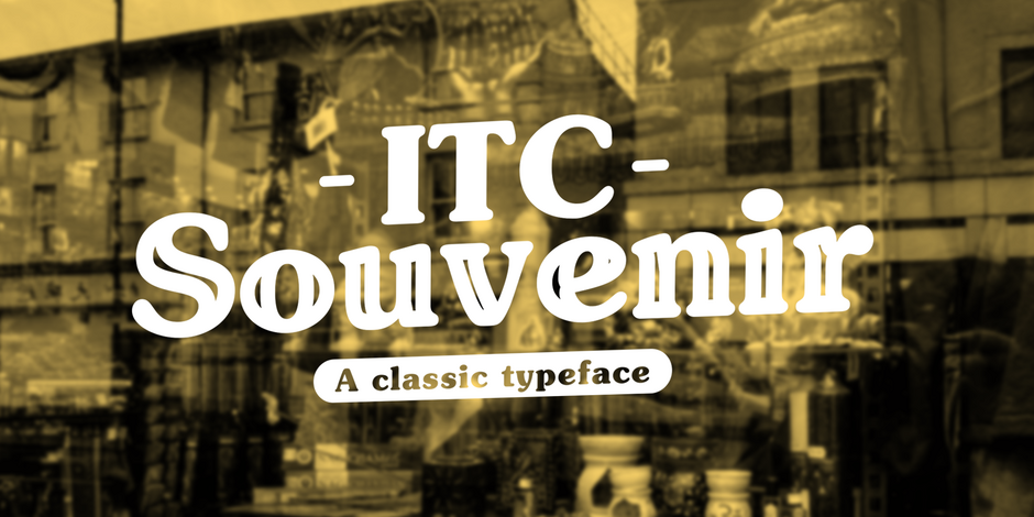
Souvenir was first shown in a, 1914, small American Type Founders specimen booklet, as a single-weight design with no italic complement. Few orders were placed for fonts of the handset type – and the design lay dormant for over 40 years.
In 1967, PhotoLettering Inc, revived the Souvenir design as an exclusive branding typeface for one of its customers. When ITC was formed, the exclusivity was no longer at issue and Souvenir became one of ITC’s first typeface families. Drawn by Ed Benguiat, it was released in four weights with complementary italic designs. ITC Souvenir quickly became one of the company’s most popular and successful offerings.
ITC Souvenir probably became so popular because of its affability. It’s a friendly and undemanding typestyle. Souvenir has no sharp edges, no strong contrast in stroke thickness, and virtually no right angles.
The problem was: the design became too popular. Ubiquity is rarely a positive quality for a typeface design. As soon as a typeface becomes very popular, it also becomes a cliché with the cognoscenti of graphic communication. Fewer and fewer designers used ITC Souvenir.
A little bit ago, the, the folks at Chobani® yogurt released a complete redesign of its branding – including new bespoke typefaces. The typefaces could be described as the love child of Windsor™ and ITC Souvenir®. ITC Souvenir is back – and it’s got friends.


