Inside the Studio: Creative Characters — Giuseppe & Paco
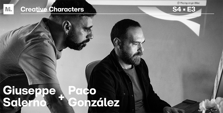
– Giuseppe Salerno
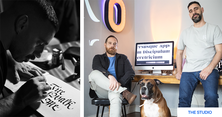
Chat with font-designing partners Giuseppe Salerno, 43, and Paco Gonzalez, 46, of Resistenza (meaning: resistance) Type Foundry, based in Torino, Italy, and Valencia, Spain, and get a lesson in lettering history. The pair are dedicated to producing typefaces via an artisanal process — creating hand lettering through calligraphy — before digitizing the fonts for the contemporary market.
Their goal: to turn out quality work that will last, even as they approach daily life in a relaxed way. Their blend of old and new, craftsmanship and pleasure, fuels their production of fonts for major ad campaigns and diverse brands. Their triumphs include their Afrobeat Nova typeface’s appearing on Reebok’s Promise Keeper shoe; their LeKick typeface, on a series of labels for artisanal wine, gin, and grappa for the Italian market; and their Mina typeface, on Taylor Swift’s Speak Now album tour. We discussed their approach to work and la dolce vita during a recent Zoom call.
Our conversation has been condensed for space.
MyFonts (MF): I understand that you have two homes, and so, I assume, two home studios. Is that correct?
Giuseppe Salerno (GS): Yes, one in Italy, one in Spain. Fortunately, our workflow allows us to travel easily, because we’ve worked remotely for many years. Part of the year we spend in Torino, close to the mountains; another part, in Valencia, close to the sea.
MF: Take me through your daily routine.
Paco Gonzalez (PG): It unfolds. We love to eat, so a day in our studio could be: we start working, and then one of us start cooking. It’s a mix of all the different stuff we love to do, like typography and designing of letters. And we also have Tor, our dog, always around. So it’s a very easy workflow.
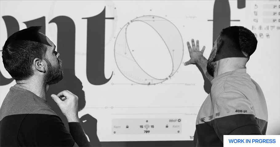
GS: We like to enjoy, without stress. For us, it’s very important to be surrounded by our books, our drawings, our ink. I’m constantly with dirty hands, because I paint, I use brushes, I use a lot of calligraphy tools. And it’s part of our style. I say, don’t be so stuck with schedule.
MF: Sounds like the way that you lead your life spurs your creativity.
GS & PG: Exactly.
GS: Mostly, we answer email in the morning. Afternoons, we draw. I do my best work around 6 pm. We don’t rush, yet we’re productive. We’ve done typefaces, wine labels and logos for other agencies. Fortunately, we can manage this lifestyle. We’ve been in the business a long time.
MF: When did Resistenza launch?
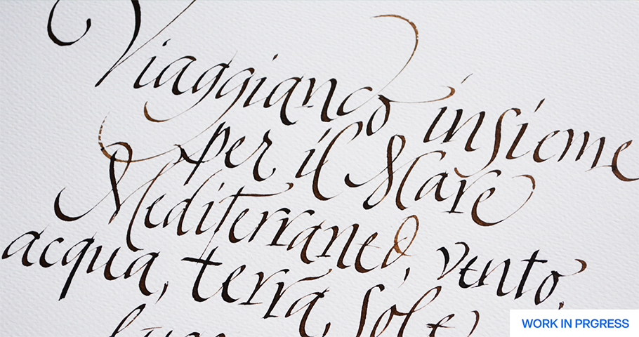
GS: In 2008. Our first type release was Afrobeat: a multilingual font inspired by African-Nigerian funk music of the same name. We love cultural heritage, archaeological artifacts, old things. At an exhibition, we spotted masks of African tribes from the Nigerian tradition, all decorated with these circular, very optical shapes. From that, we developed lettering [with a rounded disco-infused shape]. And then we said, why don’t we come up with a world alphabet?
MF: How did you develop your global business and aesthetics?
PG: I studied tourism and didn’t know that there was something called font design. We started out doing graphic design together. Our work now: self-taught.
GS: We studied and developed our skills together. Also, something very impactful was we moved to Berlin, in 2013, for a year — the first time we met type designers. Funny, but true.
PG: That’s where we came across this project of lettering versus calligraphy, developed with Martina Flor, [designer of lettering and custom typography for such leading publishers as The Washington Post, Vanity Fair, Harper Collins, Penguin Random House, Etsy, Adobe and Cosmopolitan].
GS: There was a dialogue between us. We’d sketch a letter every day. She’d do the lettering, and I’d do the calligraphy, following a certain quality. Here’s the website displaying our work: https://www.letteringvscalligraphy.com/
At that time, in Europe, there was a renaissance of lettering and calligraphy. Instagram had little influence. Everybody was like: why, suddenly, is work made by hand, important?
MF: Why is it?
GS: There’s this impulse to bring back what our ancestors did — a respect for what’s been done before. For instance, we love traveling in the south of Italy, where the influence of Roman inscription [on pagan temples, on relics] is very strong. We’re used to being surrounded by beautiful lettering that’s resisted time. It lasts. That’s our concept of Resistenza.
MF: How does that Roman influence show up in your own designs?
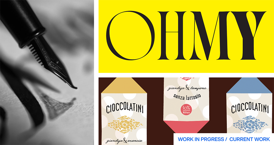
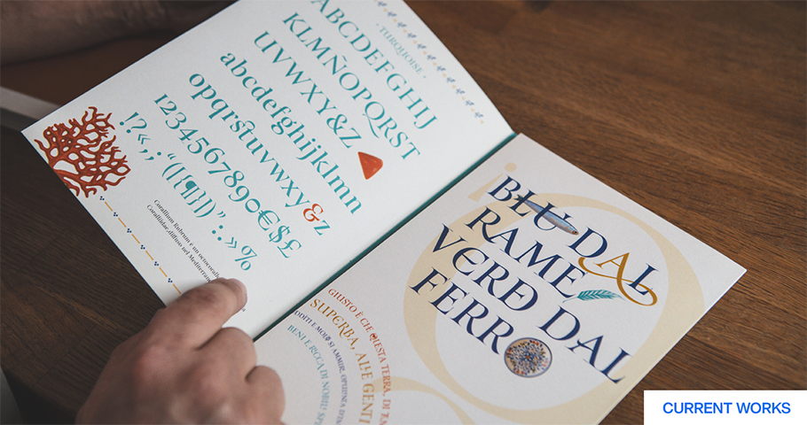
GS: One of our bestselling fonts, Turquoise, is a Roman-inspired font, but designed with a letter brush. We wanted to reflect the essence of the flat brush in every single serif. If you look closely, you see how the gouache stays. The movement of turning the brush is part of this display typeface. It’s a bit higher contrast than a usual Roman typeface. We did also a sans version, an in-line version, and a Tuscan serif version. All of them are in our catalogue.
MF: What about your award-winning font Le Kick?
GS: Le Kick, a gothic display font that’s very brushy and breaks the boundaries of gothic fractal styles, was sketched in 2015. We released it three years ago and got a prize in computer communication arts. We were very surprised. But people liked it a lot, because it doesn’t look like a font.
MF: What does it look like?
GS: A very jelly, fractal typeface: fat, rounded and bubbly, in a gothic style. Fractal fonts were perfect for reproducing fabrics because they were very straight, the lines were geometric. But Le Kick — it means “give a kick” — breaks these structural rules.
MF: Back to the concept of resistenza.
GS: Well, it’s not NOT following the rules, but breaking the interpretation of some of them.
MF: What are you working on now?
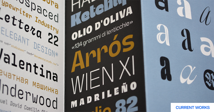
GS: Releasing our first typeface book. It’s still in process: one hundred and fifty pages! We have the first copies, and we will, hopefully, in Sept., be ready. It’s all the years of our fonts reproduced in one catalogue.
Give a shout-out on social media using #CreativeCharacters
We hope you enjoyed this interview. Check out previous interviews of Up and Coming Creative Characters & Inside the Studio: Creative Characters.


