Cyrillic script variations and the importance of localisation
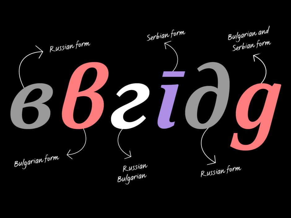
Cyrillic script variations and the importance of localisation
Krista Radoeva Knowledge share
The Cyrillic script is used by more than 250 million people across over 50 languages including Bulgarian, Macedonian, Russian, Serbian and Ukranian. It was originally developed in Bulgaria during the IXth century but spread to become the basis of many others, each with a different set of characters and different local preferences.
In terms of type design, Cyrillic typefaces have traditionally been made according to Russian standards, and this has now become the default. But not all Cyrillic languages use exactly the same characters as Russia. The character set can vary between around 70 characters for Basic Cyrillic, up to more than 200 for Extended Cyrillic, depending on whether you wish to cover just Russian, or the complete set of contemporary and historical Cyrillic languages.
Localised forms aren’t offered with every Pro font and are an underused feature for those that do. Besides the character count, there are also differences in the way some letters look. Countries with different history and development of writing and printing, have also developed different forms of the same alphabet. For example, in Bulgaria mass printing arrived much later than in Russia, so the shapes of the Bulgarian Cyrillic are more influenced by handwriting and calligraphy.
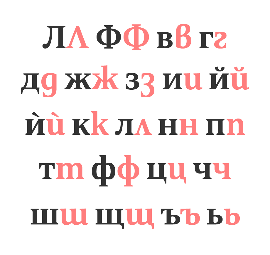
An example of the differences between Russian forms (in grey) and Bulgarian forms (in pink) in FS Sally® Pro (a Roman serif typeface):
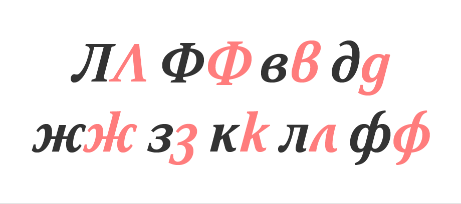
Italic follows the same principle as the Roman, but the differences are usually less, as both Russian and Bulgarian forms follow more cursive, calligraphic shapes:
These countries feel very strongly about preserving their national identity and individuality through their writing system and as a result there is an increasing interest in localised shapes for various languages and scripts. Type design no longer faces the technical limitations of the past. Fonts can accommodate not only larger character sets, but also localised forms via OpenType features. Local alternatives are particularly important for Bulgarian and Serbian Cyrillic, where the differences from the standard Russian set are quite distinct.
Cyrillic is not a static and fixed form, it is still developing. There are no strict rules about the design of Bulgarian Cyrillic (just like in Latin, where there isn’t only one shape for the letter ‘g’). It depends on the style of the typeface and on the preference of the designer. There are a few main characteristics:
Capitals
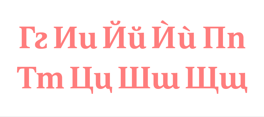
Most Russian Cyrillic forms share the same construction in uppercase and lowercase, while Bulgarian lowercase forms follow handwritten and calligraphic shapes, making a distinction from the capitals (the images below show Russian uppercase and lowercase examples in grey and the Bulgarian equivalent in pink):
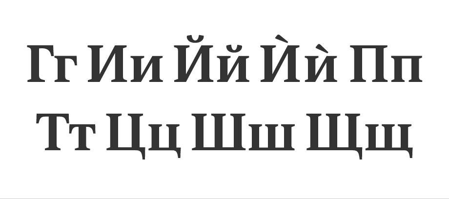
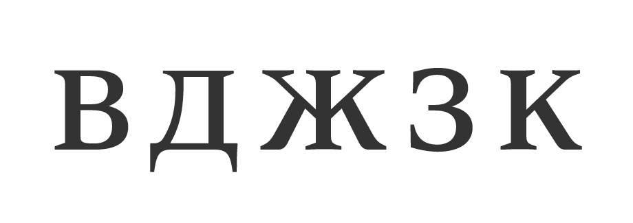
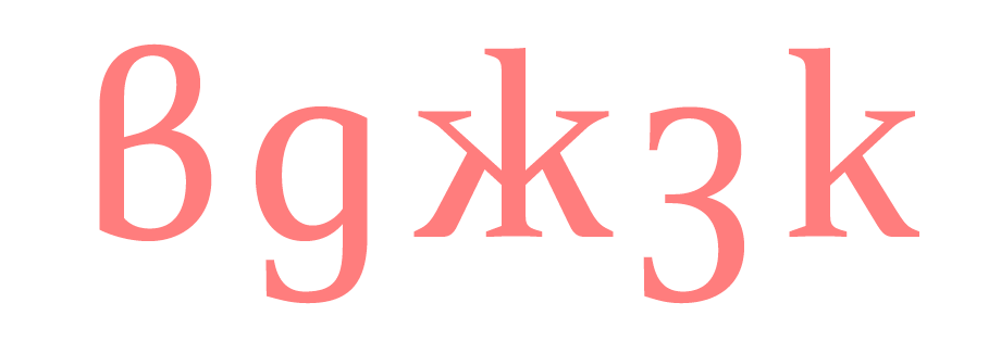
Most Russian lowercase characters don’t have ascenders or descenders and to an unfamiliar eye can look a lot like small caps. There are a lot more extenders in the Bulgarian Cyrillic forms, making it easier to compare them to Latin lowercase:
Serifs
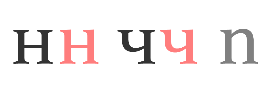
Bulgarian Cyrillic (in pink) favours one-sided serifs, similar to the top left serif of a Latin lowercase ‘n’:
Important differences between certain letterforms
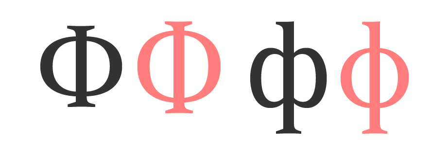
These three characters are often misunderstood by designers. The difference between Russian and Bulgarian is subtle but significant and it is usually a good idea to use Latin ‘b’ as a reference and keep the same logic in all 3 letters.
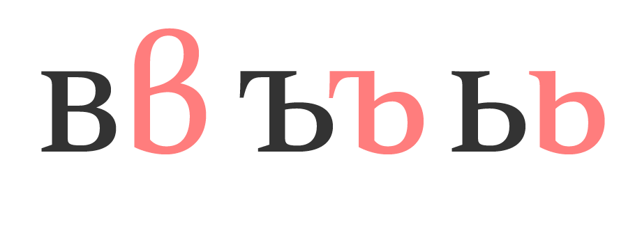
The characters below have a very specific Russian shape (in grey) and share the same construction in both uppercase and lowercase. In Bulgarian Cyrillic (pink), the uppercase letters could have either the square or triangular style, and the lowercase ones have a completely different shape:
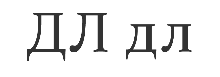
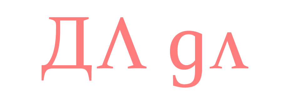
The character below looks similar but in uppercase the Russian form is smaller and more compact than the Bulgarian form. In lowercase, the Russian shape is usually made from 2 parts, while the preferred Bulgarian design is a continuous round shape:
Serbian Cyrillic
When it comes to Serbian, there is currently even less support than Bulgarian. Even if the typeface has the characters included, the Serbian language is not supported by the popular Adobe design applications, making it impossible to access the localised features.
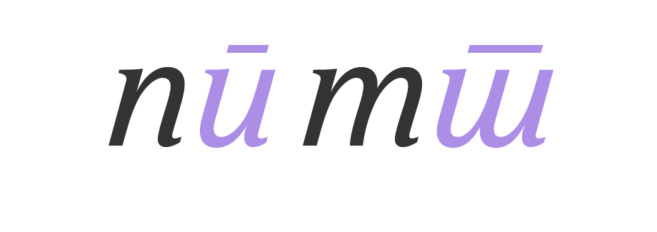
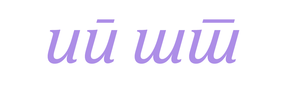
Serbian Cyrillic only requires one localised form in the Roman, but more alternatives for Italic (Serbian in lilac compared with Russian in grey):
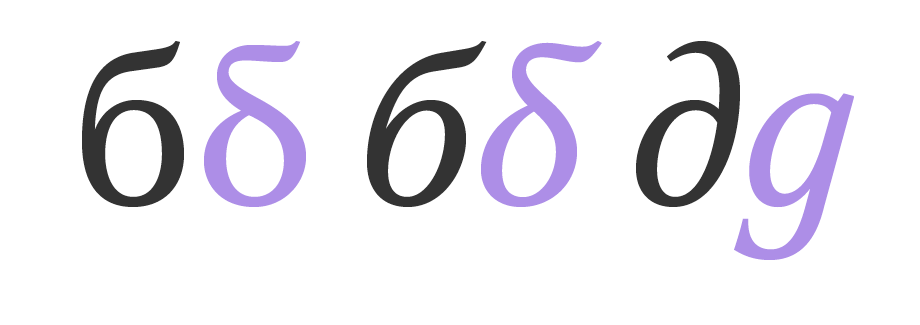
Some Serbian Italic forms derive from handwriting, rather than formal calligraphy, so they differ from both Russian and Bulgarian. The horizontal lines above the letters aren’t diacritics. They are used in handwriting to differentiate between very similarly constructed characters:
How to access Cyrillic localisation in Pro fonts
The Bulgarian and Serbian forms can be accessed via OpenType features. FS Sally Pro supports Bulgarian and Serbian Cyrillic forms via a locl feature, and also different Serbian forms as a Stylistic Set. Whenever the application allows, specify the language of the text you’re setting to automatically turn on the localised forms. Have a look at the Stylistic Alternates or the Stylistic Sets available. OpenType support varies across different applications. It is the responsibility of the typeface designer to incorporate these shapes in their fonts, and up to the designer to use them properly. Their support ensures better communication for the users and readers of those languages.