FF Meta Font Field Guide

Best Practices
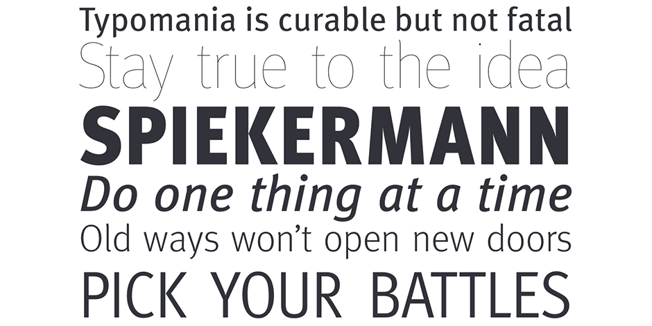
The Meta design is somewhat condensed (saving space) and benefits from stroke weights and character spacing that withstand poor printing and modest resolution digital imaging. Additionally, individual characters were designed to be highly legible.

Family
The FF Meta family has eight weights of normal and six condensed widths, each with a companion italic design. FF Meta is also part of a super family, containing FF Meta Serif and several other variations for headline and office use.
Font Facts
- Meta has been called “the Helvetica of the 1990s.”
- The PT55 typeface was intended for use on the early Apple Macintosh computer.
- Bundespost decided not to implement the PT55 typeface for fear it would “cause unrest.”
Roots
In the early 1980s, Deutsche Post (German Post Office) contracted Sedley Place Design and Erik Spiekermann to redesign its brand. As part of the project, Spiekermann proposed a new typeface based on an earlier design of his called PT55. Deutsche Post, however, was not positive toward the proposal.
When it became clear that German Post Office would not use the design, Spiekermann continued work on the typeface and eventually published it as FF Meta, in 1991, under his newly formed publishing label FontFont.

Legibility
FF Meta’s relatively open apertures promote legibility and help to differentiate one letterform from another.
How To Spot FF Meta

Alternate Choices
Perfect Pairing
More Font Field Guides

Serifa® Font Field Guide
The Serifa family is a slab serif design that benefits from a humanistic design foundation. Learn more

News Gothic Font Field Guide
Somewhat condensed and slightly angular, Bitstream News Gothic is an efficient user of space and holds up well on screen. Learn more


