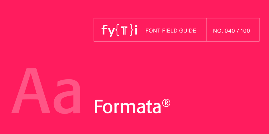
Formata® Font Field Guide

FOUNDRY: Berthold
DESIGNER: Bernd Möllenstädt
CLASSIFICATION: Humanistic Sans
Best Practices
The breadth of the Formata family makes it an excellent choice for a wide range of applications, from blocks of textual content to billboard size display headlines. Its subtle characteristics are not readily apparent in small sizes but add a distinctive mien as point size is increased.

Family
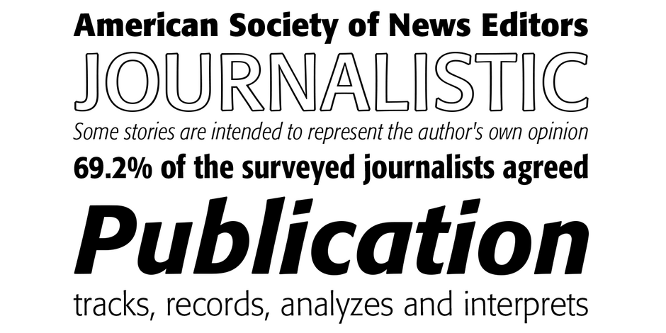
The Formata family has 26 styles: four weights of regular designs, four weights of Condensed designs and four weights of Extra Condensed designs – all with complementary italics – plus two outline designs.
Font Facts
- Formata, was released in 1984. The family was extended with Condensed styles in 1988 and Extra Condensed styles in 2007.
- Bernd Möllenstädt, Formata’s designer, was head of the type design department at Berthold.
Roots
Formata’s roots are in calligraphic letterforms. Its subtle curves and flowing shapes blend traditional calligraphic undertones with a modern ethic. The result is a design that bridges the gap between formality and approachability.

Legibility
Formata’s calligraphic roots and full-bodied lowercase create a natural horizontal flow to words and blocks of copy. This, combined with its two-story lowercase a and g, open apertures, and generous counters promote legibility in hardcopy and on screen.
How to spot Formata

Alternate Choices
Perfect Pairing
More Font Field Guides

Although the lighter weights can be used for short blocks of textual content, captions and subheads, Archer is primarily a display typeface. It’s bold weights bring a commanding, but friendly, vibe to headlines and other large-size copy

This is not a “crystal goblet” kind of design. Knockout is at its best in large sizes. Use it for headlines, branding, and packaging.


