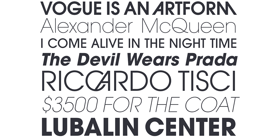
ITC Avant Garde Gothic® Font Field Guide

Best Practices
Originally, there were two ITC Avant Garde Gothic designs: one for setting headlines and one for text copy. The difference between the two were subtle, but the text design was specifically drawn to be used at small sizes. Current digital fonts of the ITC Avant Garde Gothic typeface are based on the display design and are best used above 14-point.

FAMILY
Five weights with corresponding oblique designs and four condensed faces.
Font Facts
- The ITC Avant Garde Gothic typeface started life in the late 1960s as the logo for the short-lived and often controversial magazine, Avant Garde. All requests to make the logo into a typeface family were declined until ITC was formed in 1970.
- The Roman designs were drawn by Herb Lubalin and Tom Carnase in 1970, condensed were made by Ed Benguiat in 1974 and the obliques were created by André Gürtler, Christian Mengelt and Eric Gschwind in 1977.
Roots
The ITC Avant Garde Gothic design was one of the first typeface families released by ITC. The basis for the typeface was created in the late 1960s for a new magazine conceived by the forward-thinking publisher Ralph Ginzburg. The publication was fittingly called Avant Garde. Herb Lubalin created the logo for the magazine and Tom Carnase drew the alphabet based on Lubalin’s sketches.
ITC Avant Garde Gothic Pro fonts include all the characters in the original release plus a suite of additional cap and lowercase alternates, new ligatures, and a collection of biform characters (lowercase letters with cap proportions). The first display designs contained a suite of thirty-three alternate characters and logotypes; ITC Avant Garde Gothic Pro fonts more than double this number.

Legibility
The single-storied lowercase a, diminutive loop of the f and short descender of the ‘g’ detract from legibility in text sizes.
How To Spot ITC Avant Garde Gothic

Alternate Choices
Perfect Pairing
Download a pdf version of the ITC Avant Garde Gothic® Font Field Guide and view the ITC Avant Garde Gothic®.
More Font Field Guides

ITC Legacy® Sans Font Field Guide
An excellent design for both hardcopy and interactive applications. The standard weights are full-bodied, while the condensed designs provide economy of space with little loss of legibility. Learn more

ITC Goudy Sans® Font Field Guide
While typefaces with strong personalities have limitations, few applications are outside the range of ITC Goudy Sans. Learn more


