Syntax® Next Font Field Guide

Foundry: Linotype Designers: Hans Meier Classification: Humanist Sans
Best Practices
Syntax is distinctive from geometric and grotesque sans serif typeface, making it a good alternative choice. Open line spacing and narrow columns are the best environments for reading ease.

Family
Six weights ranging from light to black, each with a harmonizing italic design. The Syntax Next suite of designs is part a larger super family that includes the Syntax Lapidar, Syntax Letter and Syntax Serif designs.
Font Facts
- In the original design, Roman characters have a subtle slant to the right.
- Meier first drew the Syntax letter shapes with a broad brush, then refined these with pencil renderings
Roots
Hans Eduard Meier drew the first pencil sketches for what was to become the Syntax family in the mid 1950s, but it was not until 1969 that is was released as foundry type. The last metal typeface produced by Stempel AG, it was available in just two weights of roman and a single italic design. When the design was made into digital fonts in the late 1980s, additional roman weights were added. Meier completely reworked Syntax in 2000, enlarging the family – and optimized the suite of faces for digital imaging. The new design was renamed ‘Syntax Next.’

Legibility
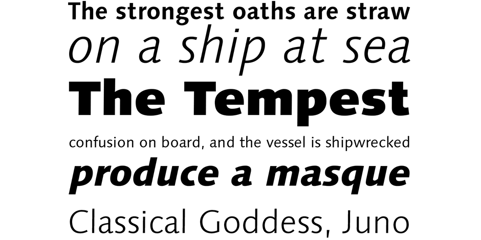
Because it is based on old style letter shapes, has wide capitals and a large x-height, Syntax Next is quite legible, even in small sizes, in print and on screen. Some of the design’s subtleties, however, are lost in small sizes and at modest resolution.
How to spot Syntax® Next
- Wide capitals
- Terminals sheared at 90º to stroke
- Italic markedly narrower than roman
- Bowl & loop g, and ear points to right
- Splayed M
- Bowl of R does not reach stem
Alternate Choices
Perfect Pairing
Download a pdf version of the Syntax® Next font field guide and view the Syntax® Next font family.
More Font Field Guides

Somewhat condensed and slightly angular, Bitstream News Gothic is an efficient user of space and holds up well on screen. Learn more

The original Baskerville typeface was created for setting books, and its modern revivals are ideally suited to the setting of continuous text. Learn More


