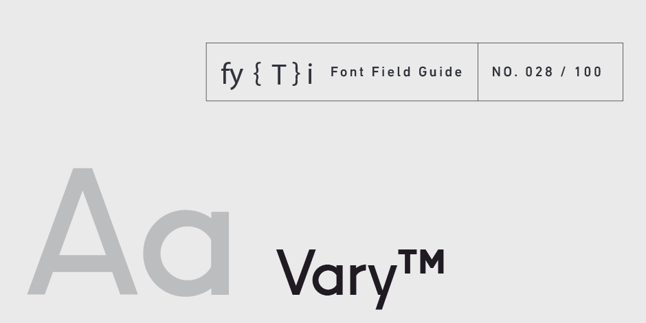
Vary™ Font Field Guide

Best Practices
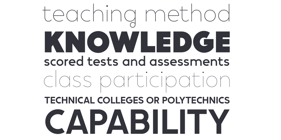
Vary is at its best in large sizes. Each variation brings its own personality to the eclectic family. Use Vary when you want to make a statement. This is not a “crystal goblet” kind of design. Use it for headlines, branding and packaging.

Family
Vary is available in 10 weights of roman, from Hairline to Extra Black. Vary Variable has 10 preset instances of the same weights.
Font Facts
- The R, in the modern stylistic set, was inspired by the handwritten Cyrillic character Я.
- The unusual g was inspired by the B in the Bulgarian hand lettering that gave Meier his inspiration.
Roots
Vary’s inspiration was Bulgarian hand lettering, seen by Meier in a shop window in Sofia, Bulgaria. Meier began designing Vary, in 2016, when he was an intern at Monotype. The family was introduced by MyFonts in 2021.

Legibility
This is a display design. While it does not rank high on the legibility scale, its distinctive letter forms are eye-catching and make a powerful statement.
How to spot Vary

Alternate Choices
Perfect Pairing
Download a pdf version of the Vary Font Field Guide and view the Vary font family.
More Font Field Guides

Aglet Sans Font Field Guide
Aglet Sans is intended for text to display sizes, both in print and on screen. It is spaced more towards display use, so very small point sizes will need a touch of tracking to read best. Learn more

Artifex Hand CF Font Field Guide
Artifex Hand CF is built for use at small to medium sizes, in print and digital environments. Its Book weight is designed for use in longform text, articles, books, footnotes, and documents, while the thicker weights can double as headlines, subheadlines, and captions. Learn more


