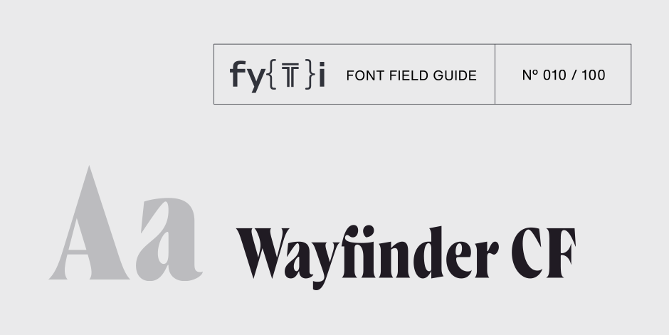
Wayfinder CF Font Field Guide

Best Practices
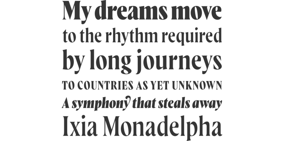
As a display typeface with fine details, Wayfinder CF is best used at large sizes in print, digital, and film. Ideal use cases include short texts headlines and posters — Wayfinder is especially stunning in print – titles, logos, album artwork, signage, fine art, and more. At home in both traditional and avant-garde design, Wayfinder can hold its own in any setting. A set of alternate glyphs and optional swashes add versatility and flair.

Family
Seven weights of roman designs, each with a complementary italic, for a total of 14 styles.
Font Facts
- Wayfinder went through a large number of names during the design process, many inspired by nature and myth; Halcyon, Swift, and Coronet were among the contenders.
- Though italics are used less in display type than in body copy, a full set was designed for Wayfinder to offer more versatility and expression.
Roots
Wayfinder CF is an original design by Connary Fagen, designed in 2019 with an eye towards incorporating a great deal of emotion and verve into a typeface. After creating several typefaces for high legibility, neutrality and versatility – Articulat CF and Artifex CF, for example – Wayfinder was made to highlight and accompany feelings of adventure, romance, and play.

Legibility
Wayfinder CF is a high-contrast display typeface and is most legible in short texts at high point sizes. Though readable at any size, its fine details excel when set large.
How to spot Wayfinder CF


