Optical illusions and eye trickery in geometric font design
Optical Illusions and eye trickery in geometric font design
Stuart de Rozario Fonts for accessibility
Designers are often troubled by optical illusions and aesthetics. An internal struggle takes place because trying to make something visually harmonious, optically aesthetic and functional is a difficult challenge. What the eye physically sees and what our mind perceives to see are two totally different things. Deciding on whether a node goes here or there has a direct impact to the final outcome of typeface design – regardless of style.
At an early stage in life we discover the basic elementary shapes – squares, circles and triangles. We look at these forms side by side to get a familiar understanding of how they work together. Assessing the flats, rounds, angles, points, size, colour and weight instinctively and as we progress through life we are still assessing these forms when reading. As the saying goes – ‘Typography is the building blocks of design’, and these simple shapes are the basis of typography.
When I first started out in type design I often found myself questioning how letterforms work and what makes the shapes function to allow us to read and decipher text. There are many subtle optical illusions in lettering and designing geometric typeface FS Lucas®, I had many tricky optical challenges to overcome.
One of the key aspects was to make the letterforms appear geometric without confining the design to a strict grid system that many other geometric fonts adhere to. Typefaces with perfect circles, squares and triangles don’t necessarily make for easy reading and aren’t very functional.
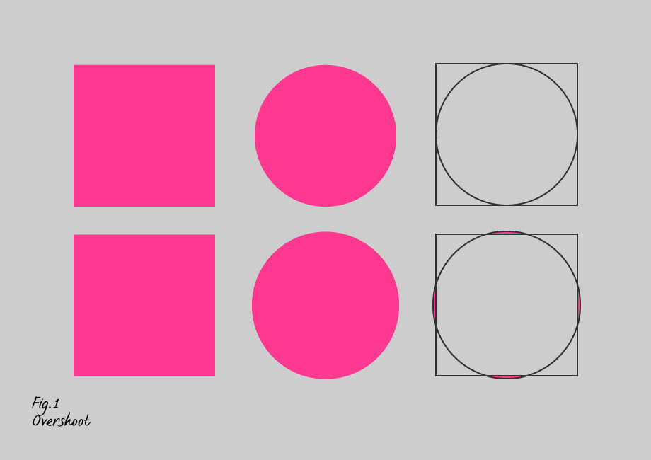
In the illustration above (fig.1), the top line shows that if we set out a perfect square followed by a circle of the same size, the circle appears smaller, so to create the correct visual balance between the two elements we need to make the circle larger by a small amount – allowing us to overcome this optical anomaly, as shown on the lower line. The small extra amount extending past the flat square is called an ‘overshoot’, this is a fundamental design adjustment and a key aspect in optical correction which is crucial to type design.
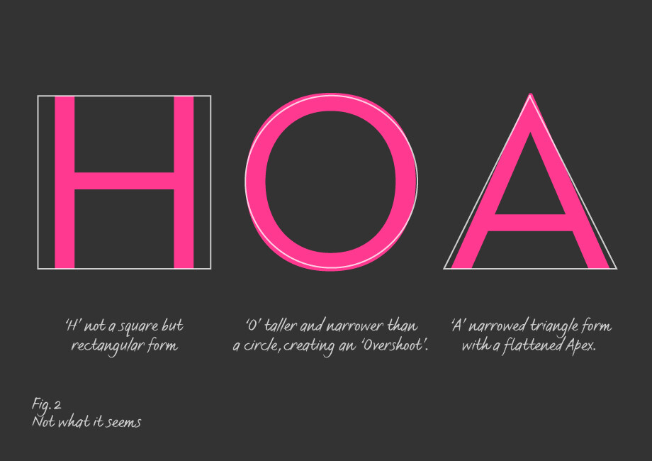
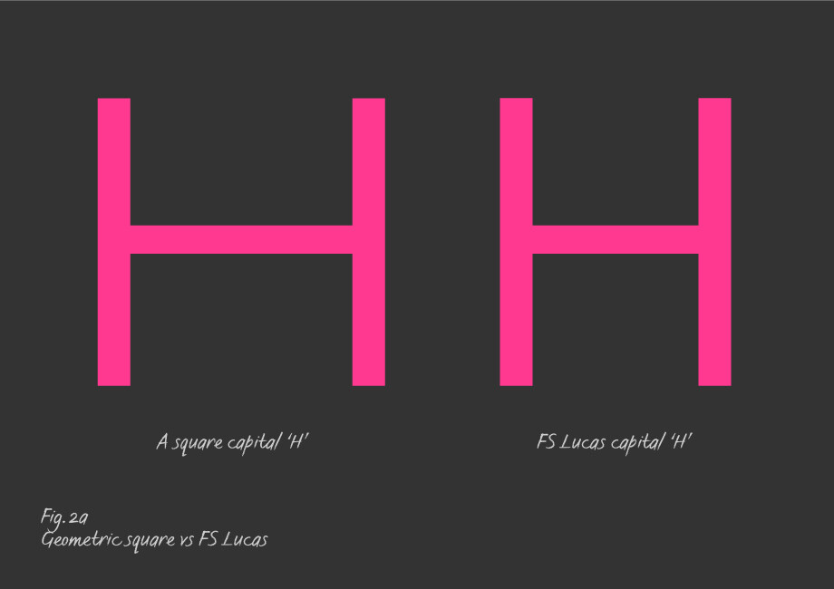
There is a misconception that the capital H is square, but in the image above it’s clear that it is a rectangle – an ‘H’ as a perfect square would look far too squat and wide (Fig. 2a).
Is the capital ‘O’ a perfect circle? Here we have an illustration of a perfect circle side by side with the FS Lucas capital ‘O’ (Fig. 2b).
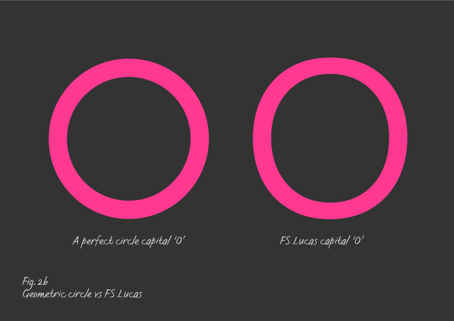
To achieve the functionality and geometric visual appearance I designed the ‘O’ by making the circular counter fractionally narrower and taller (creating an ‘overshoot’). The perfect circle then becomes more oval and allows the ‘O’ to be more legible and less mechanical looking. Perfect circles do not make very nice looking ‘O’s’ as you can see from the image. The horizontal weights are the same width but look heavier than the vertical strokes. The adjusted horizontals on a cap ‘O’ are lighter in thickness than the verticals by a few units.
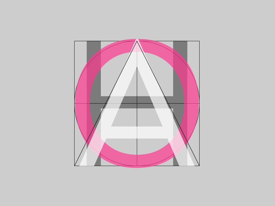
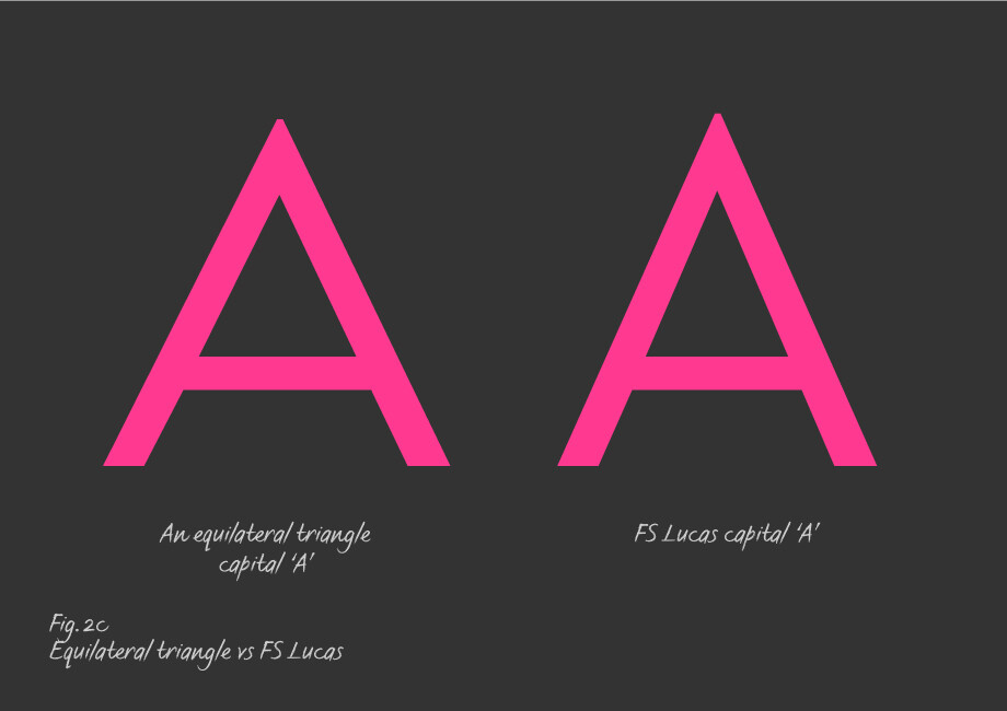
At first glance the ‘A’ seems to be an equilateral triangle (all sides equal) but that would appear too wide in comparison to the rectangular ‘H’ and oval ‘O’. By adjusting the ‘A’ narrower so that it looks in proportion aesthetically and appears equilateral it is consistent to the tone of voice of the typeface.
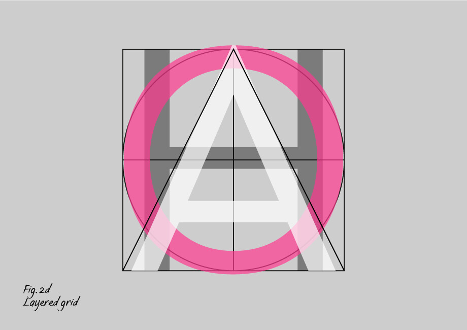
And here are the 3 shapes layered on top of each other:
The same rule applies as the horizontal strokes of the ‘O’ when designing bars and dashes. If we take the vertical stem of a cap ‘I’ and rotate it horizontally 90°, the horizontal clearly looks heavier than the verticals:
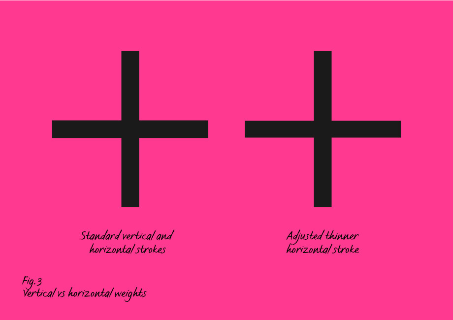
Even though it measures as the same thickness. For this reason we needed to make a fractional adjustment so that the horizontal visually balances to the vertical.
Fig 4 below shows that if you lay out the three geometric shapes in equal measure in a line the square and circle look closer together and the triangle is further to the right – so the spacing looks uneven.
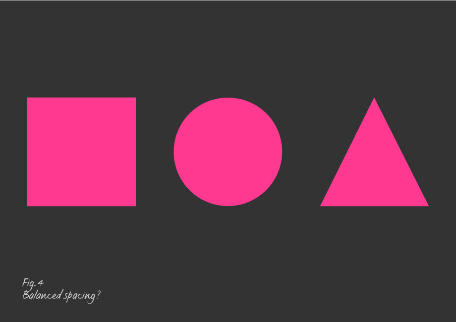
Rhythm plays a crucial part in type design, the careful balance between positive and negative shapes that create word patterns influence readability and the functionality of type. These and many other optical adjustments are the underpinning principles when designing a functioning typeface – small but important considerations and subtle tricks to make the eye see what it needs to.