Numbers Guidelines Manual
Letters are the easy part. We were taught what they are, and how to use them, in our earliest experiences with learning. Even before we started school most of us had alphabet books, wooden blocks with letters on them, or magnetized letters that stuck to the refrigerator. Numerals, however, can be trickier – and a little more difficult to master.
Setting Numerals
It’s important to pay attention to the setting of numerals. Studies show that readers tend to distinguish numerals one at a time, whereas they can perceive several letters at once grasping even groups of words. Ambiguities among letterforms are also somewhat less critical because context often suggest to the reader the identity of similar letters. Not so with numerals.
At first glance, ranging numerals may appear to be more legible than their more senior brethren, but a variety of legibility studies have proven that this is not the case: lowercase, or old style, numerals are moderately more legible than ranging numerals when isolated, and considerably more legible when set in groups. In addition to being more legible, many designers and typographers also believe that lowercase numerals are more attractive than the ranging variety
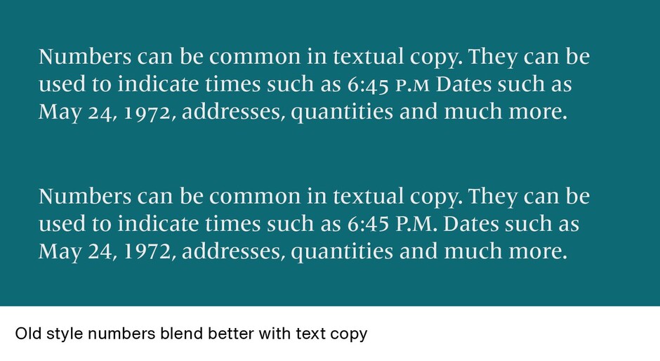
Ranging numerals are great for situations where you want figures to stand out, or when you are setting all-cap copy. When these numbers are used in text composition, however, they are often too conspicuous. The result is that the reader’s eye tends to fixate on the numerals, rather than read the text. Old style numerals, which are specifically designed to blend with textual content, provide information without calling special attention to themselves. They are also ideal for page folios, dates, in conjunction with small caps, and in other places where you want the numerals to be discreet.
Sometimes uppercase and lowercase numerals can be combined in the same piece. Parts lists and catalogs are a good example: Ranging figures can be used for item numerals, and the less obtrusive lowercase for dates, measurements and other data.
Some Numbers Guidelines
- Numerals are always spelled out when they begin a sentence. In text copy, descriptive numerals of ten and under should be spelled out. Various editorial styles may call for the spelling of higher numerals except when they refer to specific sequences, for example, the book had eighty pages and on page 64… Specific “house styles” should always take precedence in this area.
- Use the minimum number of figures in date ranges and separate them with an en dash, as in 1950–55.
- Small caps should be used in 55BC (or BCE) and AD 114. It is acceptable to use them with or without periods. [Note: Set in small caps.]
- Percent should be spelled out where it occurs singly in text matter and when used in conjunction with a written number, as in four percent. The % symbol should be used with figures, 100% of the time.
- When figures are preceded by the dollar sign and there are no cents, the decimal point and zeros may be omitted. Otherwise, there is a $5 fine.
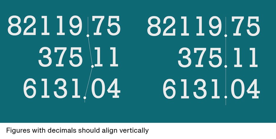
- In columns, figures with decimals align vertically on the decimal; otherwise figures should right align.
- At times adjustments need to be made when setting numerals with bullets, dashes, parentheses and brackets. These characters are designed to center-align to cap or lowercase characters. Depending upon what kind of number they are use with, they may have to be moved up or down horizontally to properly align with the numerals being used.

How About Fractions?
Numerals are not limited to the single figures zero though nine. There are also fractions to content with. Graphic designers are generally confronted with three kinds of fractions: em fractions, en (or “nut”) fractions and solidus (slash) fractions.
Em Fractions
Em fractions are the most common. They are built from superior and inferior numerals separated by a fraction bar. If they are designed to be tabular, em fractions fit on the em space. Three em fractions, ¼ ½ ¾ can be found in most fonts. Some also offer 1/8 1/3 3/8 5/8 2/3 7/8 fractions. [Note: Set the fractions in Helvetica Now, which should have them as single characters.]
En Fractions
En fractions are built are built from superior and inferior numerals separated by an en dash. These are usually pretty difficult to construct and require a lot of kerning and space adjustment to get the numerators and denominators into position.
Solidus Fractions
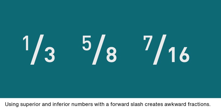
These are built by setting superior and inferior numerals separated by a forward slash – also called a virgule, slant or whack. (Bet you didn’t know that last one.) The problem with this type of fraction is that the slash is almost always too heavy and makes the fractions look awkward.
If you use fractions often, most design software provides simple automated functions to create just about any kind of fraction – if the font contains the necessary glyphs. They are much easier to use than trying to build fractions, yourself. A quick Google® search will net you quick and easy steps for creating them.
Download a pdf version of the Numbers Guidelines Manual.


