Titling Fonts Manual

Historically, a “titling font” was a font of metal type designed specifically for use in large display settings. They were, most often, all-cap, single-weight designs created to complement text families. They’d differ from their text counterparts in that they were specifically designed to look best in predominantly larger sizes. Titling fonts often have a more pronounced weight contrast, tighter spacing, and more condensed proportions than their text-sized cousins.
When produced as fonts of metal type, titling capital letters took up the full point size body-height. For example, 48-point Perpetua® Titling caps were just about 48-points tall, whereas regular 48-point Perpetua was sized such that the tallest ascender and longest descender took up most of the 48-points. Not only were the characters in the titling font larger than in the regular font, the baselines of the two were not the same, so they could not be set on the same line. In the digital world, where character heights are no longer determined by the height of a metal slug of type, titling fonts are still much larger than normal capital letters – but their baseline is consistent with the regular characters.

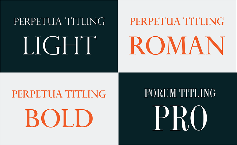
Titling fonts can also be standalone designs. Felix Titling™, Festival™, and Victoria™ Titling, for example, have no text counterparts. There are also occasional exceptions to the all-cap, single weight norm. Perpetua® Titling has three weights. While Forum Titling™, not only contains the basic cap alphabet; it also has small caps, special ligatures, and icons.


One of the most traditional titling fonts currently available to designers is Trajan™, by Carol Twombly. Based on the monumental letters of the ancient Trajan Column, this two-weight family pays homage to what many consider the quintessential Roman alphabet. Except for the expansive tail of the “Q,” this is a design that has no adornments or frills.

Titling fonts have gravitas and a sophisticated demeanor. They are elegant, refined and – at times – dramatic. While their natural environments are book titles, certificates, movie titles, periodical covers and signage, they can also be powerful communicators in headlines, subheads, and as initial letters. You may not need a lot of titling fonts, but a few will prove to be valuable typographic investments.
Download a pdf version of the Titling Fonts Manual.


