Manual: Typography for Presentation Graphics (Part One).
PowerPoint® and Keynote® presentations are often the first things that make people aware of problems, conditions, or needs. The best ways to enhance understanding, engage audiences, convey information and provide a path for creative thinking.
While producing presentation graphics is not a task to be taken lightly, a few guidelines will go a long way in helping you create a clear and powerful message:
- Choose the best fonts
- Keep things simple
- Use color to enhance the message
- Use the correct information graphics
Choose The Best Fonts
When selecting fonts for presentation graphics, sans serif designs are generally the best choice. They have proved to be the more legible than serif fonts, in slide presentations. Look to bolder weights, rather than light or thin, to enhance visibility. Font families like Helvetica® Now, and Avenir® Next are excellent choices.
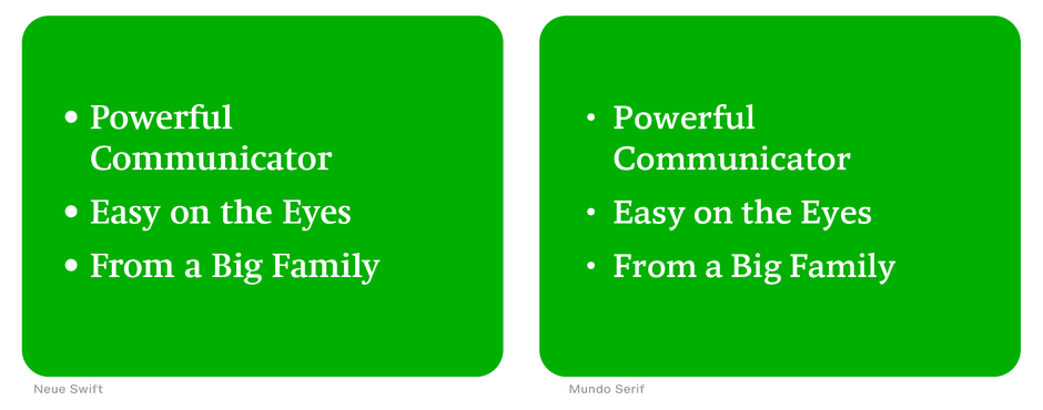
If you want to explore a broader typographic palette, consider serif fonts if they are not overly decorative, have modest contrast in stroke weight, serifs that are large – but not overpowering – and offer a large family providing versatility. Typefaces like Neue Swift®, and Mundo Serif™ are easy on the eyes and perform well in presentation graphics.
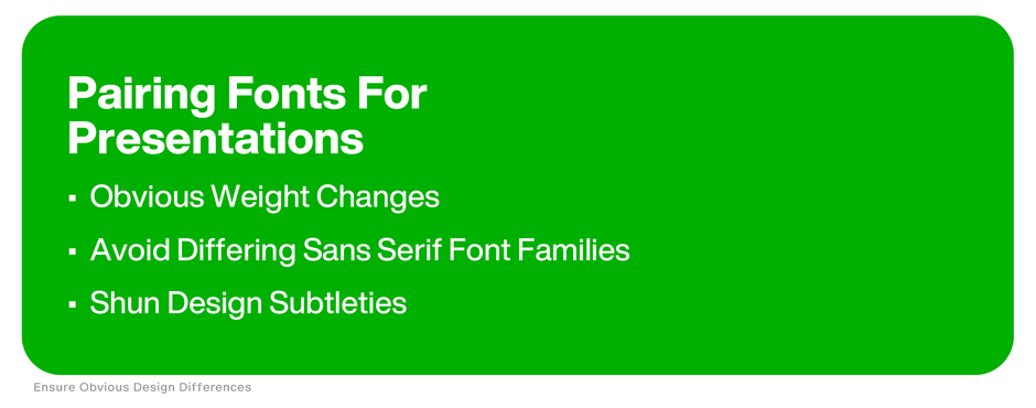
Font style changes should be obvious. The rule of not combining two different sans serif designs clearly holds true in presentation graphics. Type style and weight changes should also be obvious. Subtleties tend to get lost in presentation graphics. Many times you will have to pick font weights that are more than one level away from one another (book and bold, rather than book and medium) to achieve a strong typographic contrast.
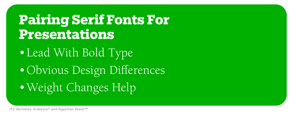
As far as serif typefaces are concerned, the subtleties of mixing old style designs with transitional are lost in presentation graphics. If you want to combine two serif styles, make them as obviously different from each other as possible (ITC Berkeley Oldstyle® with Egyptian Slate™, for example).
Keep Things Simple
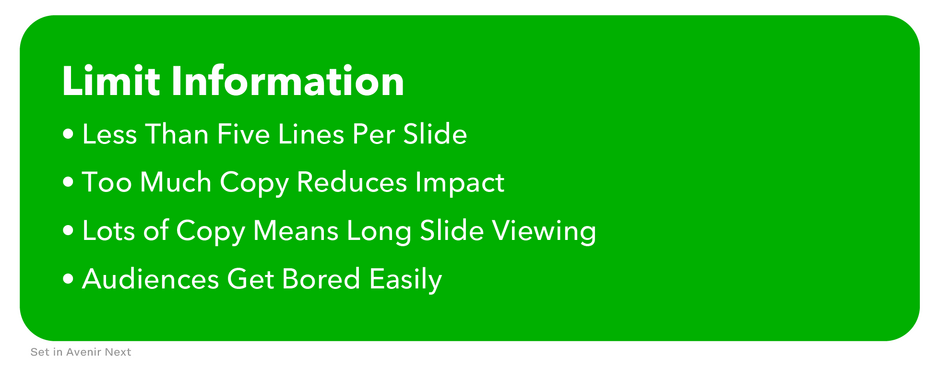
Limit the amount of information included on one slide. Confine content to four or five lines. Too much copy forces concepts to be shown at a smaller size – reducing impact. Too much information can also be confusing to the reader and mean that a slide will be shown inordinately long. (Audiences tend to get bored easily.)
Click here for more information about the best fonts for presentations.
Make sure that there are no extraneous graphic elements to get in the way of information transfer. Big color boxes with drop shadows, columns that frame copy, corner pieces, floating tiles, large multicolor triangles, bullets with color gradients, and rainbow boarders do nothing to enhance slide readability or legibility.
Use rules and bullets only when they add to the understanding. Rules can help to separate headlines from sub-points, while bullets are an aid to referencing information in series.
These are also strong graphic elements that can detract from smooth information transfer. If they begin to look too big, they probably are. Tone down bullets in size or color. Use single hairline rules instead of the bold or double variety.

Part two of Typography for Presentation Graphics will provide more guidelines on choosing fonts, the best use of color, and information graphics.


