Type Trends: 2021 Q3 Trends by Kevin Cantrell & Louis Mikolay
Louis Mikolay
Type Trends Fall 2021
Some trends like, multi-part color and psychedelic retro fonts, or men’s one-piece romper jumpsuits, have the lifespan of a fruit fly. Follow them today and you’ll be yesterday’s news before you can blink.
Other trends, however, stick around. And while they may not become tomorrow’s Helvetica or little black dress, they are worth giving a second – or third – consideration. Bespoke typefaces, evocative design and variable fonts are three such trends.
Meet Kevin and Louis
The name “Kevin Cantrell” came up, as a brand designer and lettering artist extraordinaire, in a number of interviews for previous Trends articles. So, we figured it was about time we reached out to him.
In talking with Cantrell, we also learned about the exceptional brand that Louis Mikolay, helped create for the San Francisco Symphony. We knew that this was also someone we needed to talk to.
Cantrell runs Kevin Cantrell Studio along with Erik Attkisson, who focuses on business management and brand strategy. Attkisson and Cantrell work synergistically, often building from one another’s discoveries and ideas. “I’ll come up with something that feels right, and Erik ensures that it fits perfectly in the strategic expression,” says Cantrell.
While some artists might use pen and paper, Cantrell credits advances in digital technology for progressions in his work. “Digital tools have come so far, that I essentially view my mouse and pen tool as an extension of my hand,” he says. “In fact, I can draw more accurately with these tools, than with a pencil.”
Louis Mikolay studied at Ravensbourne University, in London, prior to working in London and Berlin, piloting design and brand identity projects for a range of organizations. In 2019, he relocated to San Francisco, to join the COLLINS San Francisco team. Here, he’s directed projects for companies as diverse as Cora, Exploratorium, Facebook, Mattel, Netflix, Nike, Okta and The San Francisco Symphony.
Mikolay’s work has been recognized by international organizations including, D&AD, Type Director’s Club, The One Show, The Brand Impact Awards and the Tokyo Type Directors Club.
A Bevy Bespoke Typefaces
Both Cantrell and Mikolay are intimately familiar with bespoke typefaces. Cantrell draws them and Mikolay commissions them.
‘There’s been a proliferation of bespoke fonts created for branding. Almost all of our projects has required one,’ says Cantrell. ‘The voice of the brand plays one of the most important roles in creating a brand identity. Type has become the most common mediator of the brand’s voice.’
Typeface choice, however, goes beyond bespoke designs. Cantrell explains, ‘Most bespoke typeface families are narrow in scope. Usually, they have only one or two designs. Even relatively small scale branding implementations, require the scope of a robust typeface family.’ Cantrell advises off-the-shelf font families for ease in implementation. ‘We recommend structured designs that juxtapose with the bespoke typeface,’ says Cantrell. ‘These, drawn by professional typeface designers, provide breadth and depth of choice. Juxtaposition also creates dynamics and drama.’
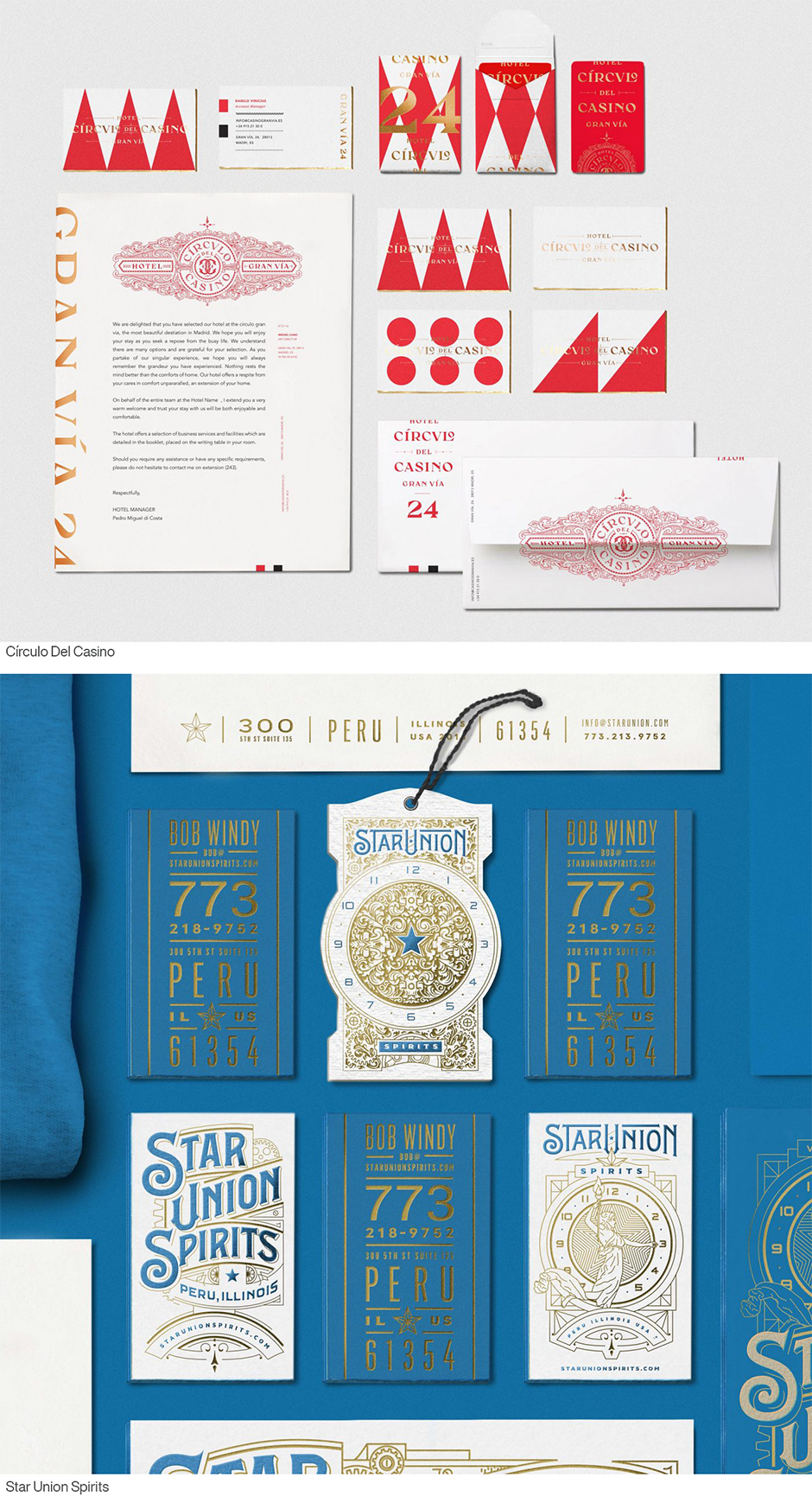
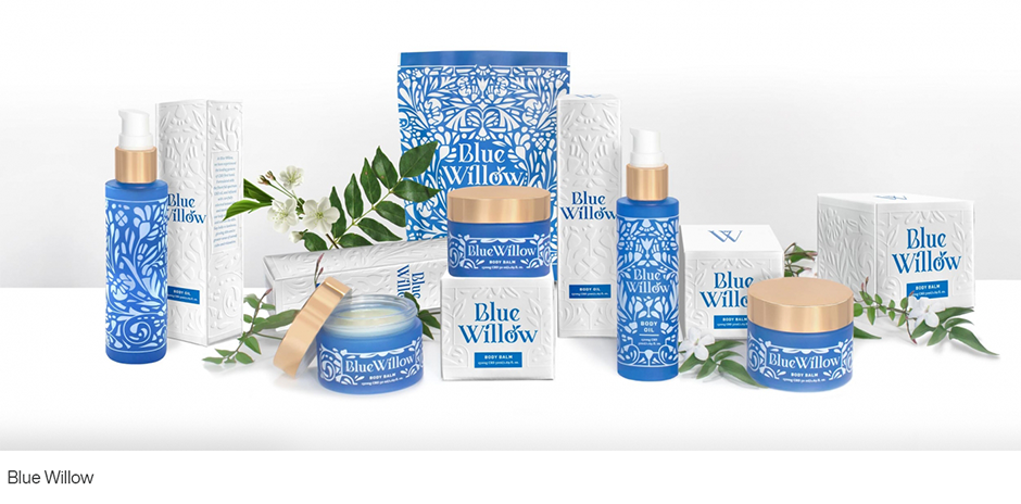
The ornate design Cantrell created for Círculo Del Casino’s brand, is paired with Avenir and Garamond. Sackers Gothic serves as a counterpoint to the ornate logo he drew for Star Union Spirits, while the Blue Willow brand takes advantage of the many weights in Freight Micro.
Evocative Designs Tell a Story
Cantrell’s design solutions tend to take on a maximalist approach. They’re opulent and ornamental, yet underpinned with an architectural structure. Some have a foundation in Art Deco design, while others are influenced by Art Nouveau or Victorian forms. These evocative designs bring depth and richness to the brand’s story.
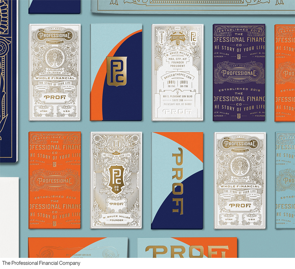
Cantrell’s solution’s for The Professional Financial Company (ProFi) is a distinct blend of engravings with overlapping wave patterns suggesting financial growth. The result is a rich brand architecture and brand identity system with myriad touchpoints from print collateral to a modular and opulence icon and seal identity system.
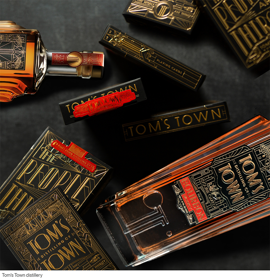
The custom glass bottle Cantrell designed for, Kansas City’s. Tom’s Town distillery reflect the company’s prohibition roots. Pulling from the art deco architecture prevalent at the time, the design evokes the grandeur and magnificence of this “Paris of Planes” and reinforces the label branding. The towering balustrades flanking the bottle echo the dramatic geometry of period Kansas City buildings, while the embossed design of Tom’s Town’s double “TT” monogram further distinguishes the brand.
Merging of Art and Technology
Both Cantrell and Mikolay see the merging of art and technology as a very important typographic trend.
“Motion and three-dimensionality are becoming a vital and dynamic part of typographic expression,” says Cantrell.
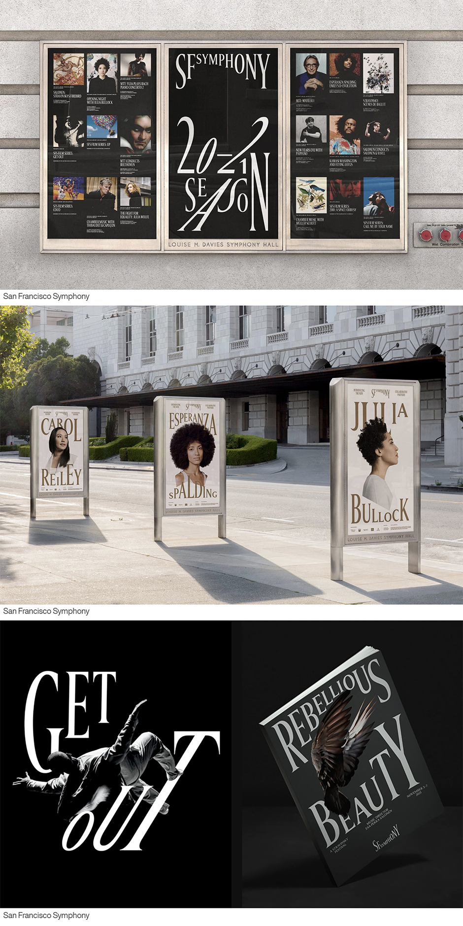
“At COLLINS we love to experiment with emerging technologies,” says Mikolay, “and in the case of the San Francisco Symphony branding project, our work’s heart lies in new digital, sonic, and typographic experimentation. We used responsive and variable font technology to add an unexpected contemporary behavior to typography – giving each character the ability to immediately change form, in reaction to sound and music.”
“We chose to create a variable font with the help of Dinamo in Switzerland,” he continues. “Because we wanted to be able to scale and skew each individual letterform with precision and total flexibility. Variable technology allowed us to define the extreme letter forms, and then move seamlessly between these extremes.”
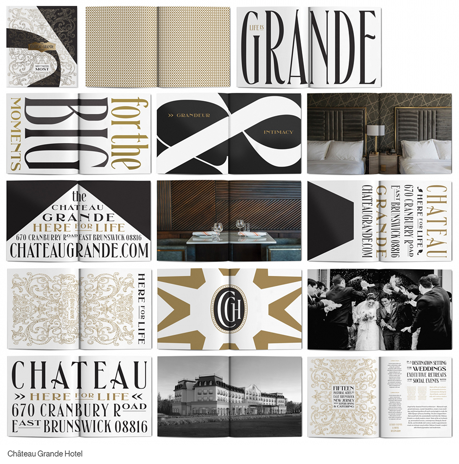
Cantrell’s branding for the Château Grande Hotel also takes advantage of variable fonts. It allows the main branding typeface to be condensed and expanded to the needs of various applications, while still maintaining the character and voice of the foundational design.
Bespoke typefaces, evocative design and variable fonts are three typographic trends worth watching and taking advantage of. You can also be sure that they’ll be around for a long time.
Links to:
Download a pdf version of the Type Trends: 2021 Q3 article and add it to your bookmarks.


