Popular LucasFonts fonts.
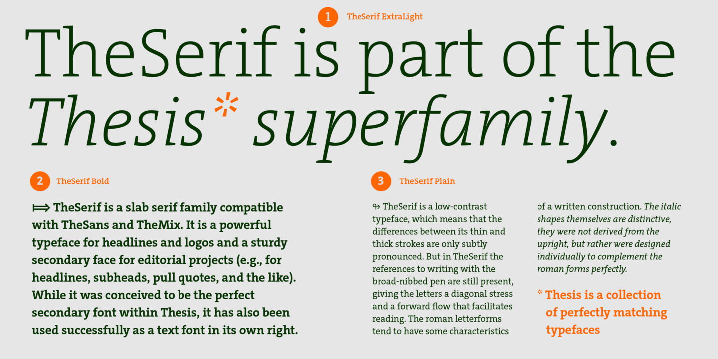
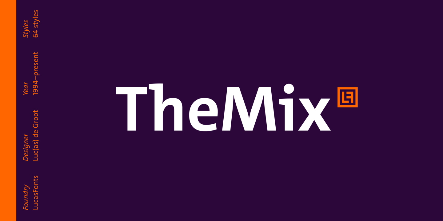
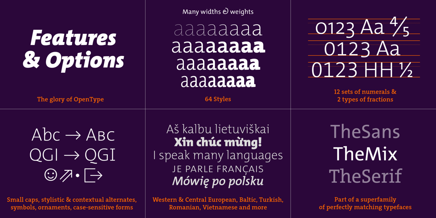
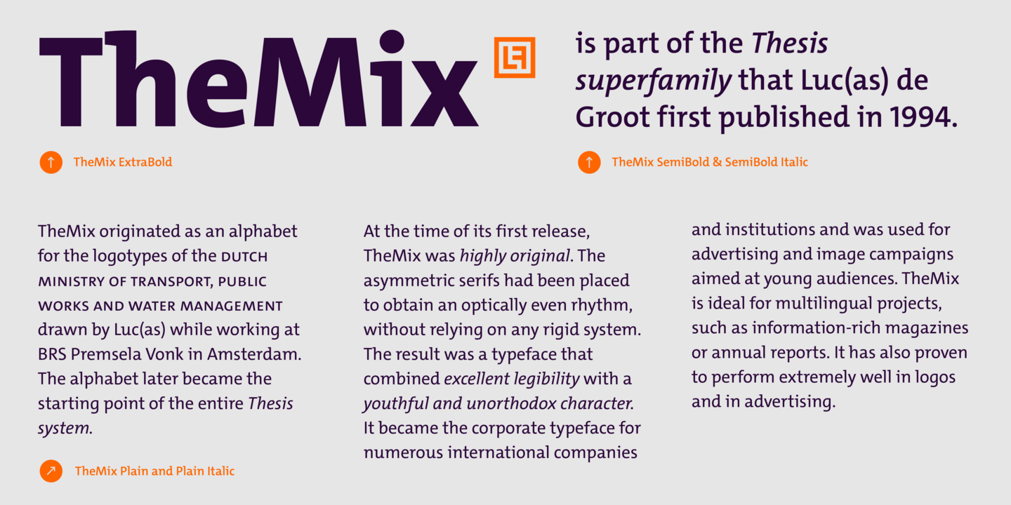
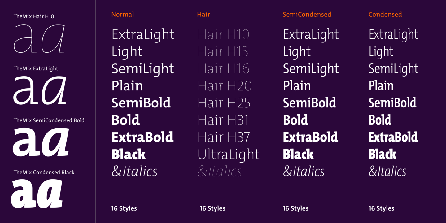
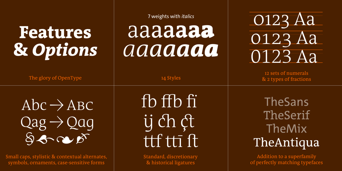
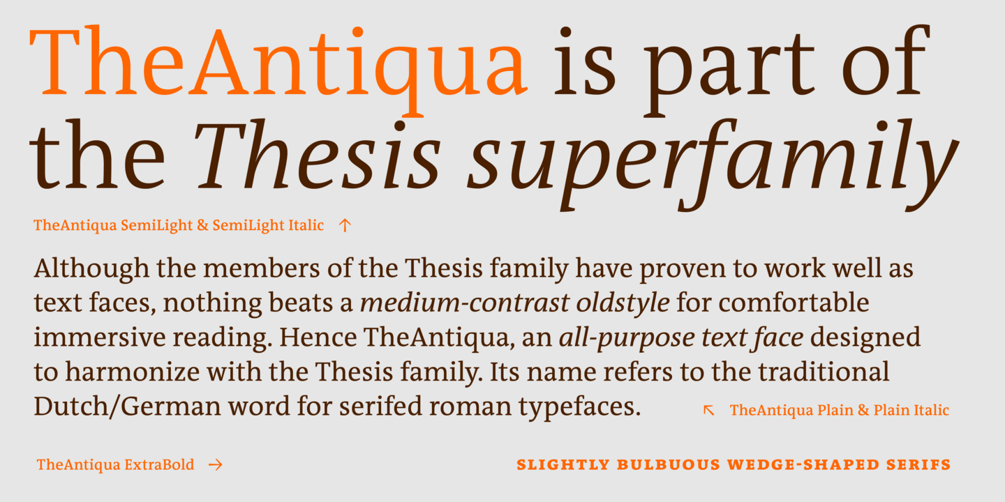
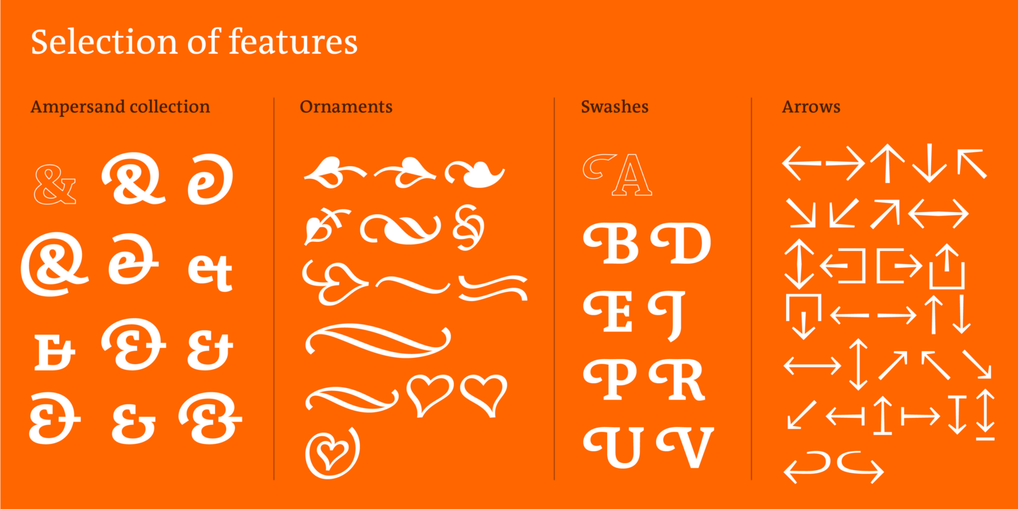
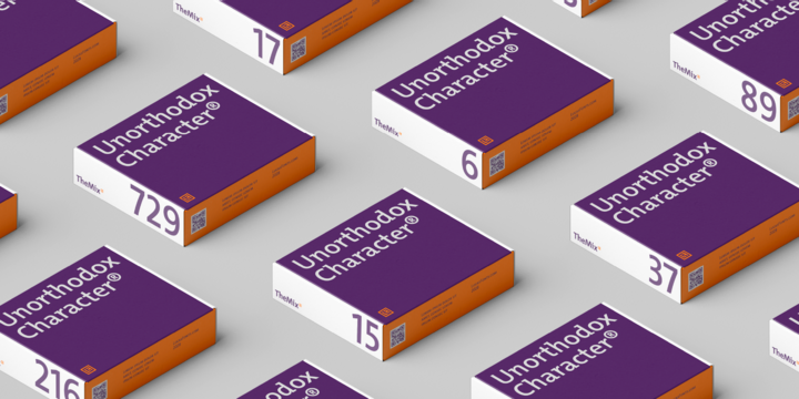
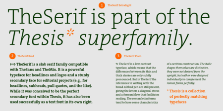
TheMix is a semi-serif typeface with low contrast – i.e., the differences between thin and thick strokes are not very pronounced. Yet the reference to writing with the broad-nibbed pen is still present, giving the letters a diagonal stress and a forward flow that facilitates reading. It is part of Luc(as) de Groot’s legendary Thesis superfamily.
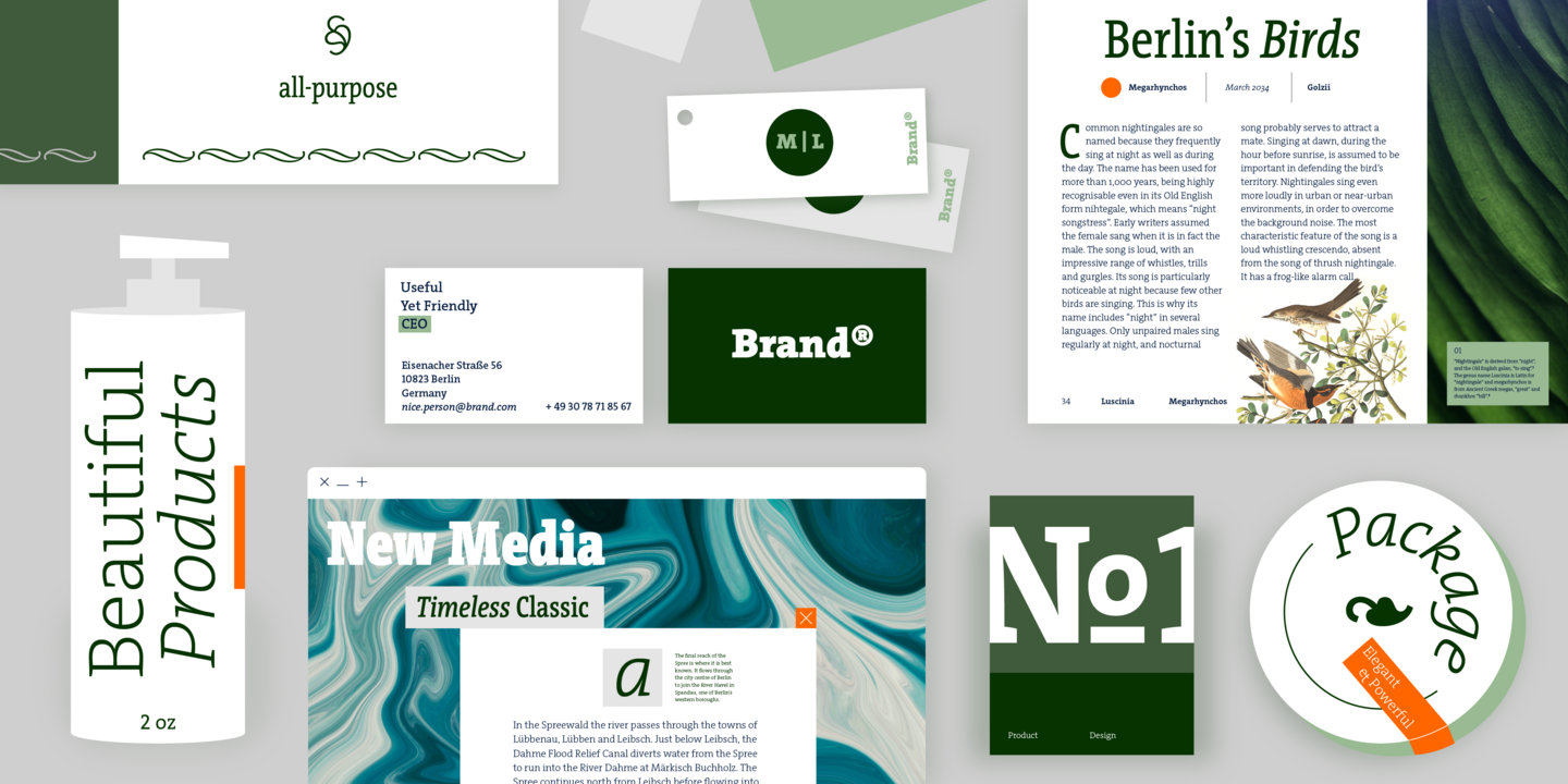
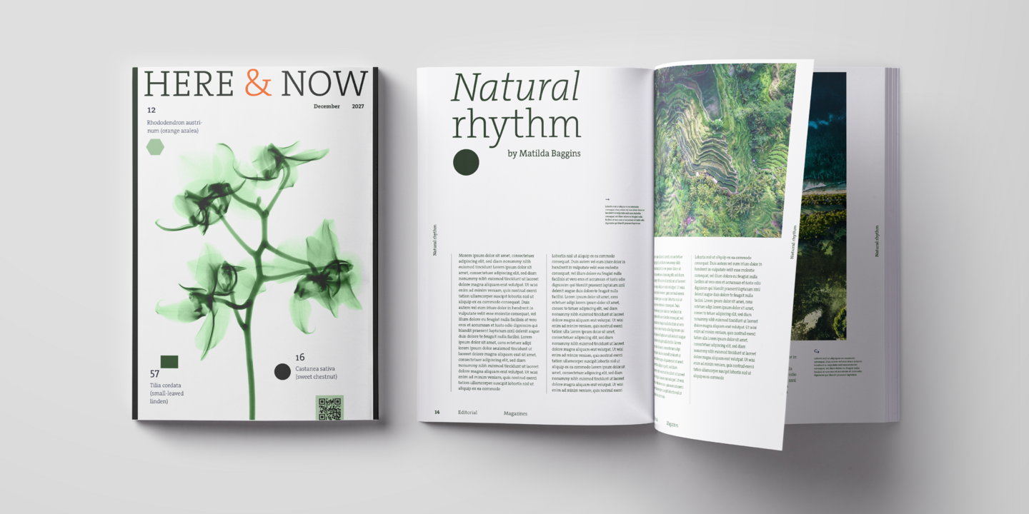
Fonts in use.



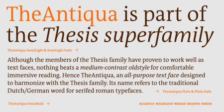
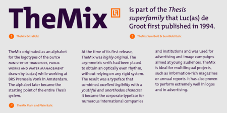

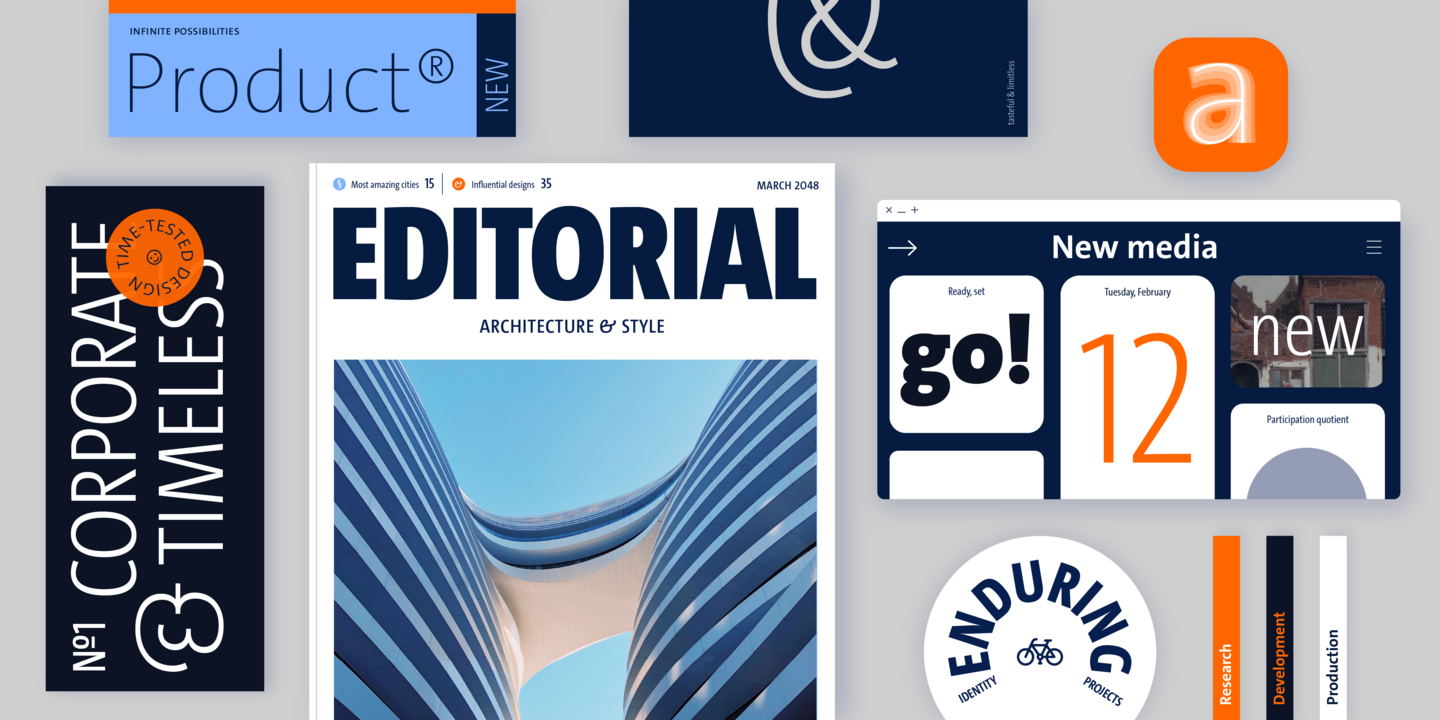
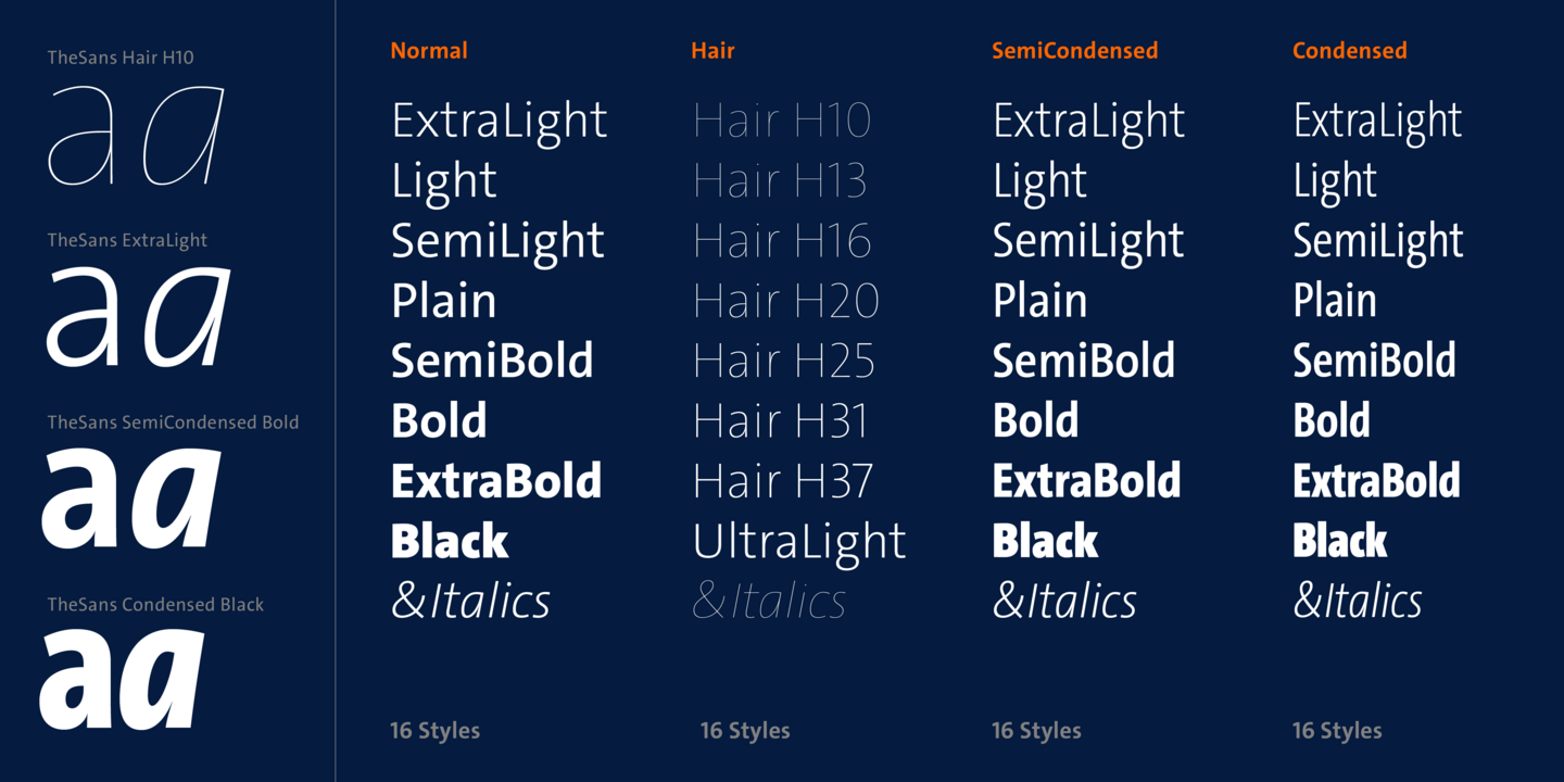
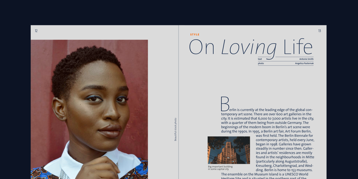
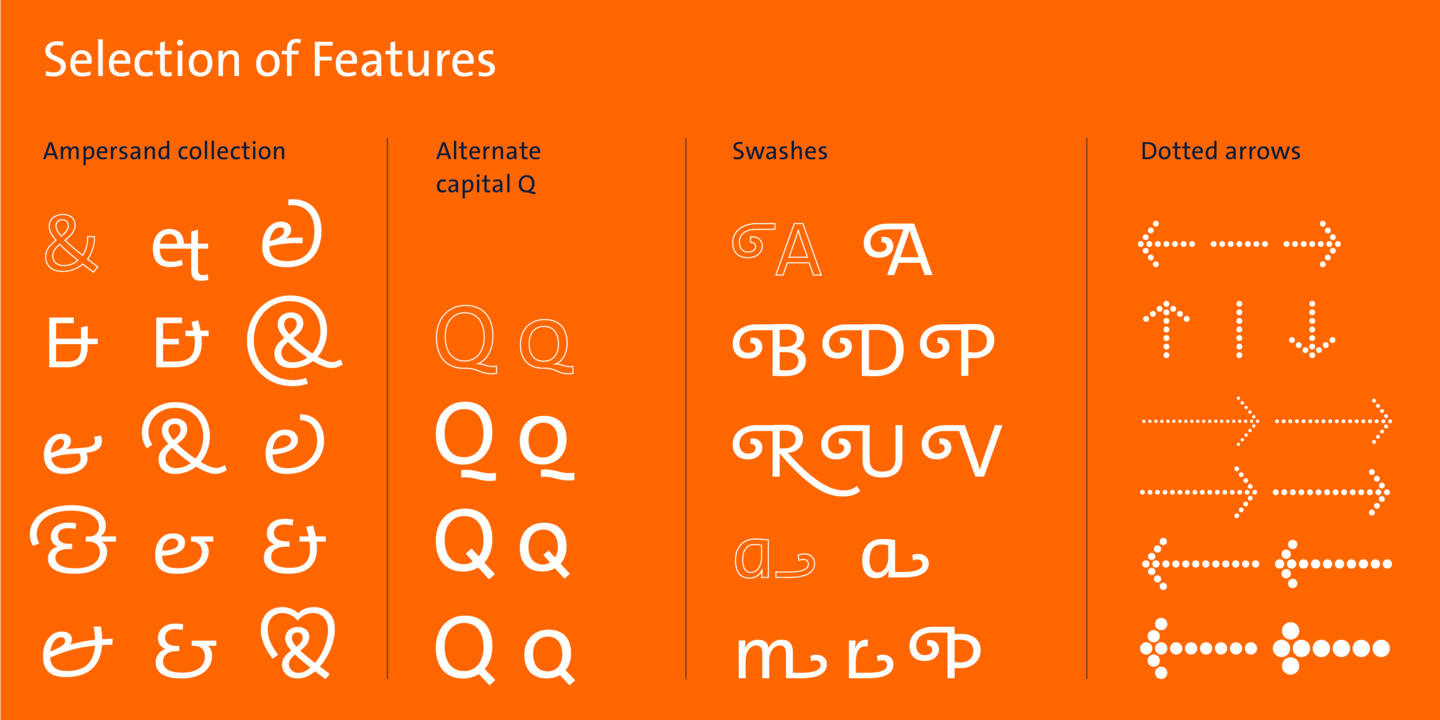
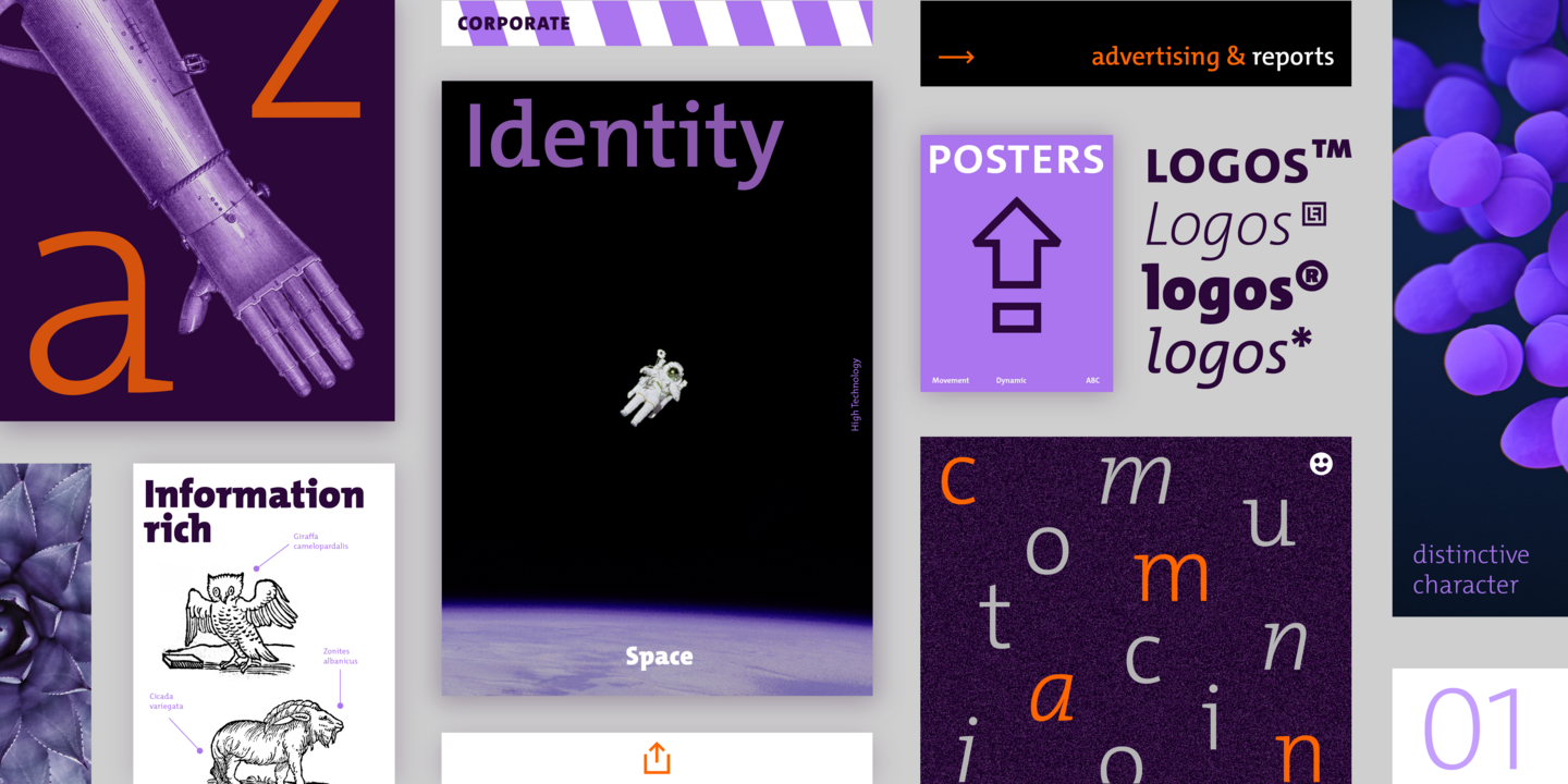
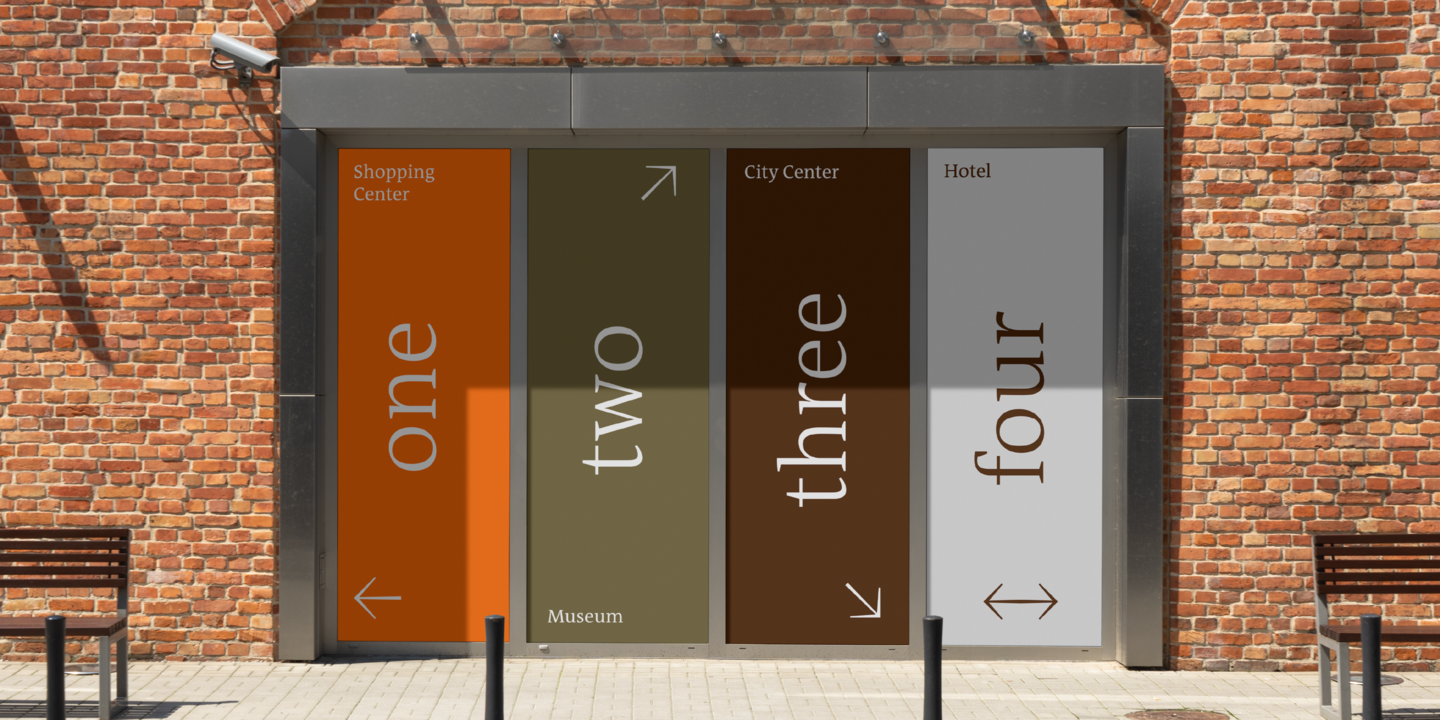
Used by demanding typographers and graphic designers across the world, LucasFonts typefaces have been known to give fine performances in many different contexts - from tiny footnotes to truck-sized logos, and everything in between.

CEO of LucasFonts
Luc(as) de Groot
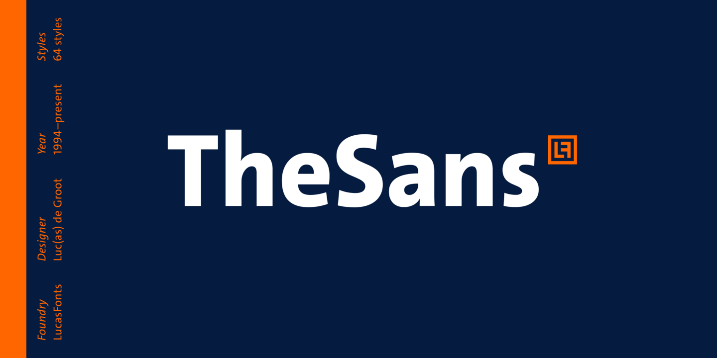
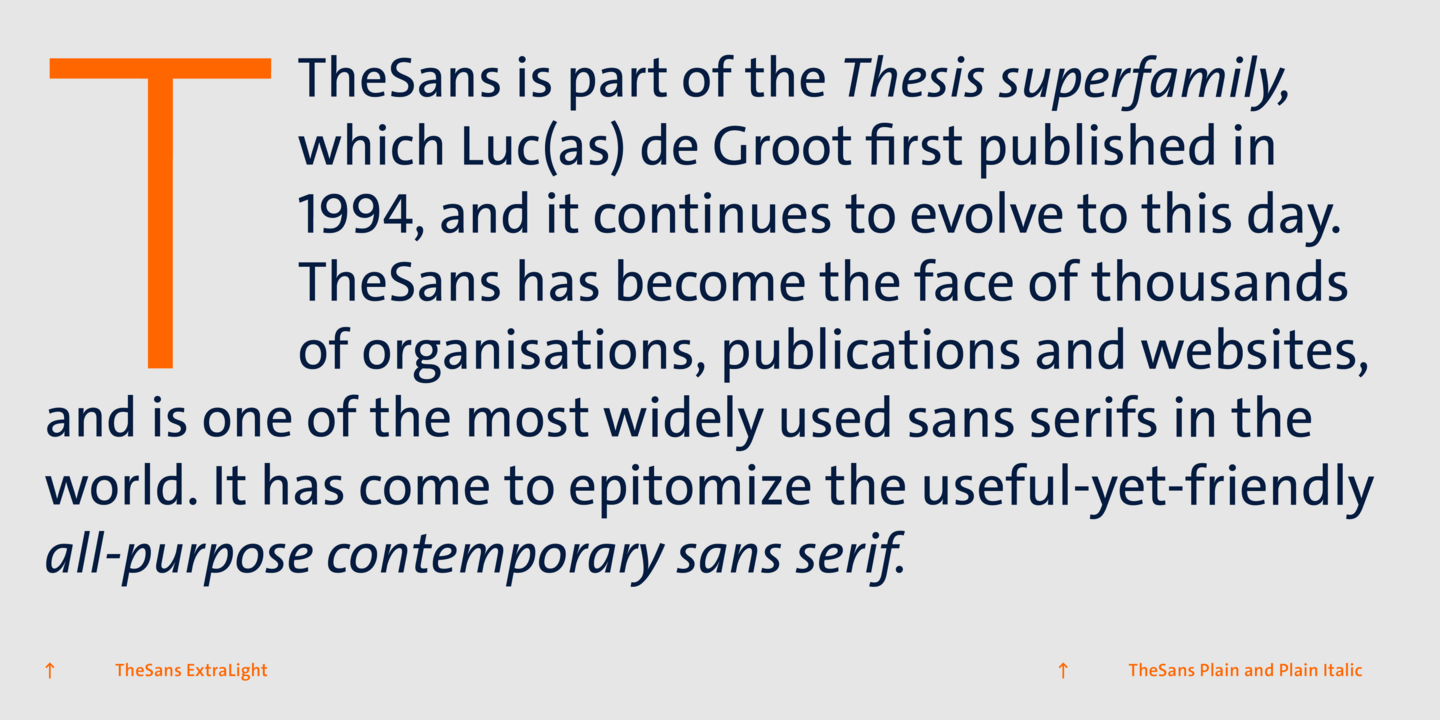
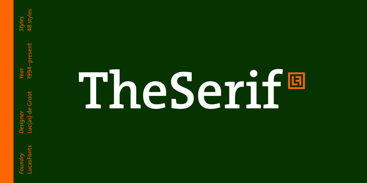
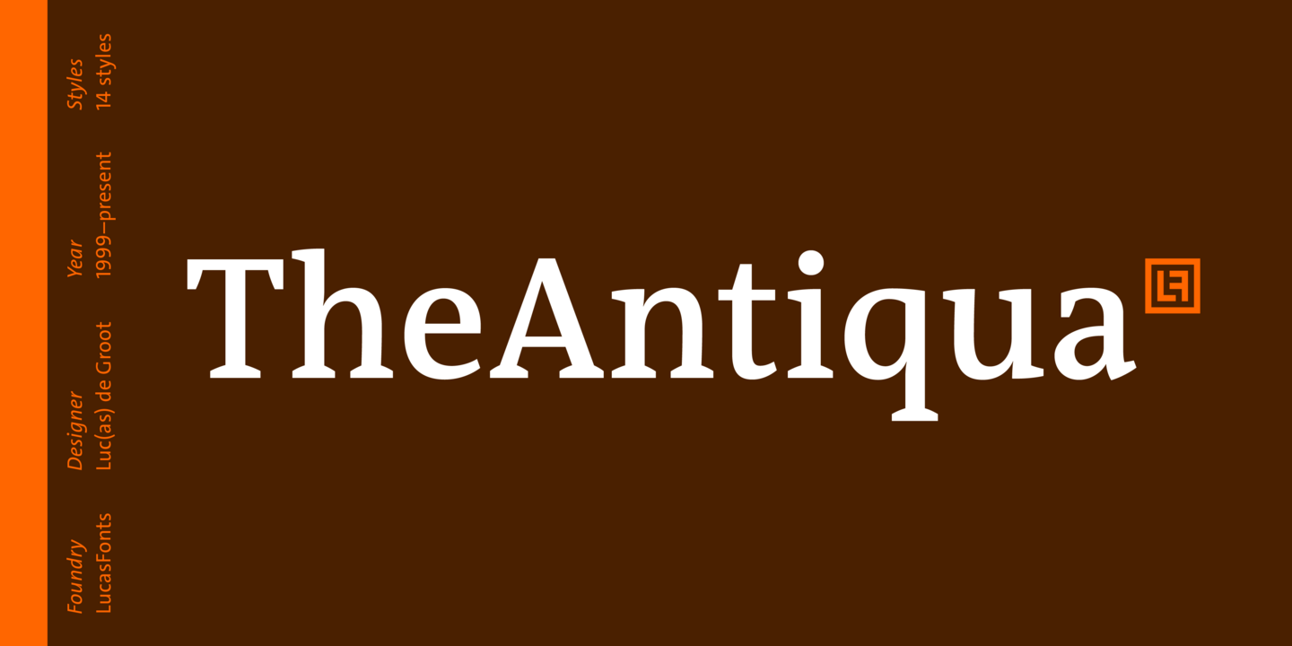
Berlin-based Dutch type designer Luc(as) de Groot is best-known for his superfamily Thesis (TheSans, TheSerif, TheMix, TheAntiqua), and of course Calibri. Luc(as) de Groot is also a web font and hinting specialist, developed a theory of interpolation and teaches at the University of Applied Sciences in Potsdam, Germany. Since 2000 he runs his type foundry LucasFonts and design studio FontFabrik in Berlin. His aim, in a few words: to make the world a better place by designing typefaces that look good and work well under any circumstances and in many languages.

Monotype Fonts
LucasFonts fonts are included with Monotype Fonts


