Popular Milieu Grotesque fonts.
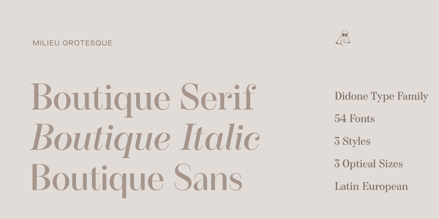
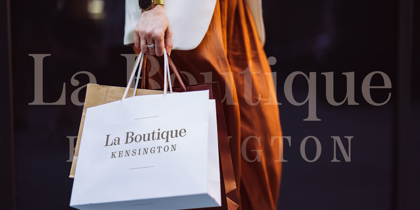
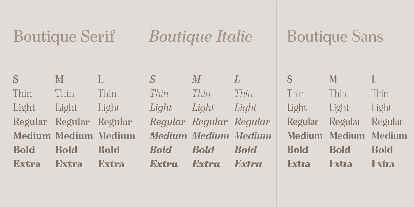
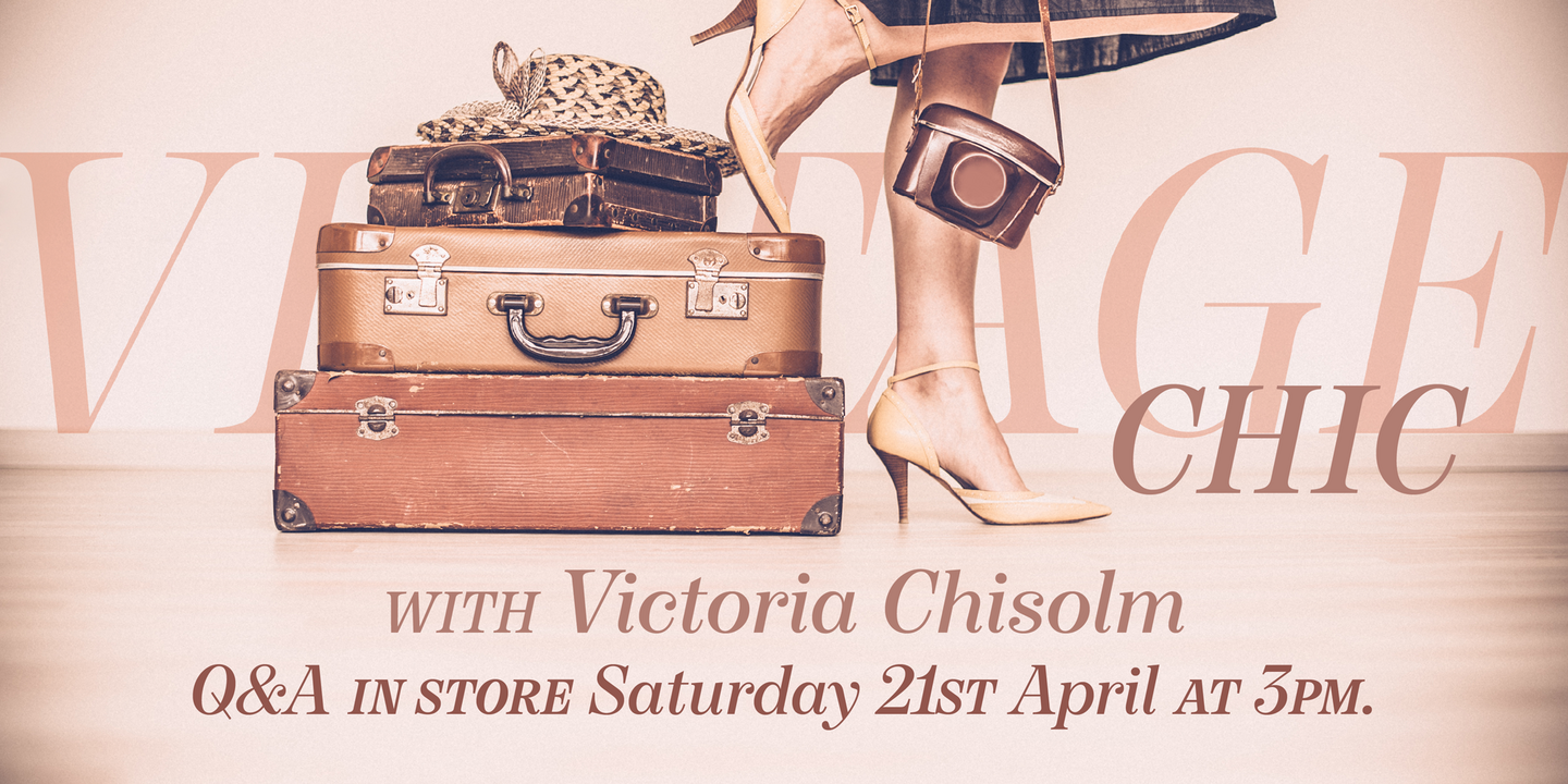
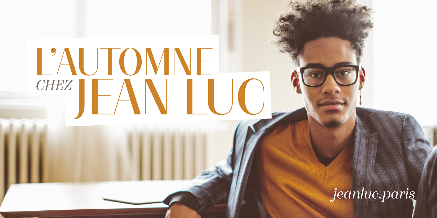
Boutique is a sophisticated sans serif typeface that pays homage to the Didone skeleton. Boutique is a reinterpretation of Modern typefaces that posits an alternative present for the genre. The initial version of Boutique explored the relationship between Modern typefaces and Modernism. While typeface is built upon a Didone Skeleton, its geometric character has been amplified and ornament stripped to create an elegant sans-serif with an idiosyncratic edge.
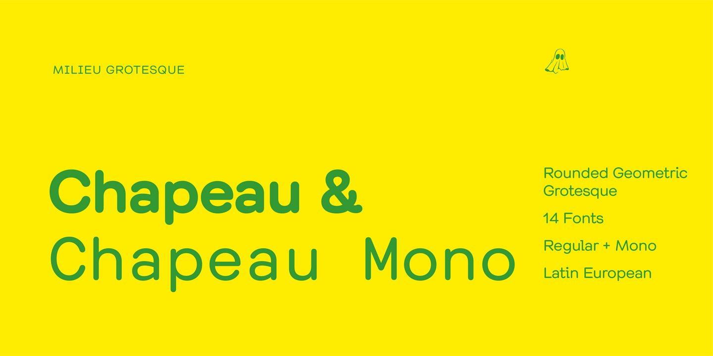
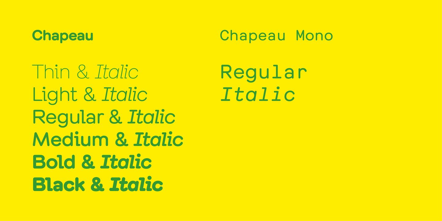
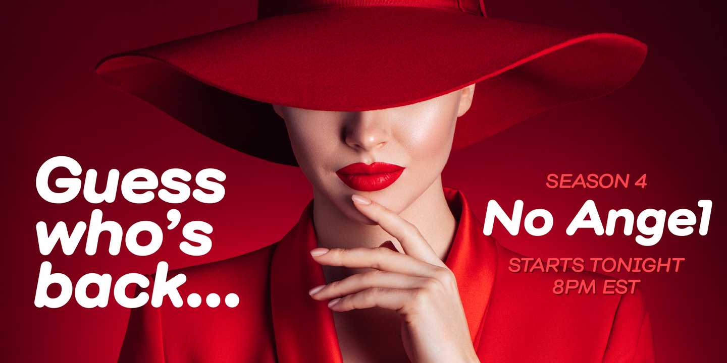
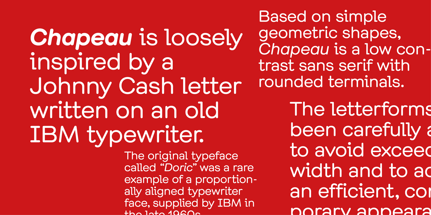
Chapeau is loosely inspired by a Johnny Cash letter written on an old IBM typewriter. The original typeface called “Doric” was a rare example of a proportionally aligned typewriter face, supplied by IBM in the late 1960s. Based on simple geometric shapes, Chapeau is a low-contrast sans-serif with rounded endings.
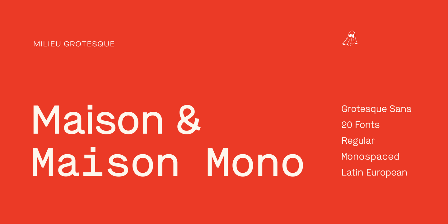
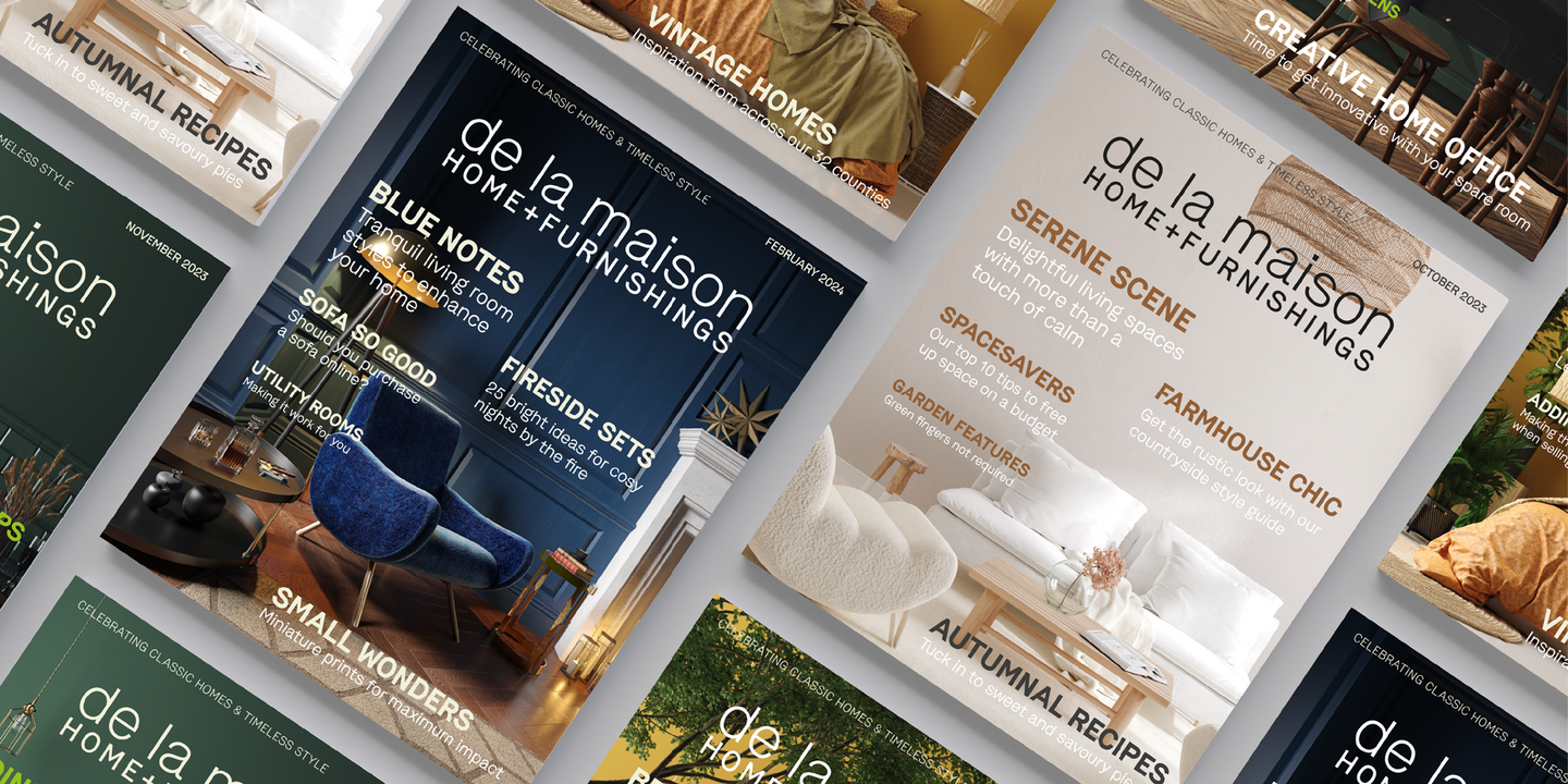
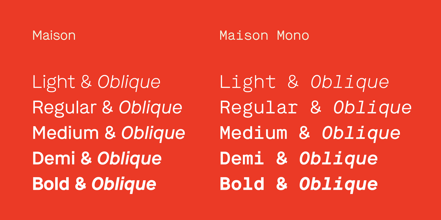
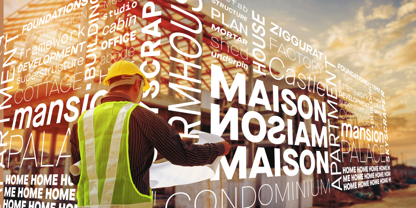
Maison is a mono-lined grotesque constructed using rigid elements to achieve a minimalist industrial feel in homage to the early twentieth-century modernist design concepts. Originally created as a mono-spaced typeface family—with fewer optical corrections than its successor Maison Neue—Maison has been further developed to work equally in both mono-spaced and proportional alignments.
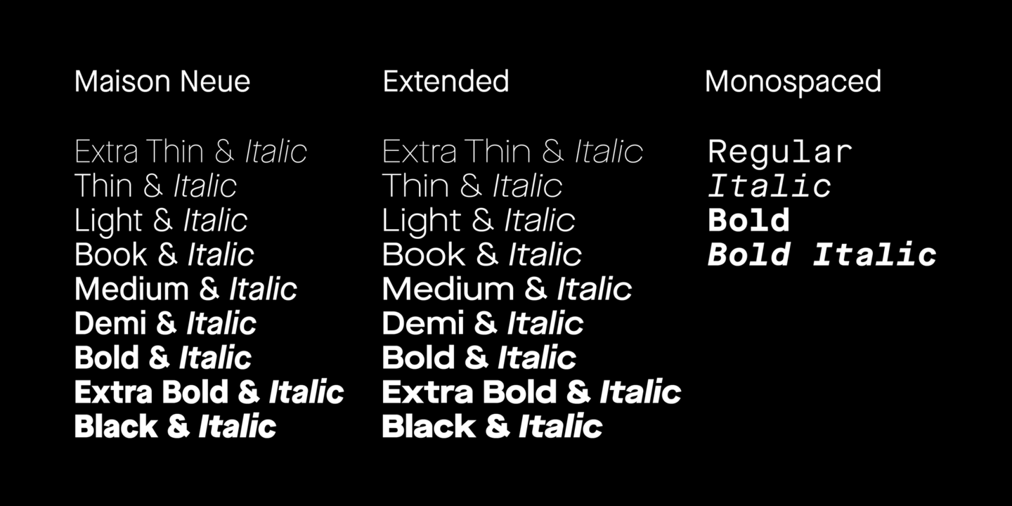
Maison Neue is a superfamily of 40 styles in minimalist homage to early-twentieth-century modernist design. Maison Neue is the completely reworked version of our original Maison typeface family. While the earlier version was constructed using rigid elements, Maison Neue has been meticulously redrawn to be less formulaic and have a stronger focus on optical criteria to create a distinct grotesque paying greater attention to harmony, rhythm, and flow. In 2017, Maison Neue was further developed and expanded into a superfamily of 40 styles including the subtly condensed original version, an extended counterpart, and a mono-spaced alignment—all featuring additional weights within each family.
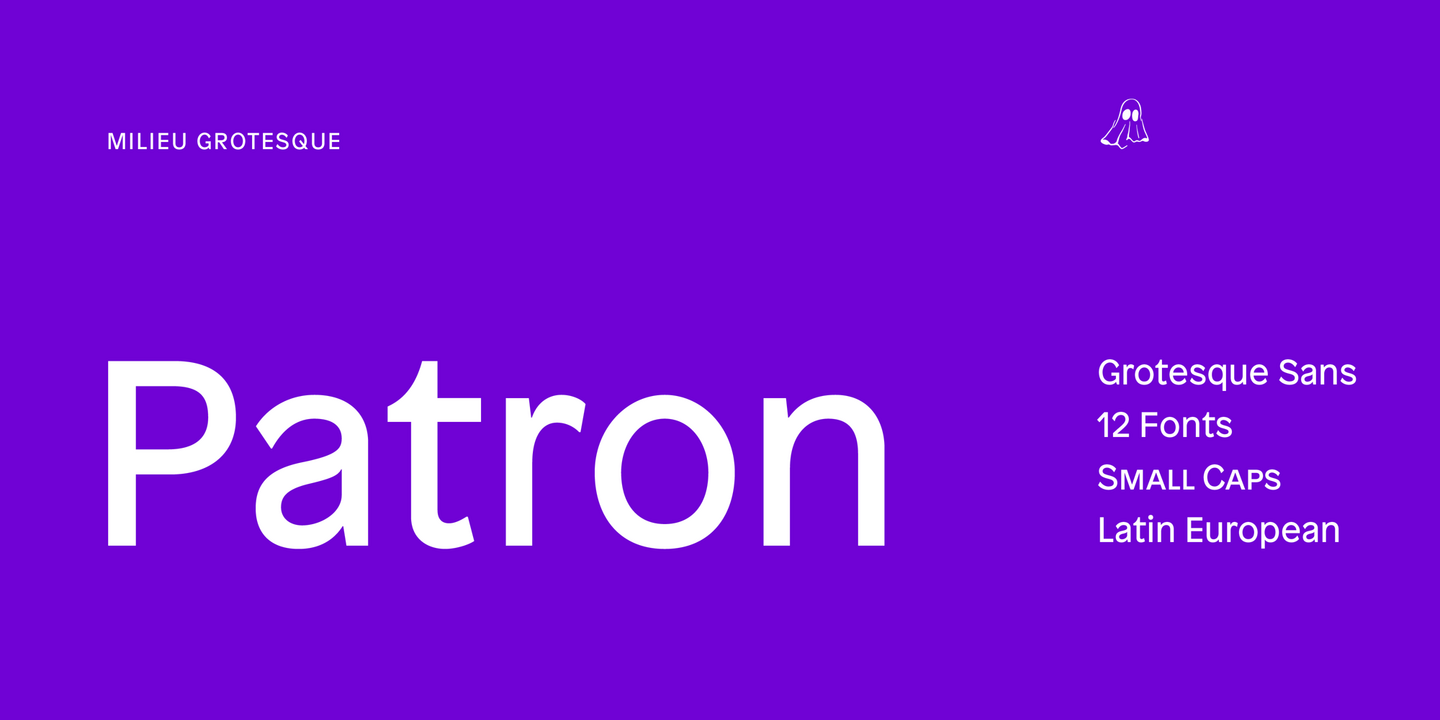
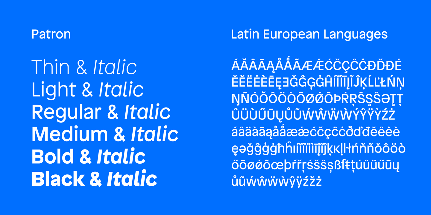
Patron is a sans serif influenced by two dissimilar type designers, Günther Gerhard Lange, and Roger Excoffon. Patron unites their contradictory approaches to create an expressive, yet versatile grotesque. As a result, Patron is characterized by a generous x-height, flared stroke endings, and an unconventional shift in balance, inspired by Excoffon and a rigorously precise, modern interpretation for which Lange was most famous.
Fonts in use.
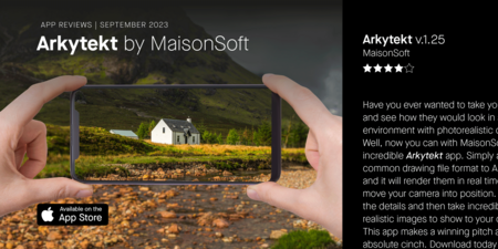

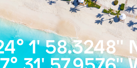
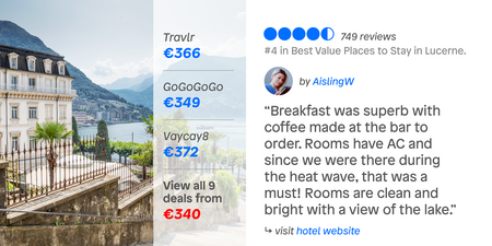
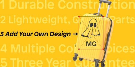

Milieu Grotesque

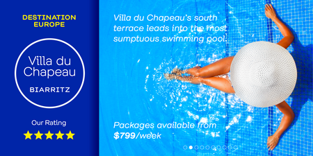
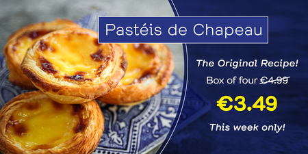
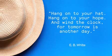
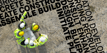
The five Milieu Grotesque typeface families include Maison Neue, a super family of 40 styles that pays homage to early 20th century geometric sans serif designs, Boutique, a modern Didone with a casual flair, Maison, a minimalist 20th century geometric sans, and Chapeau, inspired an old IBM Selectric typewriter font.

Type Designer
Timo Gaessner
Timo Gaessner, a Lisbon-based graphic and type designer, studied at the Gerrit Rietveld Academie in Amsterdam. In 2002 he founded 123buero, a Berlin-based graphic design studio primarily focused on printed matter, identity programs, exhibitions, and type design.
In 2010 he established the digital type foundry Milieu Grotesque, through which all recently developed typefaces have been distributed exclusively. Milieu Grotesque has been acquired by Monotype in 2023.
Timo has lectured and held workshops internationally, at the École Nationale Supérieure des Arts Décoratifs (National School of Fine Arts) in Paris and the Hochschule für Künste (University of the Arts) in Bremen, amongst others. From 2011 to 2013, he has been a visiting lecturer at the Staatliche Hochschule für Gestaltung (University of Arts and Design) in Karlsruhe, Germany.

Milieu Grotesque fonts are included in Monotype Fonts.


