Neue Plak™ Font Field Guide

FOUNDRY: Monotype
DESIGNER: Paul Renner, Linda Hintz, & Toshi Omagari
CLASSIFICATION: Grotesque Sans
Best Practices
While “Text” weights have been designed, Neue Plak is essentially a display design. Neue Plak’s somewhat quirky design traits, make it an excellent alternative to more structured geometric sans serif typefaces.

Family
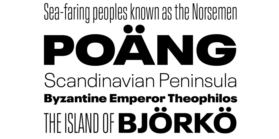
Neue Plak offers 60 weights, including a new text version that pairs with the display weights. This allows the design to perform well in print and digital environments – and within a wide range of applications.
Font Facts
- Despite being designed by Paul Renner, Plak never reached the popularity of his, earlier, Futura design.
- Hintz and Omagari based their updated and extended version on the original Plak wood type, uncovering lost details and incorporating them as alternate characters – including the choice between open or strikethrough counters.
Roots
Plak was originally designed as wood type in the late 1920s. Neue Plak is an extended and updated version of a 1928 typeface, by Paul Renner. It blends an industrial exterior with flashes of unexpected playfulness.

Legibility
Modest stroke width variations, letters with a distinct personality and simple character shapes make for a highly legible design in a wide range of sizes. Relatively closed apertures and the single-storey g, however, detract from an excellent score.
How to spot Neue Plak

Alternate Choices
Perfect Pairing
More Font Field Guides

The breadth of the Formata family makes it an excellent choice for a wide range of applications, from blocks of textual content to billboard size display headlines. Its subtle characteristics are not readily apparent in small sizes but add a distinctive mien as point size is increased.

Although the lighter weights can be used for short blocks of textual content, captions and subheads, Archer is primarily a display typeface. It’s bold weights bring a commanding, but friendly, vibe to headlines and other large-size copy


