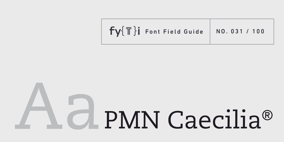
PMN Caecilia® Font Field Guide

Best Practices
The PMN Caecilia family is a suite of designs that are ideally suited to branding, headlines and short form text copy in print and on screen. Its simple shapes, large x-height, open apertures and robust serifs also make it a good choice for print and on screen environments.

Family
PMN Caecilia is available in four weights, each with an accompanying cursive italic. In 2017, a much larger PMN Caecilia Sans family was released to complement the original design.
Font Facts
- The typeface name is based on Noordzij’s initials, and his wife’s name, Marie-Cecile Noordzij-Pulles.
- One of the most influential reading tools of the Information Age – the Amazon Kindle® – initially used PMN Caecilia as a standard font for its books.
Roots
Noordzij was studying at Koninklijke Academie vor Beeldende Kunsten in The Hague, Netherlands, in 1983, when he created the first sketches of what eventually became PMN Caecilia.
Designed to represent the writing of a broad-nibbed pen, PMN Caecilia has curved, angled, and vertical strokes. When most people write, the direction and pressure of the pen change, but the angle of the pen in relation to the line usually does not. This notion was built in to the PMN Caecilia design.

Legibility
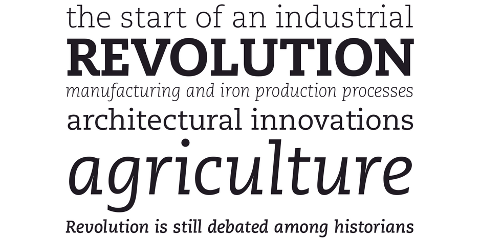
PMN Caecilia combines classical ductus with a contemporary vibe to create a friendly and versatile slab serif family. Its large x-height, open counters, simple character shapes and sturdy serifs all contribute to the design’s high levels of legibility
How to spot PMN Caecilia

Alternate Choices
Perfect Pairing
Download a pdf version of the PMN Caecilia Font Field Guide and view the PMN Caecilia font family.
More Font Field Guides

Palatino® Nova Font Field Guide
Because of its expanded proportions, Palatino Nova can, and in many cases should, have somewhat longer line lengths. It’s also a typeface which does not tire the eye, when longer line lengths are specified. Learn more

Avenir® Next Font Field Guide
The design of Avenir Next is clean, straightforward and performs with confidence in long blocks of text copy and headlines. It also pairs well with well with so many contemporary serif text typefaces. Learn more


