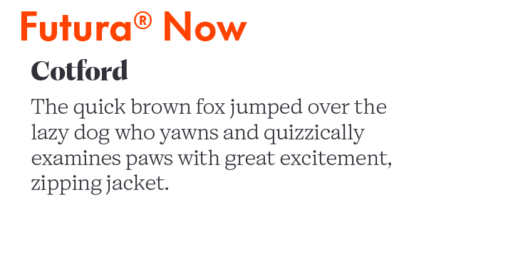
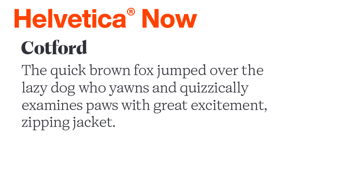
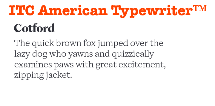
Cotford™ Perfect Font Pairings
ABOUT THE FAMILY:
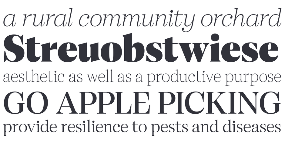
As a Transitional Serif design, the axis of Cotford’s the strokes normally have a vertical stress. Weight contrast is more pronounced in the display designs. Serifs are bracketed and head serifs are oblique. Cotford ranges from micro to display optical size, across Thin to Black weights, providing legible and stylish type at all sizes.
WHAT TO LOOK FOR IN FONTS THAT PAIR WELL WITH COTFORD:
- Typefaces that serve as a counterpoint, such as Humanistic and Geometric Sans
- Glyphic designs like Friz Quadrata™ or Albertus® Nova make for good display complements to Cotford text
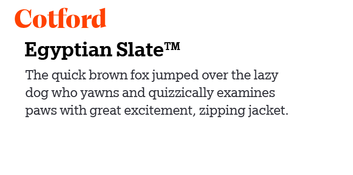
- Look to Slab or Clarendon typefaces, like Sentinel® or Grotesque Sans, like Whitney®
- Cotford is available as a variable design. Experiment with instances of the variable font that contrast with and complement the fixed designs.
- Avoid other Transitional designs like, Baskerville™ or Perpetua®
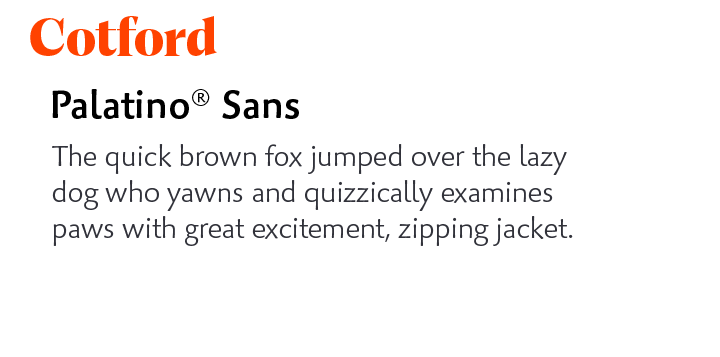
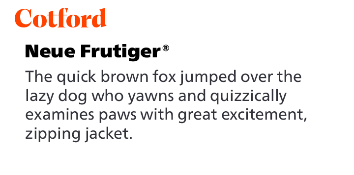
COTFORD PAIRING WITH TEXT FONTS:
COTFORD PAIRING WITH DISPLAY FONTS:
Explore Other Font Pairing Guides
Futura Now is the definitive re-digitized version of the iconic geometric sans serif typeface. With 102 styles, including Condensed, Headline, and Text weights, in addition to extensive language support, Futura Now is poised to take on virtually any typographic task.
Designed for Fonderie Olive, “Antique” is a European typographic term for gothic or sans serif. Antique Olive is generally considered a display typeface. Because of its exaggerated x-height and tight letter spacing, only the light weight, in large sizes, is recommended for blocks of copy.
