Perpetua® Perfect Font Pairings
ABOUT THE FAMILY:
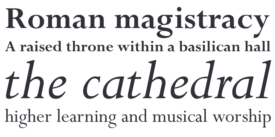
Perpetua was to be the first original typeface in Stanley Morison’s plan for building the Monotype type library. He wanted the design patterned after epigraphic rather than calligraphic letters, and asked Eric Gill to create the design.
The Perpetua family is available in two weights, each with an italic, and three weights of titling designs.
WHAT TO LOOK FOR:
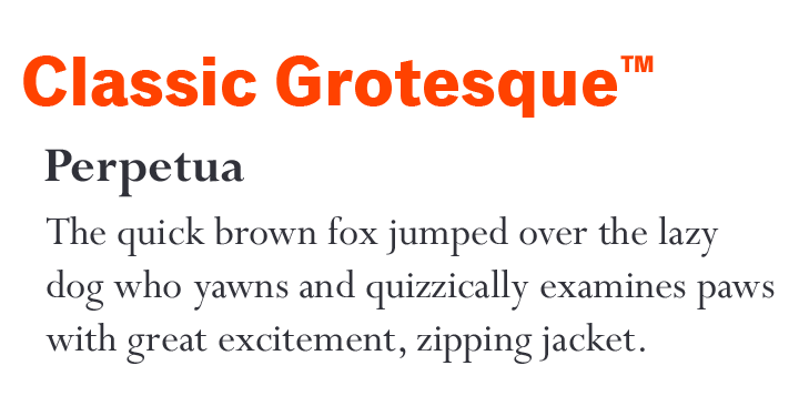
- Sans serif typefaces with a wide range of weights
- Slab or Clarendon typefaces with subtle stroke weight changes
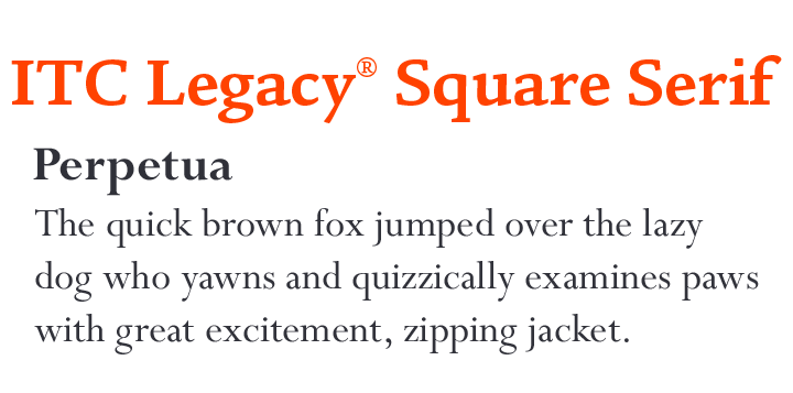
- Old Style typeface designs like Eloquence™ or ITC Legacy® Square Serif
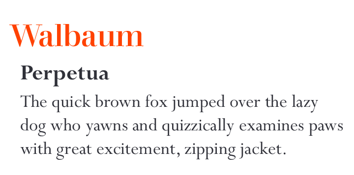
- Didone typefaces like Walbaum and ITC Bodoni Seventytwo™
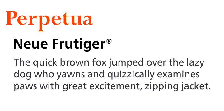
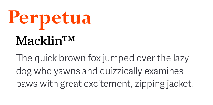
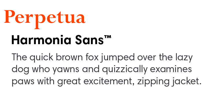
PERPETUA PAIRING WITH TEXT FONTS:
PERPETUA PAIRING WITH DISPLAY FONTS:
Explore Other Font Pairing Guides
“When creating the Avenir® typeface, Adrian Frutiger drew inspiration from the past and the future. His goal was to modernize the geometric sans serif styles of the early 20th century, while embodying the aesthetics of the 21st century. In the process, Frutiger also infused a touch of organic humanism into the design.

ITC Avant Garde Gothic’s characters are based heavily on geometric shapes. There is no softening with humanistic undertones. Its lowercase x-height is tall and the characters are wide. Weights range from a delicate extra light to a commanding bold. Both regular and condensed proportions are available.
