By The Numbers: From Gutenberg to Subscripts Manual
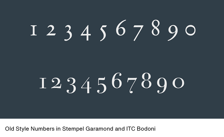
When Gutenberg invented the art of typography he included a set of numerals in his fonts. But, for almost 100 years, numerals were treated as “pi” characters and not created to be part of any particular typeface design. Claude Garamond, the great 16th century type designer, is generally given credit for creating the first font of type with numerals specifically designed to complement letterforms of a specific typeface. Except for stylistic variations, Garamond’s numerals set the standard for over 200 years.
Old Style Numerals
Garamond intended his numerals to be set as part of text copy and designed them to have the same proportions as the lowercase letters. Like lowercase letters, Garamond’s numerals are based on three forms: ascending, medial, and descending. In addition, to avoid confusion with the lowercase o, the zero has a different weight stress than the lowercase character.
New Numbers
This “lowercase” style of numerals became a model for type designers until the late 18th century. It was then that a new kind of number (called “lining” or “ranging”) was introduced for mathematical and technical typesetting. The idea behind this new set of numerals was that they would be larger – and a more legible alternative to Garamond’s design. If the first numerals used in printing can be considered as lowercase characters, then ranging numerals should be thought of as uppercase designs. These numerals usually have the same height, and match the uppercase letterforms in weight and proportion.
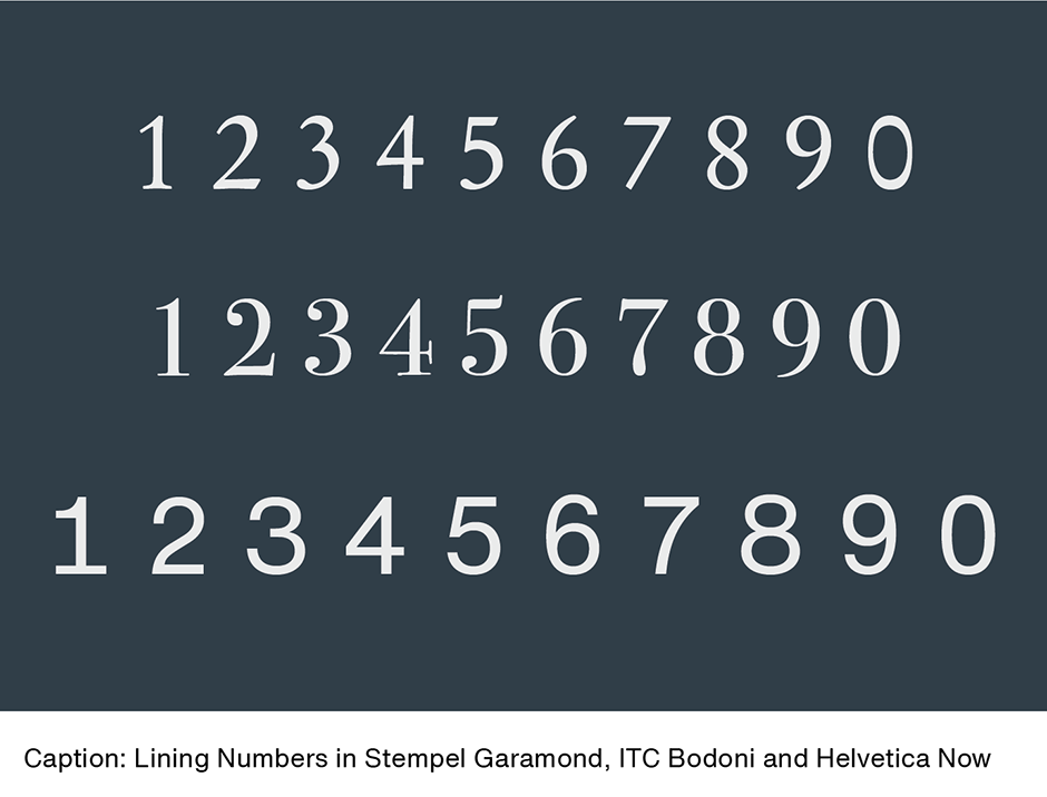
Sometimes lowercase numerals are referred to as “old style” designs. This is because when ranging numerals became popular, many typographers referred to them as “modern” numerals – which left the previous style to be relegated with the moniker of “old style”. To this day traditionalists tend to refer to the style of numerals found in Garamond’s font as “old style.”
For many years, printers and typographers benefited from both sets of numerals, but as machines began to be used for setting type, typographic variety was sacrificed for mechanical efficiency. Machine-set type had limited character sets, which allowed for only one set of numerals. Some fonts (generally those text designs confined to what printers called “book work”) had the lowercase design, while others (more general purpose fonts used for “jobbing work”) had the ranging design. When phototype replaced machine set metal type, most foundries chose just the ranging style for inclusion in their fonts.
Tabular Numerals
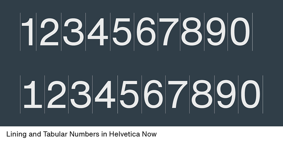
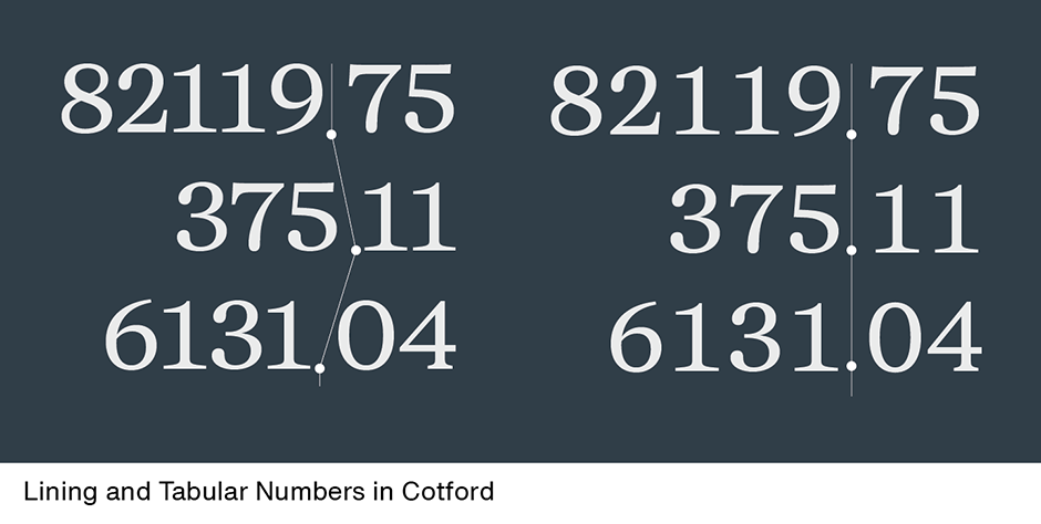
Tabular numerals are designed and spaced so that the zero through nine are on the same width space. This allows columns of numerals, such as those in annual reports, other financial statements or mathematical content, to align. In machine-set metal type, tabular numerals were usually put on the en-space. This is not necessarily the case with digital type. Generally, the ranging designs are used to create tabular numerals. In some fonts, however, both ranging and old style tabular numerals have been made available as tabular characters.
Superior and Inferior Numerals
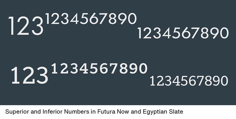
Superior and inferior numerals, sometimes called superscripts and subscripts, are drawn to be about 60% the height of the full size numerals. Superior numerals are used to indicate footnotes, to signify exponents or indices in mathematics and sometimes (in display copy) for prices. Inferior numerals are normally used in setting chemical and mathematical notations.
In the five-hundred plus years, since many fonts shared the same numbers, fonts now contain ten, or more, different sets – and that’s not including fractions.
Download a pdf version of the By The Numbers: From Gutenberg to Subscripts Manual


