Manual: Typography for Presentation Graphics (Part Two).
The second half of “Typography for Presentation Graphics” addresses:
- Use of color to enhance the message
- Safe fonts for traveling presentations
- The value of build slides
- Use of the correct information graphics
Color Can Enhance A Message
Choosing colors for slides is just as important as it is for a brochure or product catalog – maybe more so. In presentation graphics, color not only invites the audience into the text, it can augment reading process and aid comprehension.
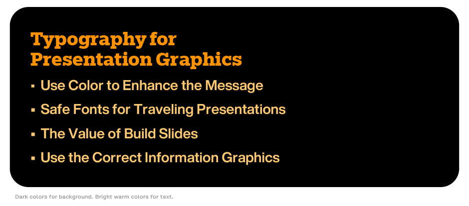
Background colors define the image-plane, while the colors used for copy should enhance readability. Use dark colors for the background and warm, bright colors for the textual content. Avoid cool colors like light blue and green for backgrounds. They tend to reduce the vitality of your presentation.
Avoid dark colors for textual content because they make it retreat into the background, and reduce contrast, necessary for good readability.
Limit the palette to two or three colors for consistency. More than that, creates visual clutter, and confusing hierarchy.
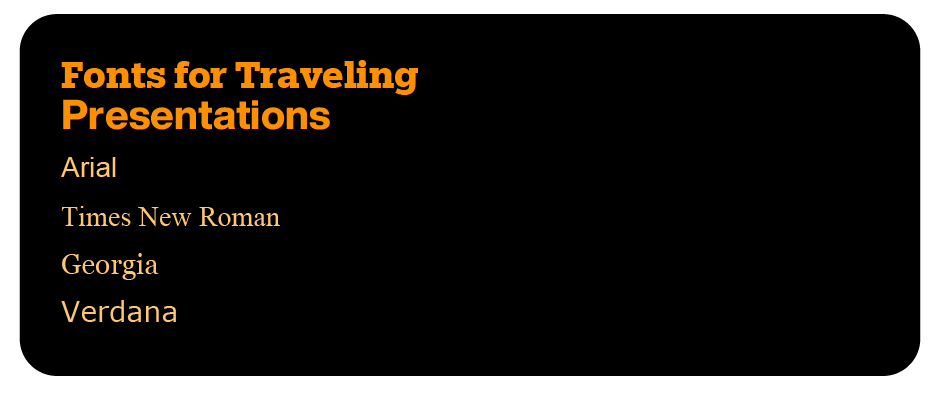
Fonts for Traveling Presentations
If you will be sending your presentation to others, or giving it on a computer other than your own, use fonts that are universally available across various operating systems and applications. This ensures consistent display in the presentation.
Common safe fonts include:
- Arial: A clean, sans-serif font known for its readability.
- Times New Roman: A classic serif font that’s widely available and professional.
- Georgia: A serif font designed for screen readability.
- Verdana: A sans-serif font specifically designed for clarity at smaller sizes.
Value of Build Slides
A build slide starts with the first major bullet point and shows more major bullet points as the presentation proceeds. This helps to make the transition from one point to the next, and highlights the new content.
Transitions in a build slide can appear in a variety of ways. They should not, however, overpower or distract from the message.

Use The Correct Information Graphics
Diagrams and graphs also help to make complicated information simple to assimilate. They should, however, only be used to illustrate main points, and must be easy to understand at a glance. Overused or complicated graphics can hinder the communication process.
Use the right kind of information graphic:
- Diagrams show structure
- Pie charts show parts of a whole
- Tables and bar graphs show relationships

Design for presentations can be as challenging and demanding of as any project you might run up against. It can also be some of the most rewarding. Rarely will you be able to witness such instantaneous approval, reward, and validation of your efforts.
Click here for more information about the best fonts for presentations.


