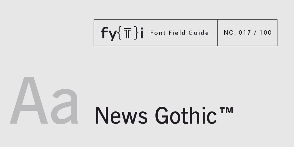
News Gothic Font Field Guide

Foundry: Bitstream Designers: Morris Benton Classification: Sans Serif Grotesque
Best Practices
Somewhat condensed and slightly angular, Bitstream News Gothic is an efficient user of space and holds up well on screen. The bold weight is not overly so, and condensed designs are well suited to environments where space is at a premium.

Family
Four roman weights and two condensed designs, each with an italic complement, in addition to two extra condensed designs.
Font Facts
This was the fourth “gothic” family from Benton. It was preceded by Globe Gothic, Alternate Gothic, and Franklin Gothic.
Roots
First designed by Morris Fuller Benton in 1908 for American Type Founders. Additional weights and proportions were added in the 1940s and 50s. Bitstream News Gothic is a digital updating of the original design.

Legibility
Two-storied a, bowl and loop g, open counters and apertures ensure legibility at small sizes in print and on small screens. The regular weight is legible and easy to read in reverse at small sizes..
How to spot News Gothic

Alternate Choices
Perfect Pairing
More Font Field Guides

Optima nova should be set more open than tight. The unhurried elegance and light gray color created by the face is disrupted when letters are set too tight. Learn more

The original Baskerville typeface was created for setting books, and its modern revivals are ideally suited to the setting of continuous text. Learn More


