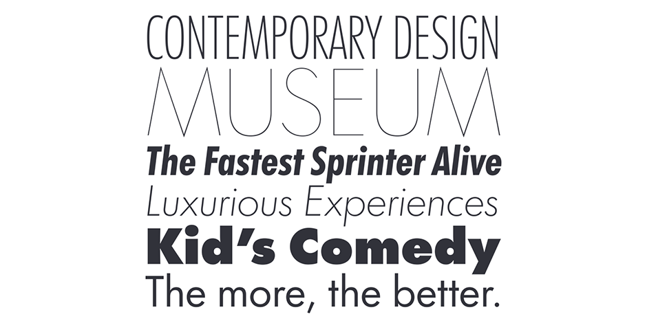
Futura® Now Font Field Guide

FOUNDRY: Monotype, DESIGNERS: Paul Renner and Monotype Studio & CLASSIFICATION: Geometric Sans
Best Practices
Spacing has a huge influence on legibility and reading comfort. Use the optical sizes to help tune that right away: Try Text styles for 18 pt. and below and use Headline styles above 18 pt. In general, very light or very heavy weights are best saved for headlines. Start with light, regular, or medium for text weights.
The ligatures available in Futura Now are very obvious and can be distracting to the reader, so we have designated them to the optional Discretionary Ligatures feature. Use them carefully! There is also an alternate lowercase a, ampersand, and figure styles to spice it up

FAMILY
Futura Now has an extensive family designed with two optical sizes and two widths: Text and Headline, regular and Condensed. It ranges from thin to Xblack, in Latin, Greek, and Cyrillic scripts. Available in Variable formats.
Font Facts
- Futura is a pop-culture and science fiction favorite because of its use by NASA and the plaque on the moon, commemorating Apollo 11 in 1969.
- Along with the Helvetica typeface, Futura is one of the most popular typefaces ever, being used for nearly every industry around the world.
Roots
Futura and Modernism go hand in hand. Futura arrived in the late 1920s, at the height of the Bauhaus, and just one year before the publication of Jan Tschichold’s revolutionary Die Neue Typographie (The New Typography). It has remained popular for nearly a century
Futura Now is all 90 years of the Futura family and much, much more. Futura Now collects, organizes, and recasts the entire history of the Futura family—from 1927 to today. It’s the result of careful study, planning, and crafting, but it moves well beyond historical revival.

Legibility
Futura Now is better suited for text than many geometric sans serifs because of its proportions and optical adjustments. If the single-story a hinders text at small sizes, try the two-story a.
How To Spot Futura Now

Alternate Choices
Perfect Pairing
Download a pdf version of the Futura Now Font Field Guide and view Futura® Now.
More Font Field Guides

Futura® Font Field Guide
An exceptionally versatile family, the Futura Bold and Condensed designs are powerful display typefaces. The Futura family is also a good choice for space-sensitive environments. Its simple letterforms allow it to be set at surprisingly small sizes with little drop in legibility. Learn more

Felbridge™ Font Field Guide
The Felbridge typeface is a straightforward sans serif design with strong, clear letterforms that do not degrade in low resolution or on-screen environments. Learn more


