Manual Bold for Boys, Scripts for Girls – Not
It seems that we are continually trying to equate personalities, emotions, or other human traits to typeface designs. Perhaps it is a way to make sense out of the seemingly unending array of typeface designs that are available. Maybe it’s because we assume that typeface designers have “personality trait” as part of their standard design brief for developing new typefaces.
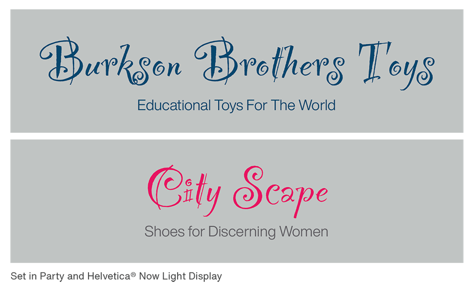
The problem is that 90% of fonts do not have personalities – or any other human traits. Sure, the typeface “Party™,” as a result of its name and distinctive design, is used to set lots of invitations and announcements for festive events. This, however, pigeonholes the design and limits its use in other applications. Party, for example, could be equally at home in an ad for women’s shoes as it would for a brochure for educational toys.
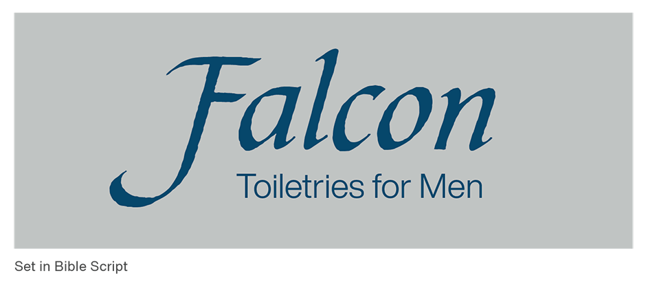
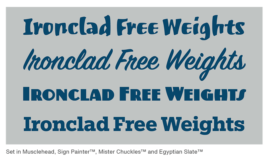
While some typefaces, like Chiller or ITC Willow, were clearly designed with a particular suite of uses in mind, most were not. Bible Script would be equally at home in an advertisement for men’s toiletry products, as it would delivering a spiritual message. And Musclehead is as suited to a poster for a gamer’s conference as it is for the logo of strength-training products – which, by the way, it probably is not.
While it might be fun believing that typefaces have personality traits, it can also get in the way of creating good graphic communication. It can stifle creativity, send stereotypical messages and limit brand development.
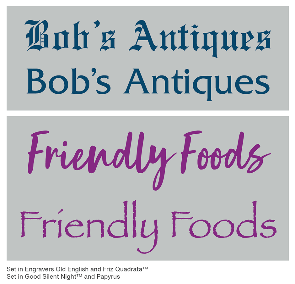
If you were asked to create a logo for an antique store, Old English would probably be the last typeface you would to use. It has become a cliché for “Ye Old Antique Store” signage. But what about a menu for the health food restaurant in your neighborhood? Would you use Papyrus? Maybe not – but too many graphic designers will pick the stereotypical typeface design and, in the process, create a brand that’s about as distinctive as a glass of milk.
If you really need a typeface that says “scary,” or one that will complement a “futuristic” poster design, start with the search engine and keywords provided by the MyFonts; then run the typefaces that come back from the search through your own filter. Are the choices fresh? Will they set your design apart? Do the individual letters in the brand name combine well in the typeface? Then choose the typeface that is best for your project. And remember: bold is not necessarily for boys.
Download a pdf version of the Manual Bold for Boys, Scripts for Girls – Not.


