Swash Letters Manual
Typography tends to be structured. But what if you want to add some flare and verve to your typography? That’s where swash letters come in. Swash letters were born out of calligraphic lettering. They’re decorative letters that have a flourish or an extended stroke, terminal, or serif. They tend to be calligraphic in appearance, and add a bit of elegance or drama to an otherwise straightforward letterform.
Most swash characters fall into one of three categories: fancy capitals, beginning and ending characters, or stylistic swashes. Historically, swash capitals were used at the beginning of a sentence; today, they are often used as an eye-catching initial letter to begin a paragraph, chapter or article.
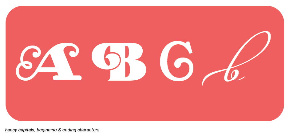
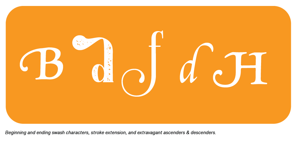
Beginning and ending swash characters are caps or lowercase characters whose swash extends horizontally, adding a decorative element to the type. Stylistic swashes include anything from a simple stroke extension to a sweeping, extravagant ascender or descender.
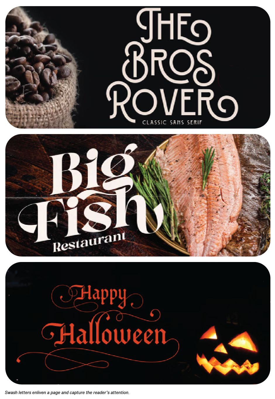
Swash characters enable subtle and not so subtle customization of text copy and display headlines. They create sparkle and elegance in text and a sense of flair and immediacy in headlines. Swash letters enliven a page and capture the reader’s attention.
One of the challenges in using swash characters, is where to find them. This is because sometimes fonts differ in how they categorize swashes, and design software differs in how to locate and apply them.
Swash characters are usually classified and identified as a Swash in design software. They can also be found in InDesign’s Glyphs panel. In some fonts, however, they are classified as Stylistic or Contextual Alternates.
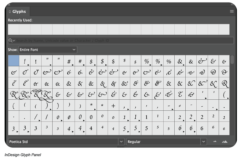
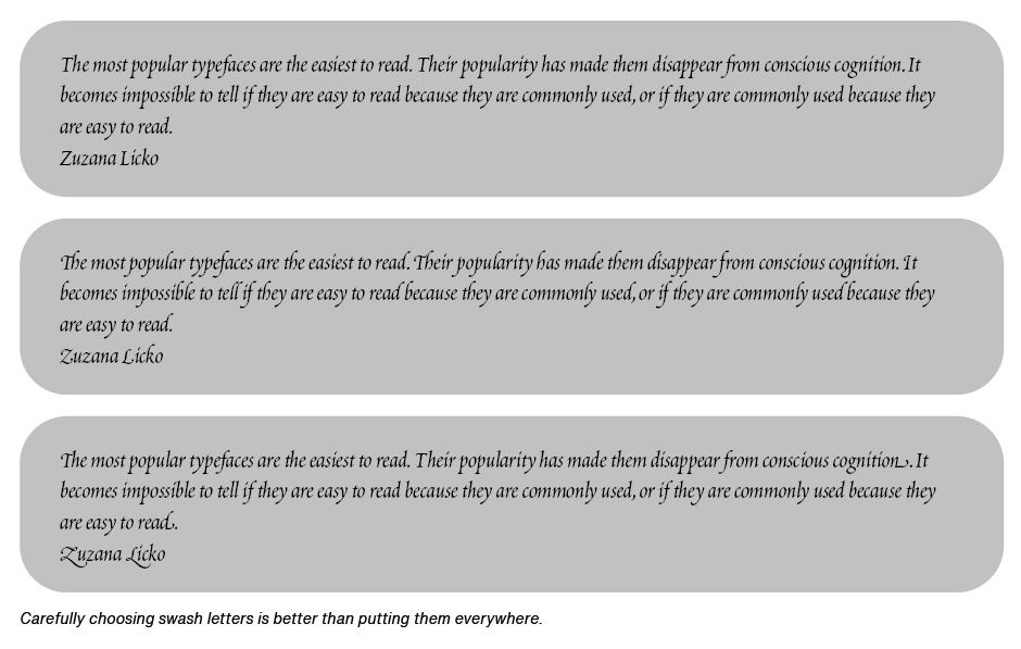
Swashes can be accessed in two ways: either globally by choosing from the Character or Control panel menus, or individually from the Glyph panel. If applied globally to text, all available swashes in the font will replace the standard glyphs. While this is the fastest and easiest way to apply them, you’ll likely end-up with a block of copy peppered with swash letters. In most cases, you’re better off using the Glyphs panel.
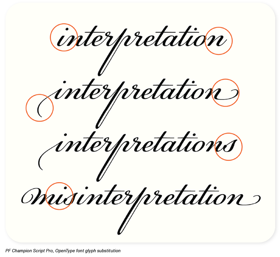
OpenType fonts have a feature entitled glyph substitution. This is a bit of software that tells a font to when to insert situational glyphs. which can include initial, medial and terminal swashes and alternates. For example, some swash characters are intended for either the beginning or end of a word to avoid crashing into other letters or creating too much space between two characters. When a font has glyph substitution, the correct swash will be automatically inserted. If the copy is changed, it will automatically change the swash character back to the standard one as necessary.
While swash characters can turn simple letters into compelling and distinctive typographic communication, many go unnoticed and unused, by graphic communicators. To get the most out of fonts, take the time to explore the complete character offering. You just might find an exciting new world of typographic opportunities.


