Manual: It’s About Ampersands

Typeface design is a relatively technical craft. It is about producing a series of interchangeable tools which always work in harmony no matter how they are combined. For the most part this puts a real damper on how creative a designer can get when it comes to drawing individual letterforms. There are, of course, some exceptions to this rule – the ampersand is a shining example.
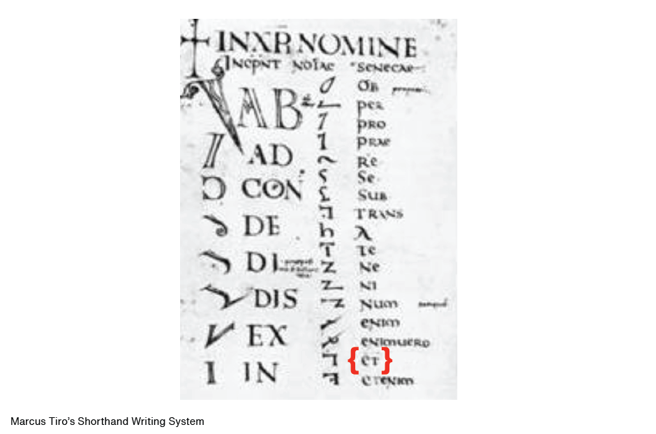
Rooted in the Latin “et” (meaning “and”), the ampersand is a ligature composed from the letters e and t. The word “ampersand” itself is an alteration of “et per se and”, which became corrupted to “and per se and,” and finally “ampersand”. Credit for the invention of the ampersand is sometimes given to Marcus Tiro who, in 63 B.C., made it a part of a shorthand writing system he developed.
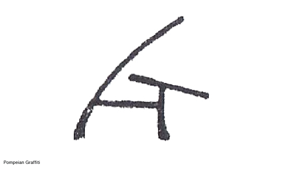
Another source sites that it wasn’t until about 45 A.D. that the ampersand, written in the style of the early Roman capital cursive lettering, first appeared on a piece of papyrus. Still another source points to Pompeian graffiti dated around 79 A.D. as the first use of the ampersand. Clearly, the exact age of the ampersand will never be established.
Like many of the letters in our current alphabet, the ampersand probably began as a convenience. The Latin word for “et” was first written by scribes as two distinct letters, but over time the letters were combined into a monogram of sorts. Once accepted as a single character, artistry took over and a more flowing design was the result.
By the time Charlemagne’s scribes developed the Carolingian minuscule in about 775 A.D. the “et” ligature had become a standard part of their repertoire. This ligature was then adopted with the invention of printing in the early 15th century. Ampersands were commonly used characters in the first hundred, or so, years of printing. For example, Francesco Golonna’s Hypnerotomachia Poliphili printed by Aldus Manutius in 1499, is peppered with ampersands on every page.
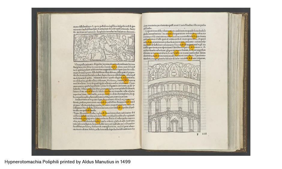
The reason for the more liberal use of the ampersand in early printing is two-fold. First, early printers wanted their work to be in the tradition of hand illuminated manuscripts and, second, because then, as now, the ampersand was considered a particularly beautiful character which early printers enjoyed using for its own aesthetic merit.
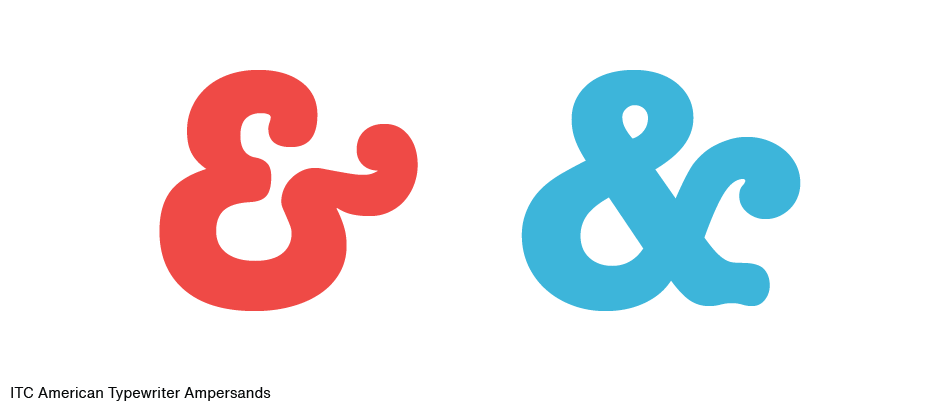
Today, the ampersand is part of every new typeface design – and is, many times exceptionally beautiful. Take for example the ampersand in ITC American Typewriter. One would expect a fairly pedestrian, ho-hum ampersand in this face. Wrong. Not only does ITC’s typewriter font include a handsome design for the “et” ligature, but an alternate as well.
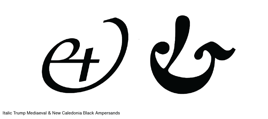
Other great ampersands can be found in the italic fonts of Trump Mediaeval, and New Caledonia – especially the Black weight.
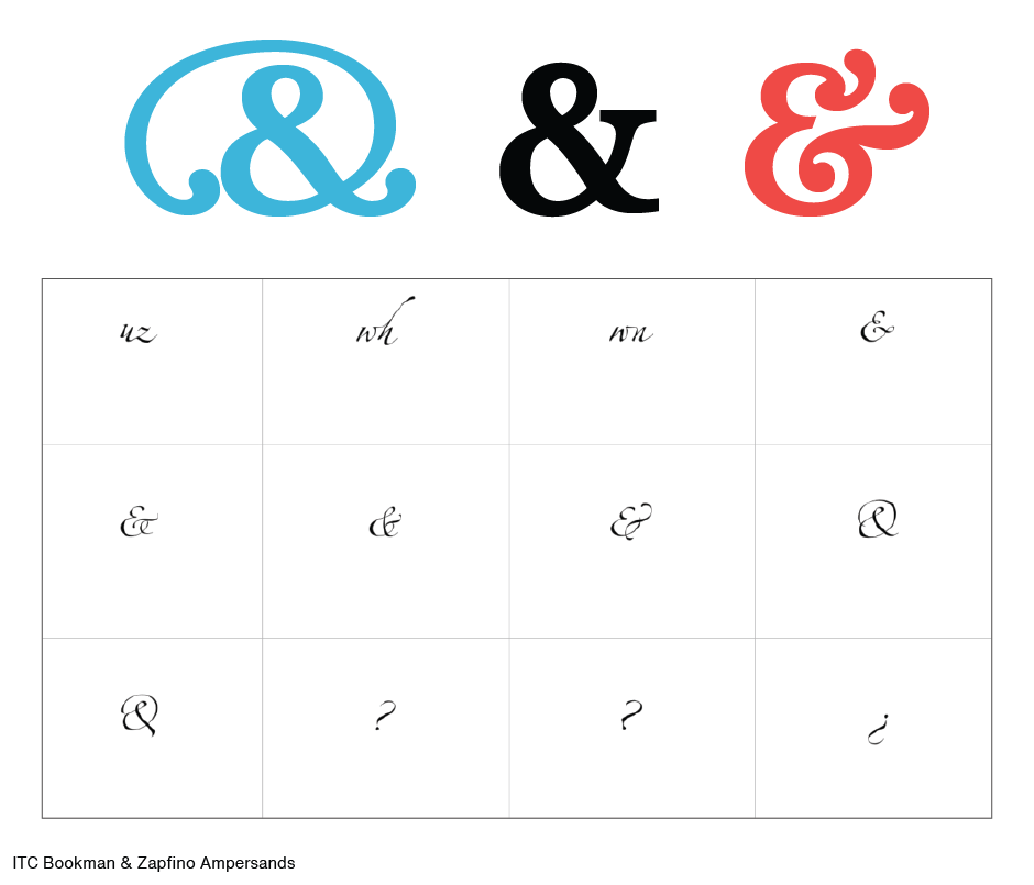
Some typefaces even give you several choices for the ampersand. ITC Bookman has three, and Zapfino gives you a handful.
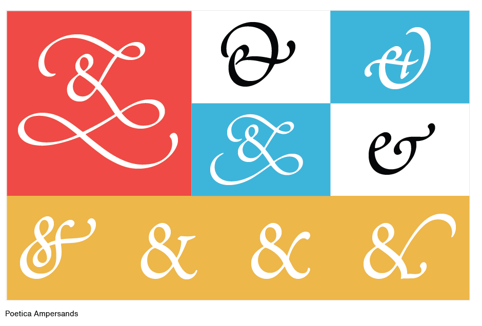
If you really want a lot of choice, try Poetica. It has over 50 different alternative ampersand designs!
Download a pdf version of the Manual - It’s About Ampersands.


