Manual Typeface Families
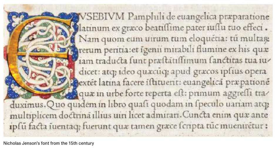
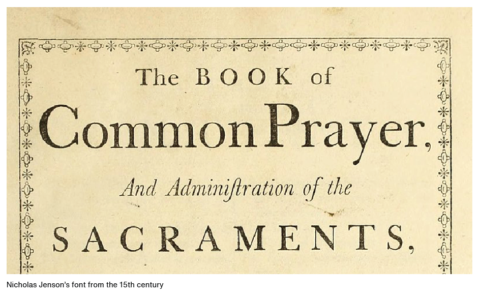
When typefaces were first invented, the notion of having a family of type hadn’t occurred to anyone. All fonts were simply roman designs. In the early 16th century, cursive – or italic (named after Italy, where the idea was popularized) – type was introduced. There were still no typeface families, however. Romans were one style of type and italics were another – much like serif and sans serif.
In the late 1700s, foundries began to release fonts in families – pairing roman and italic designs that matched each other in style. Later the concept of typeface weights and proportions was added to the typeface family mix. In the 20th century, type families were enlarged even further with the introduction of different designs such as condensed, expanded and outlined.
Modern Type Families
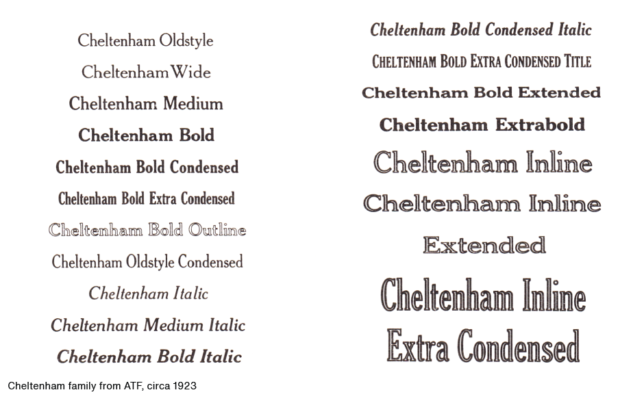
The person generally credited with conceiving the modern idea of a typeface family is Morris Fuller Benton, director of typeface development for American Type Founders in the late 19th and early 20th centuries. Benton’s premise was that typefaces within a family would share the basic characteristics of the parent design, but with individual variances. The Cheltenham, Century, Cloister, and Stymie typeface families are just a few of the designs developed under Benton’s watchful eye.
Planning by the Numbers
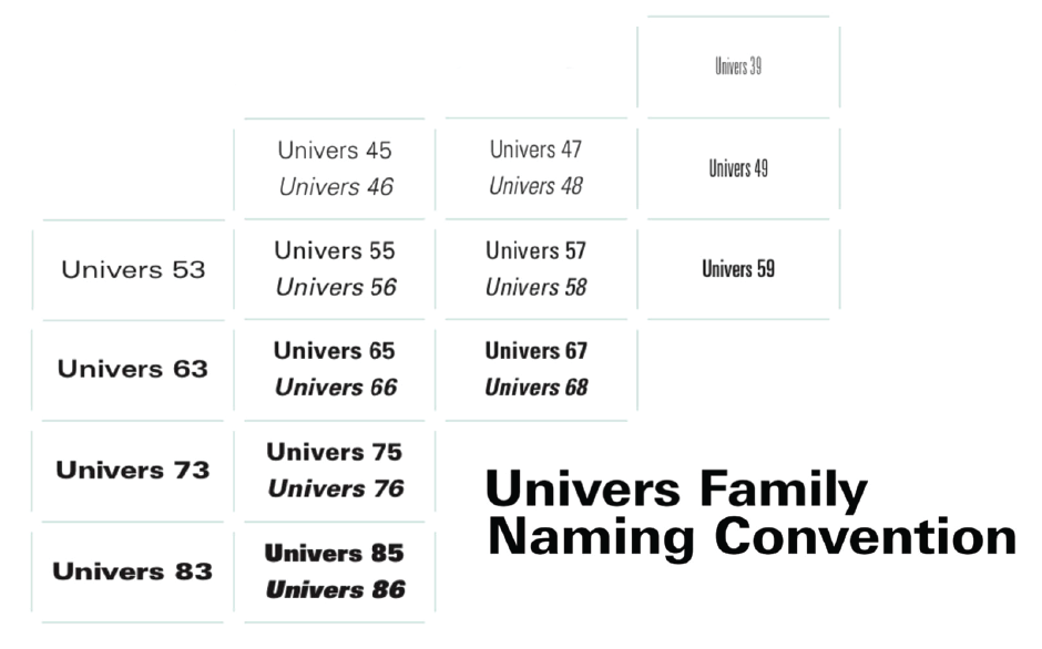
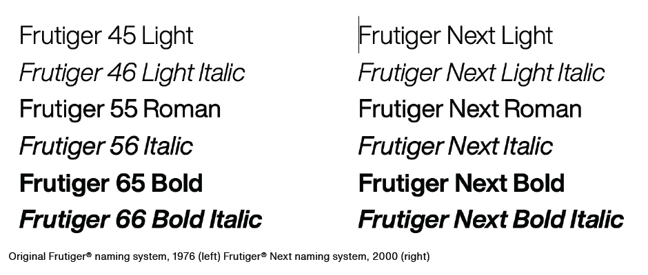
In 1957, the Swiss type designer Adrian Frutiger designed a new kind of type family. He felt that the traditional system of providing names – “bold,” “semi-bold,” and so on – was confusing and outdated, Frutiger proposed a logical, systematic numbering scheme. In his system, each typeface was given a two-digit suffix. The first digit classified the alphabet weight, with 3 indicating the lightest weight in the family and 8 the boldest. The second digit identified the typeface proportion, with higher numbers for condensed designs and lower numbers for expanded designs. In addition, if the second number was odd, the typeface was a roman design; if it was even, the typeface was italic.
The naming system, however, seems to have won-out, as new families, and even revivals of older families that used the numeric system, have returned to using names like bold, extra bold, etc.
Extended Type Families
Some typeface families are made up of two or more sub-families. FF Kievit is a good example. Its sub-groups consist of Serif, Sans and Slab. Each design has roman and italic versions in nine weights for a total of 54 individual typefaces. The designs share the same cap height, lowercase x-height, stem weight and general proportions. Each typeface, however, is designed to stand on its own as a useful, distinctive communication tool. Slate™ and Macklin™, are other popular typeface families that are made up of sub-families.


Size-specific Families
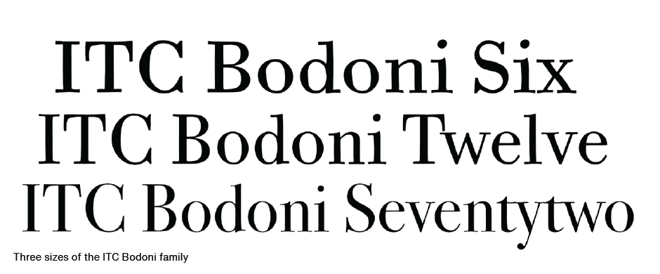
Another kind of type family has different designs for use at different sizes. ITC Bodoni is such a family. It’s comprised of three size-sensitive variants, named Six, Twelve, and Seventy-two. These were designed to emulate the differences in the progressively-sized metal punches that Giambattista Bodoni created for his original fonts.
And now we have variable fonts – which let you build your own typeface families. Typographic communication is virtually ubiquitous, and we now have typeface families for any project.

Download a pdf version of the Manual Typeface Families.


