Manual: Two-Story Type

The basic shapes of the Roman Alphabet are pretty consistent. They may be embellished with serifs, ball terminals, swashes, and such, but a B is pretty much an upright stroke and two bowls. The m is basically an n with an additional hump and the n looks like an h with the ascender cut off.

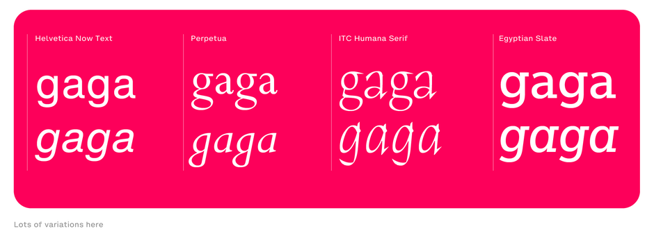
There are, however, two distinctively different forms of the lowercase letters a and g. The one-story a (sometimes spelled storey) and the two-story a. The lowercase g also comes in single- and two-story variants. (The latter is sometimes referred to as the bowl and loop, or spectacles g).
The single-story version of the letters are the ones most of us learn to write as children and are commonly (but not exclusively) used in handwriting, calligraphy, and many italic fonts.

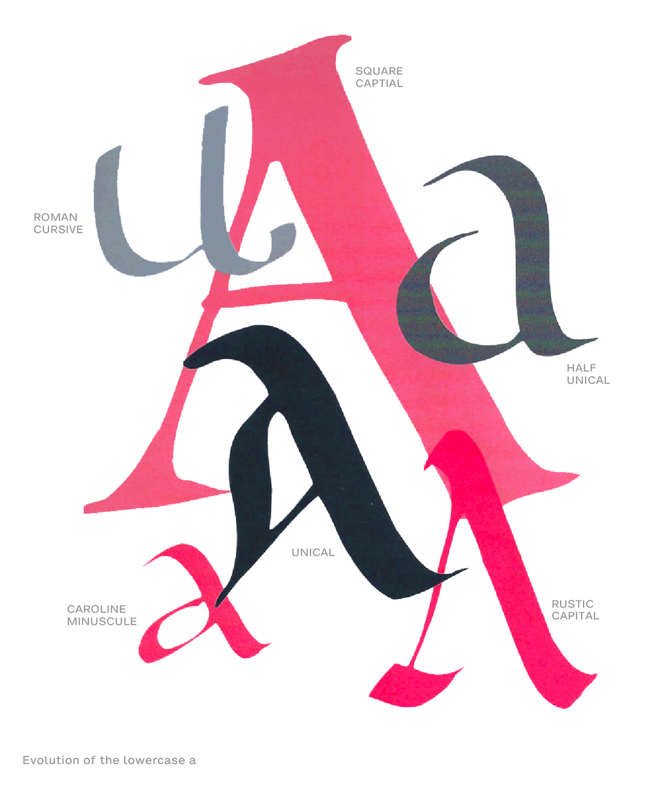
The two-story a and g are more common in Roman, or upright, typestyles. Both versions evolved from the capital letterform and the evolution of calligraphic Uncial scripts in Codex books – originating around the 2nd century. The codex form of book replaced earlier rolls of papyrus and wax tablets, and was developed in conjunction with the growing use of parchment and vellum as writing surfaces.

Uncial letters are also quicker and easier to draw, giving the scribes a leg-up turning out handwritten books in the shortest amount of time. Yup, quotas were important, even in the 2nd century.
The two-story versions of the a and g are also easier to differentiate from other one-story letters, aiding in legibility of textual content.
There is no set rule for the inclusion either version of the characters in a typeface. Knowing the terminology and recognizing the differences between the versions provides a tool to observe differences in typestyles, a language to discuss them and some insight into ensuring legible text copy.


