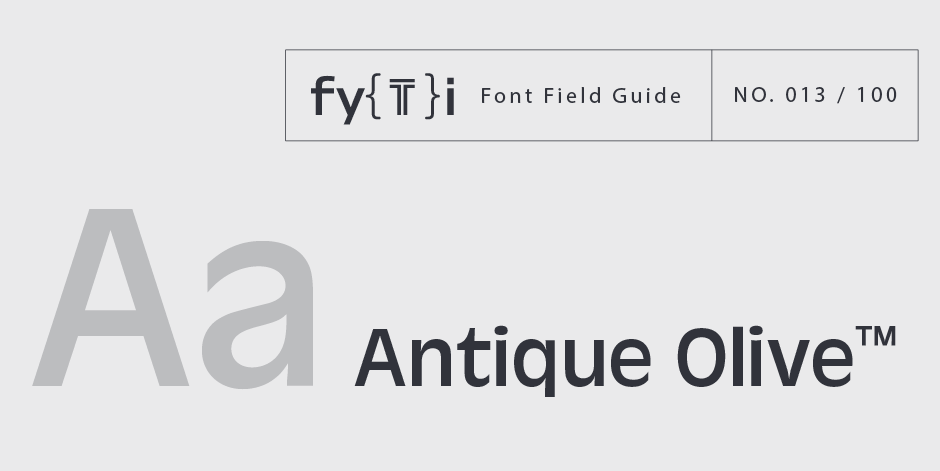
Antique Olive Font Field Guide

Foundry: Linotype Designers: Roger Excoffon Classification: Humanistic Sans Serif
Best Practices
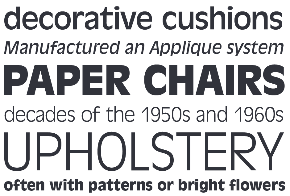
Antique Olive design is not intended for continuous text copy. It can, however, be used for short blocks of textual content if given ample line space. Somewhat squared curved shapes and vertically clipped strokes allow for tight, even display setting.
Family
Seven weights, two with italics, a condensed and compact design
Font Facts
- Designed for Fonderie Olive, “Antique” is a European typographic term for gothic or sans serif.
- Because of its distinctive shapes and proportions, the Antique Olive design can be paired with other sans serif typefaces.
- The heaviest weight is called “Nord” – “North” in French.
Roots
Released in the early 1960s, The Antique Olive family was intended to be a rival for the Helvetica® and Univers® typefaces. It has also been called the most striking sans serif since Futura® and Gill Sans®. Antique Olive was designed by Roger Excoffon who, in addition to being the design director for Fonderie Olive, also ran a flourishing design studio in Paris. His many typefaces were personal design statements drawn primarily for advertising typography.
Excoffon’s first typeface, Chambord, was a sans serif design. Five distinctive scripts followed. The Antique Olive family was his last.

Legibility
Characters are distinctive, generally making them legible. Tight apertures, however, detract from legibility – especially at smaller sizes.
How to spot Antique Olive


